Žiga Anderlič, graphic design, motion design, type design, Ljubljana, Slovenia / e-mail: anderlicziga@gmail.com / instagram: zigaanderlic / About
Žiga Anderlič, graphic design, type design, Ljubljana, Slovenia / e-mail: anderlicziga@gmail.com / instagram: zigaanderlic / About
Showreel 2024
Showreel of my recent commercial and personal motion design explorations.
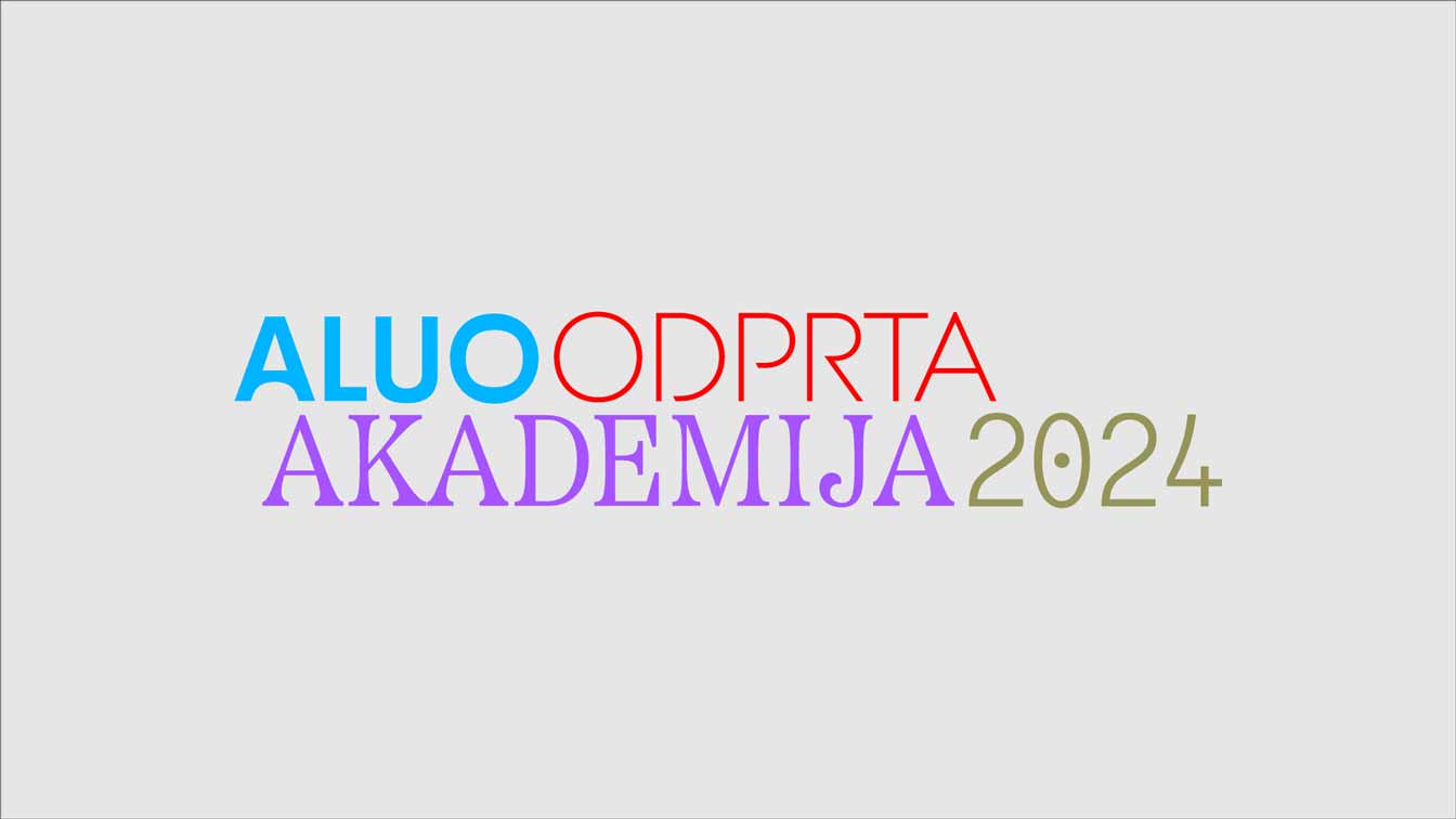
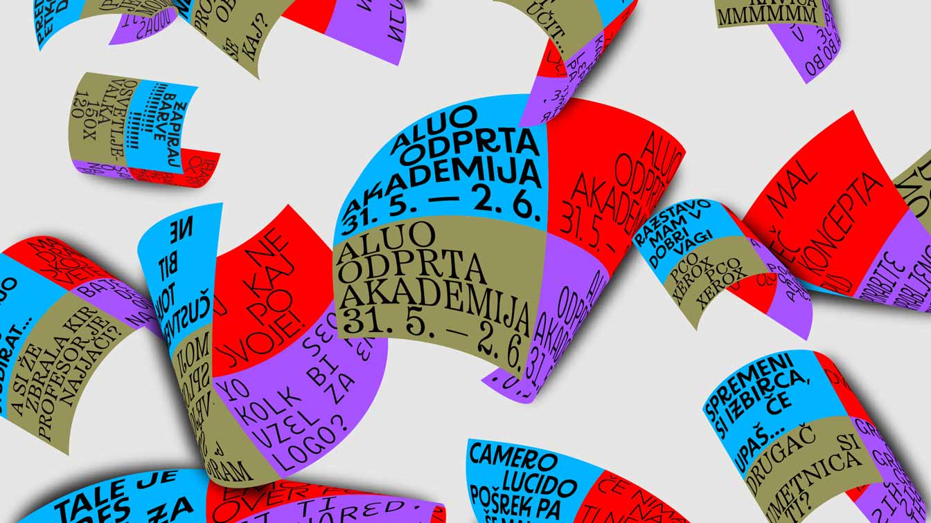
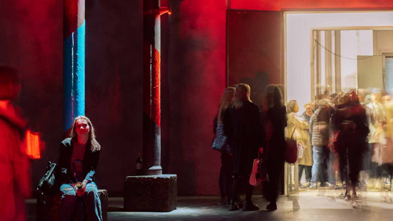
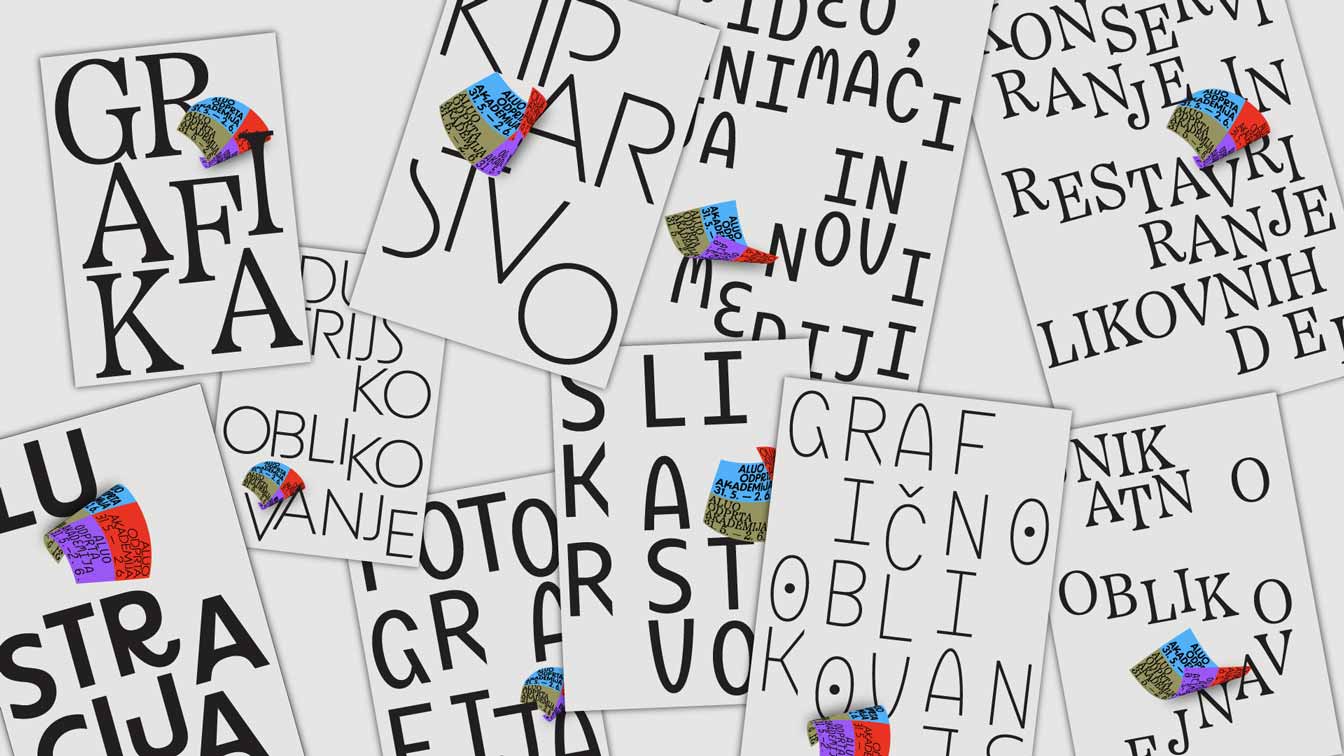
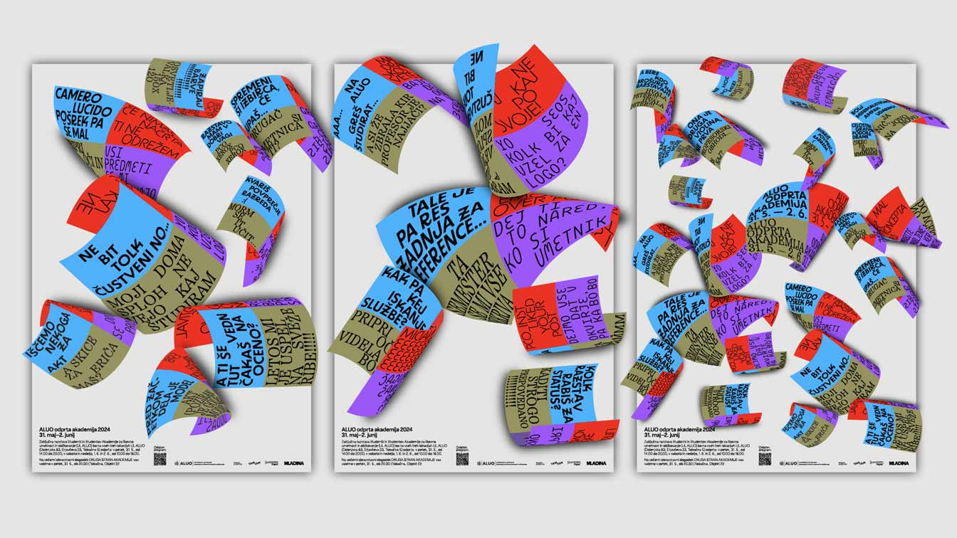
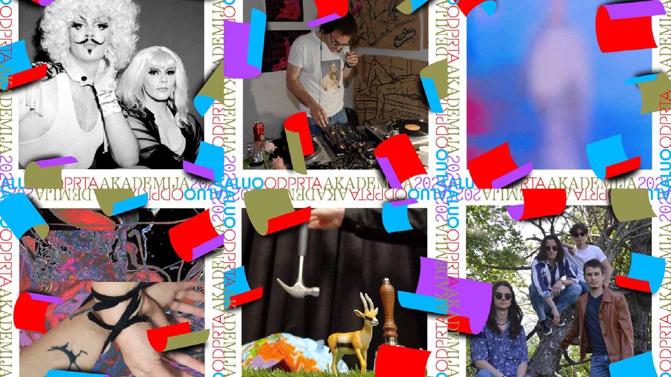
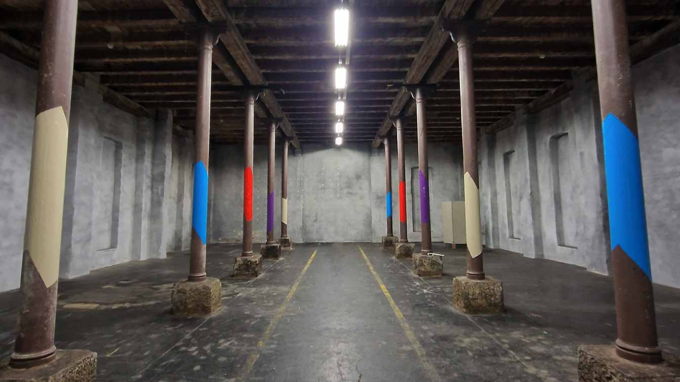
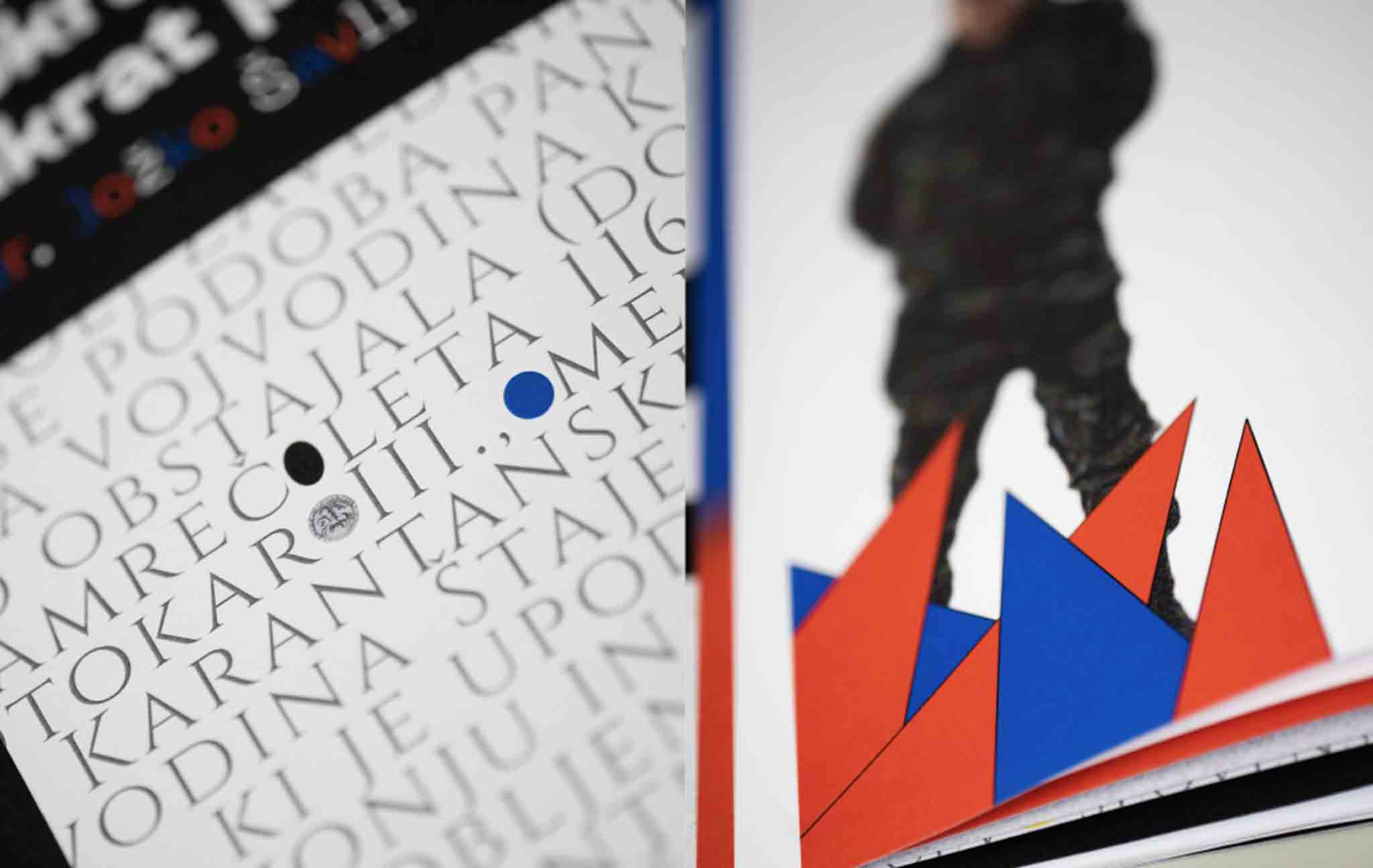
Visual identity for final exhibition at Academy of fine arts and design Ljubljana
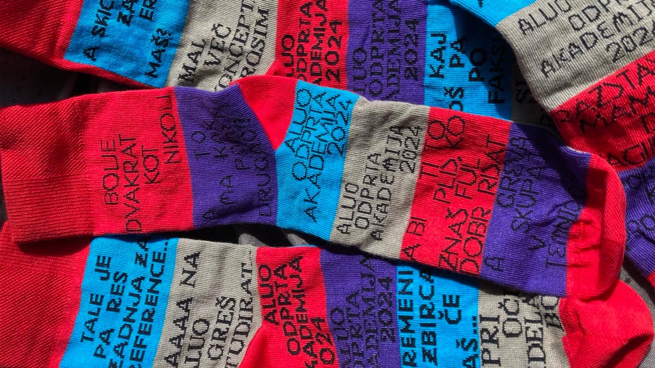
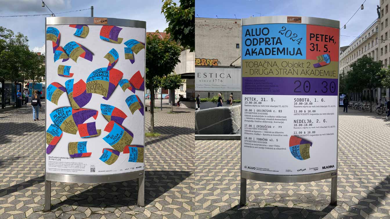
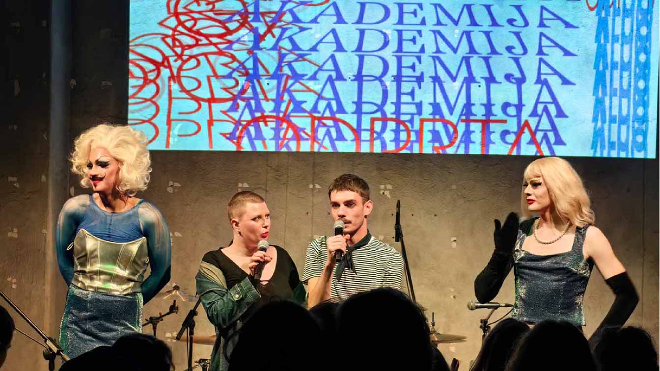
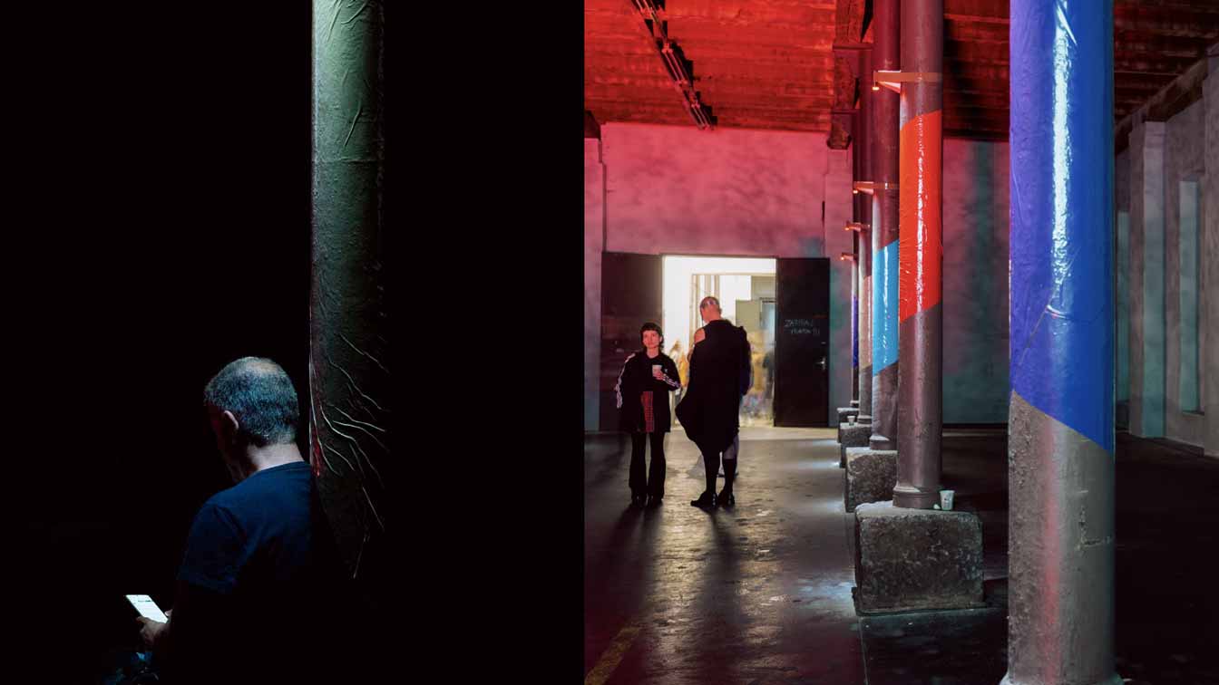
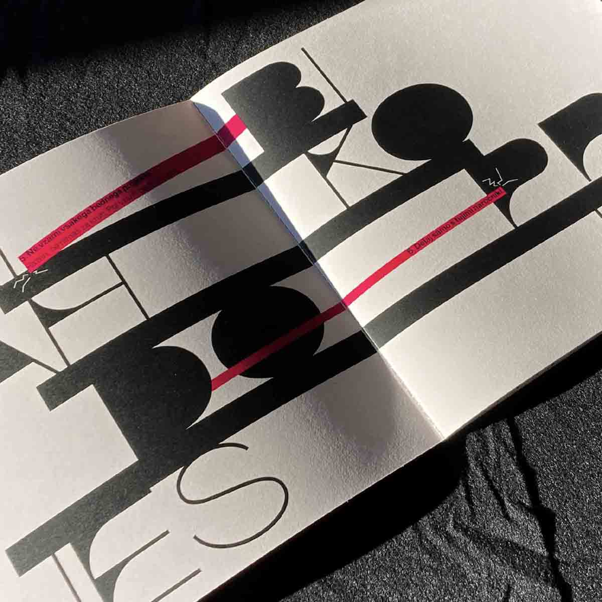
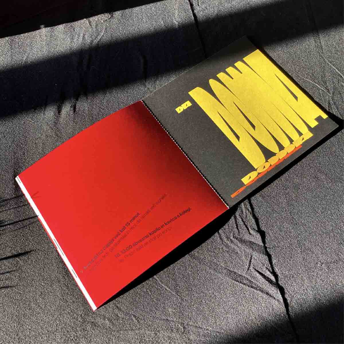
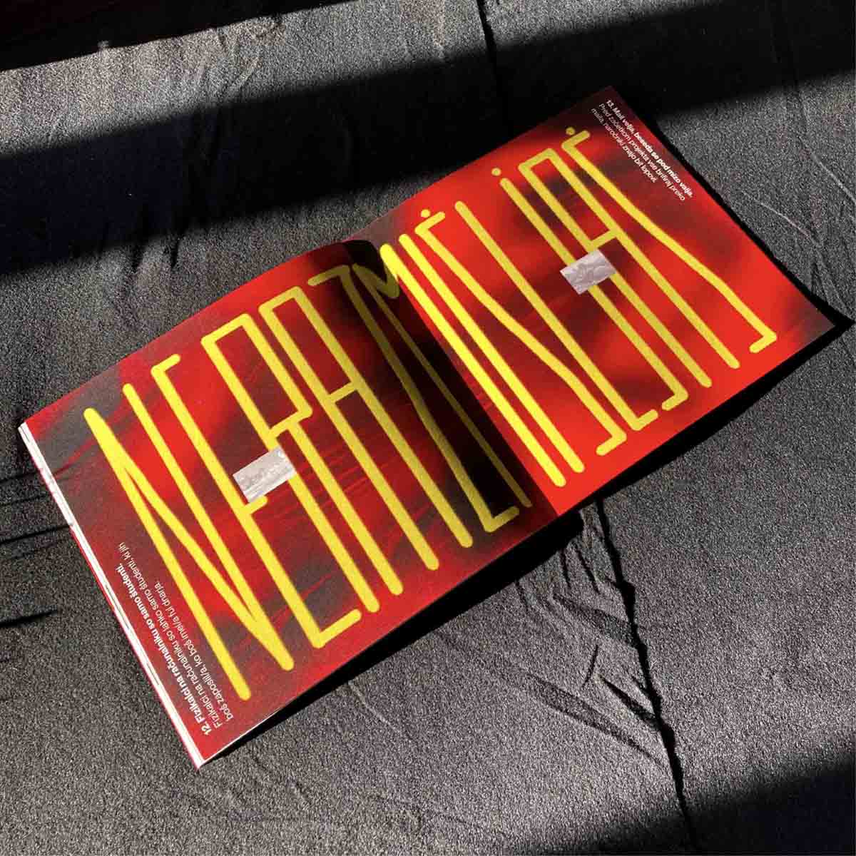
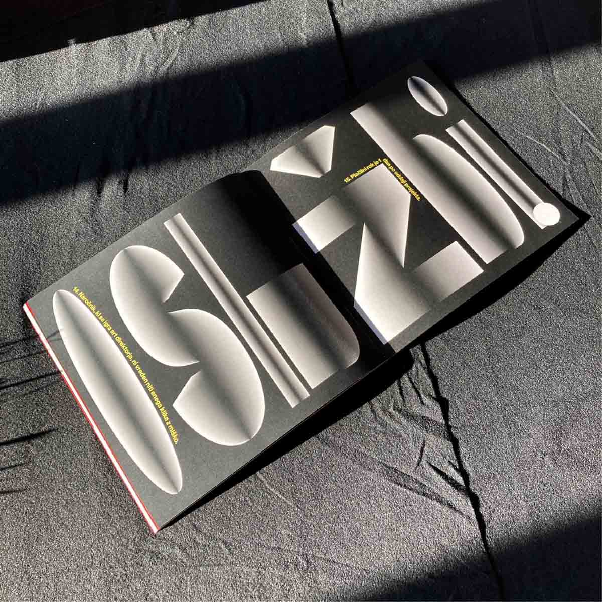
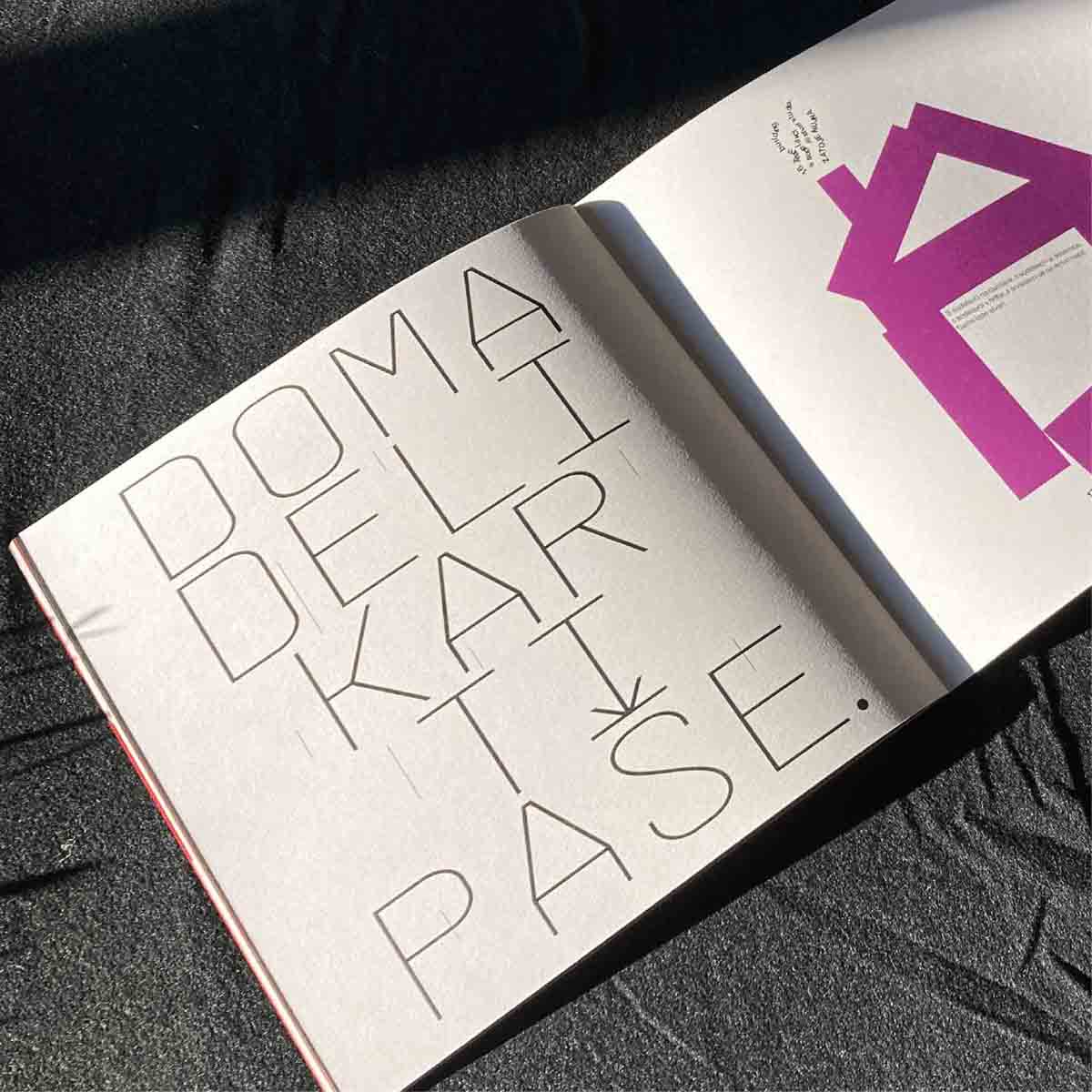
I had the opportunity to design a visual identity for the final exhibition of the Academy of Fine Arts and Design in Ljubljana in 2024. The theme of identity was internal view of the academy. The idea was to present the students through an insight into their activities, concerns, questions and challenges they face everyday at the academy, etc. The identity is built from sayings/thoughts written on paper that I got from the students and professors themselves and does not show their works at all. With this approach, I wanted to connect all three locations into which the academy is divided, since, in my opinion, even students do not connect with each other enough during their studies.
Photos by Žan Vargek
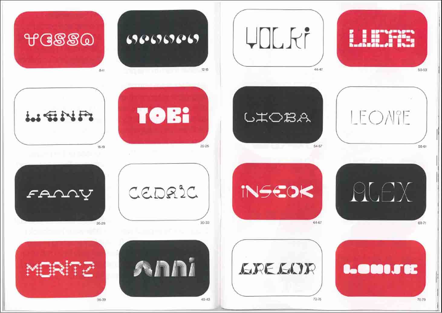
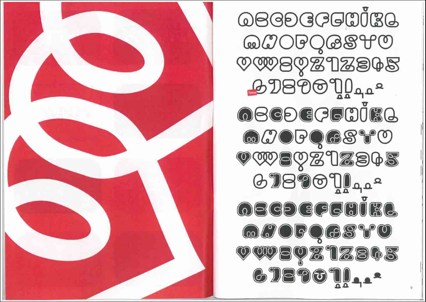
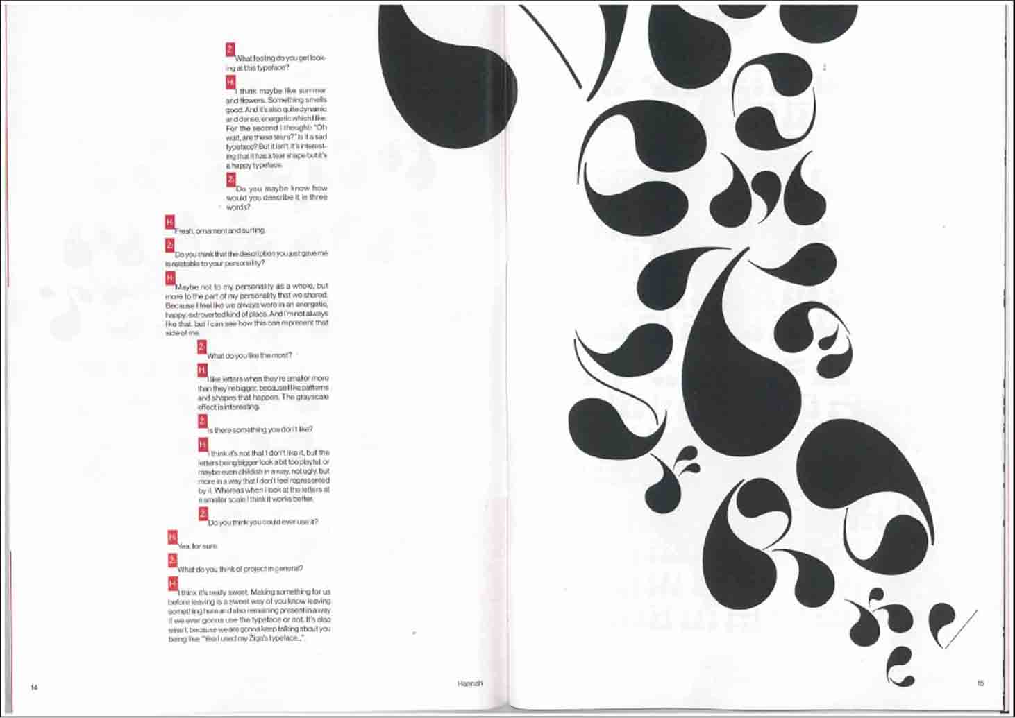
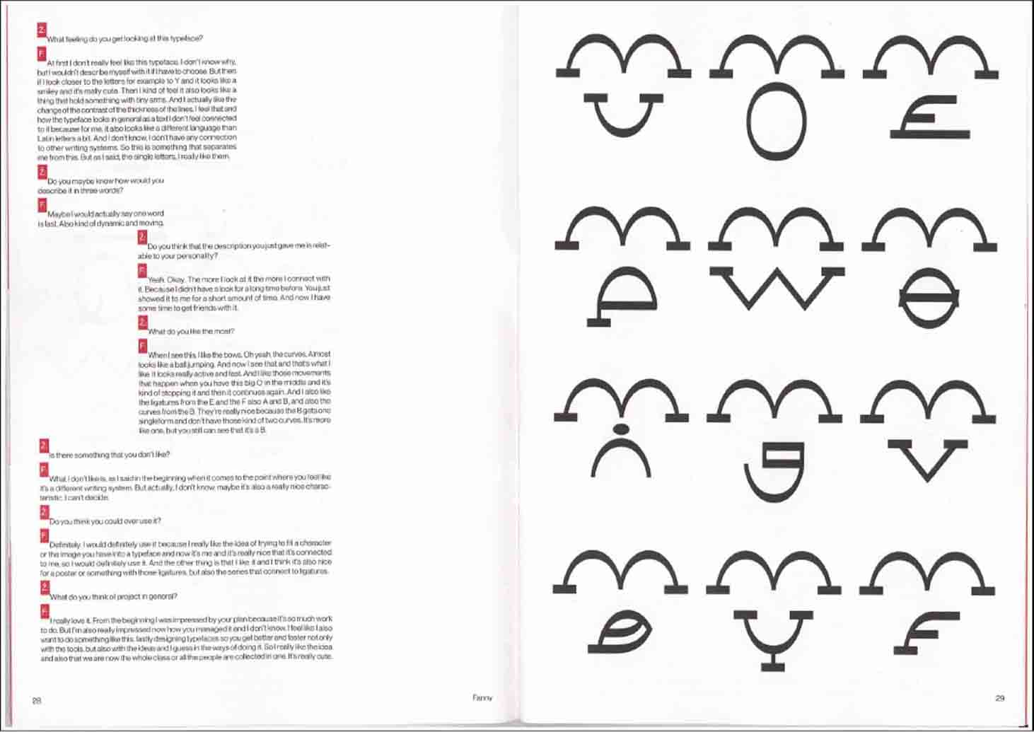
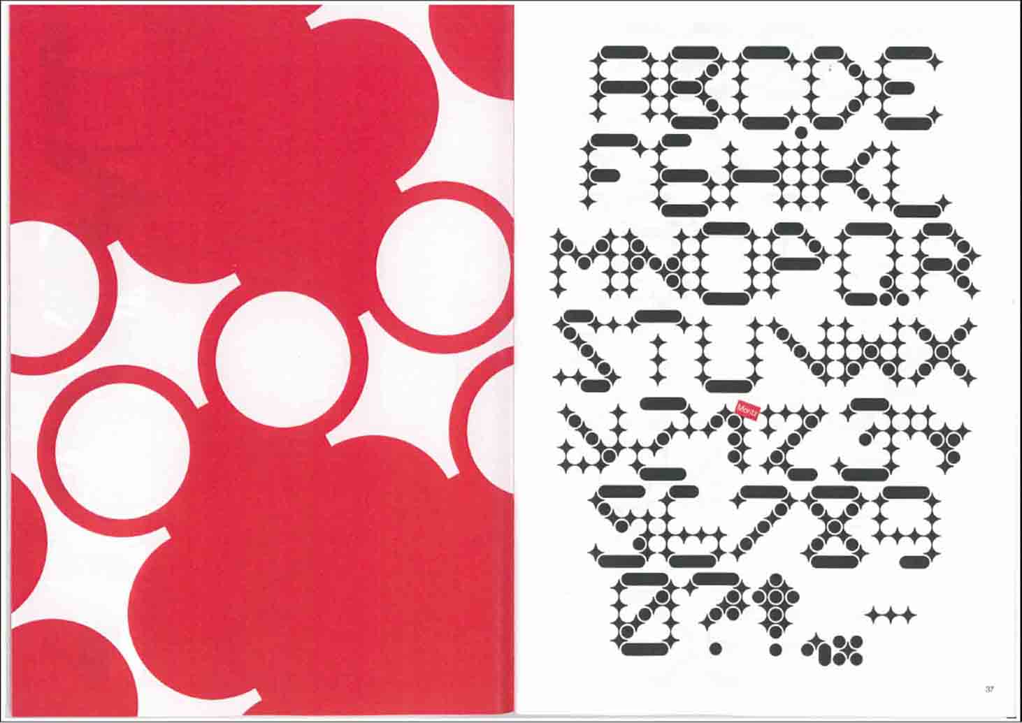
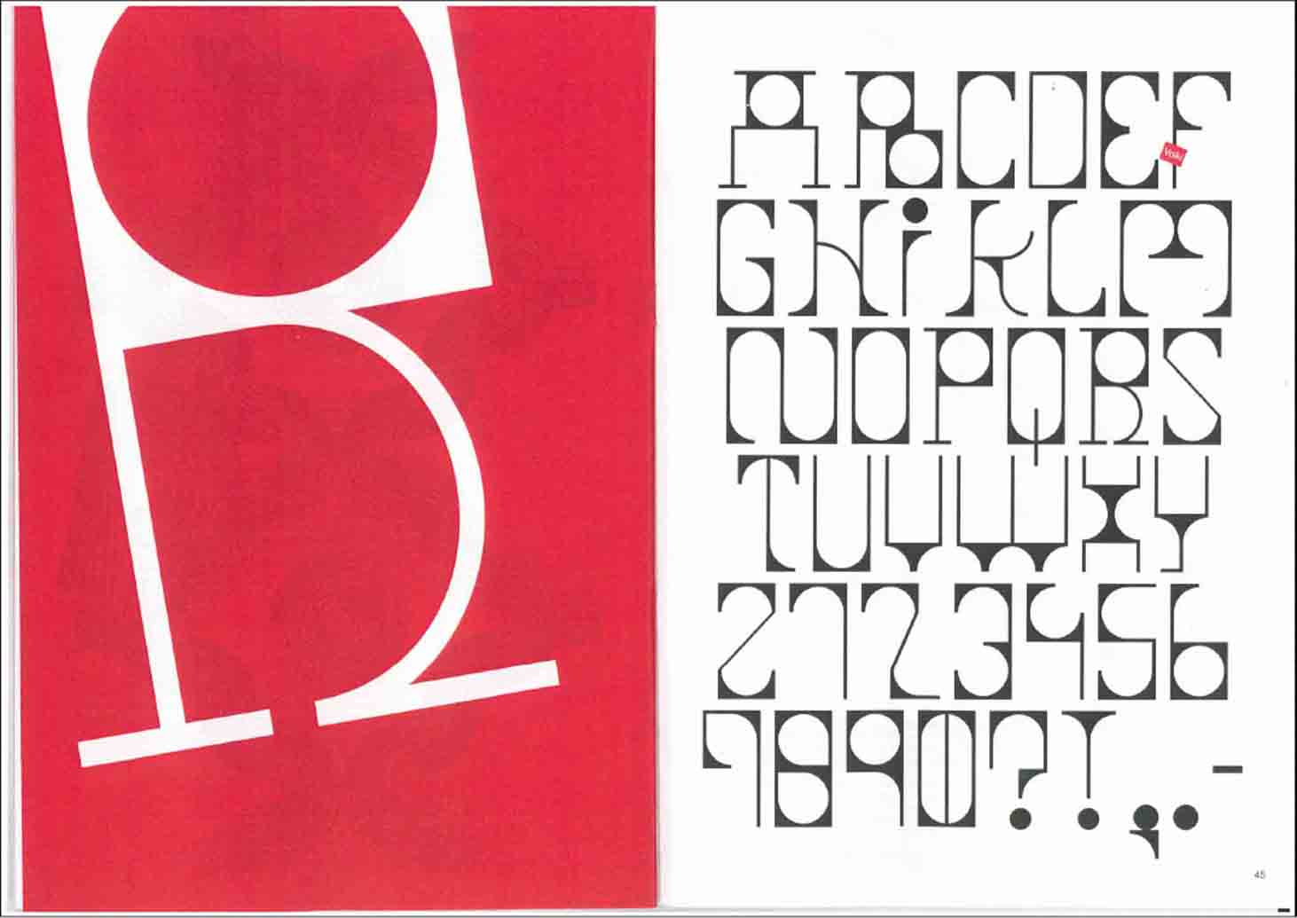
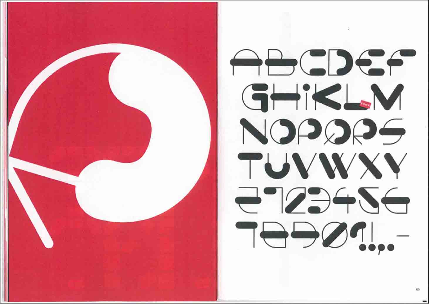
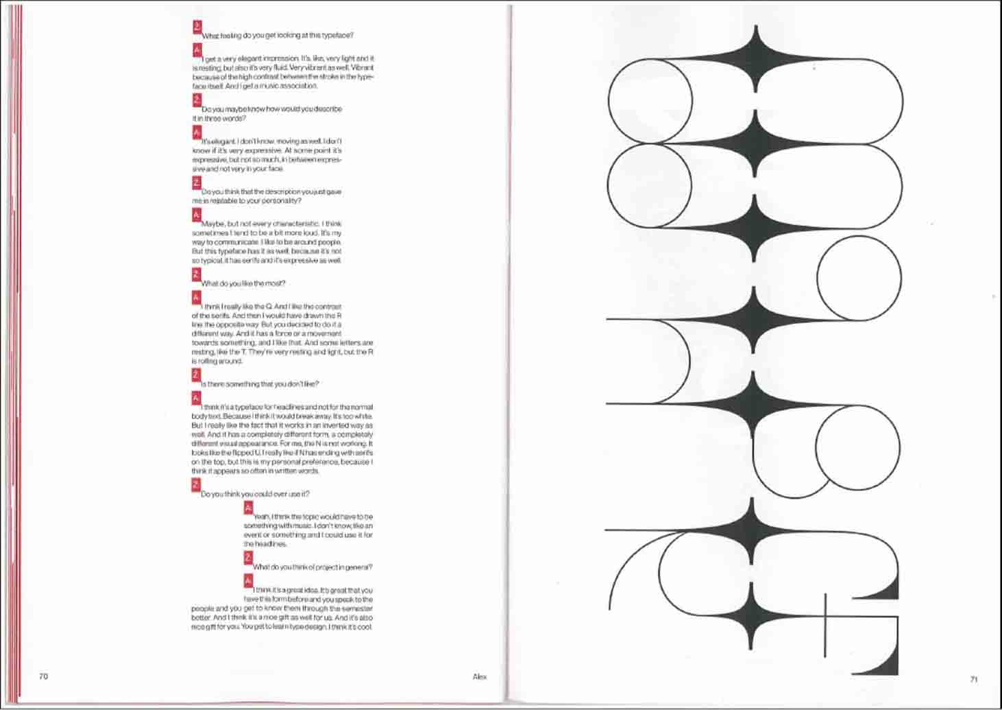
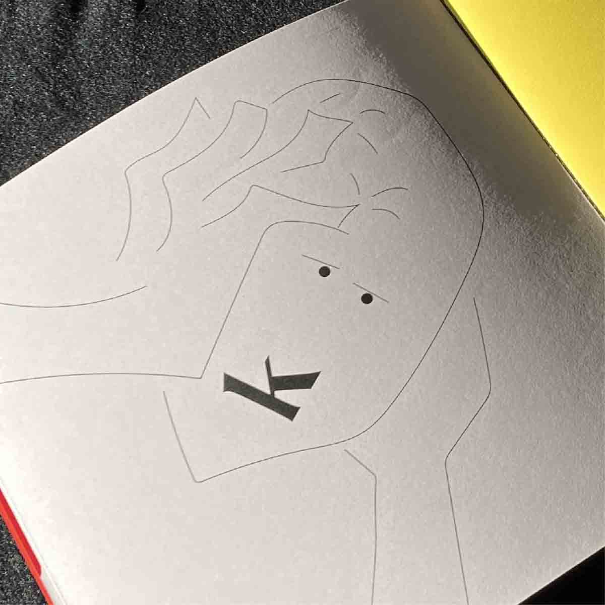
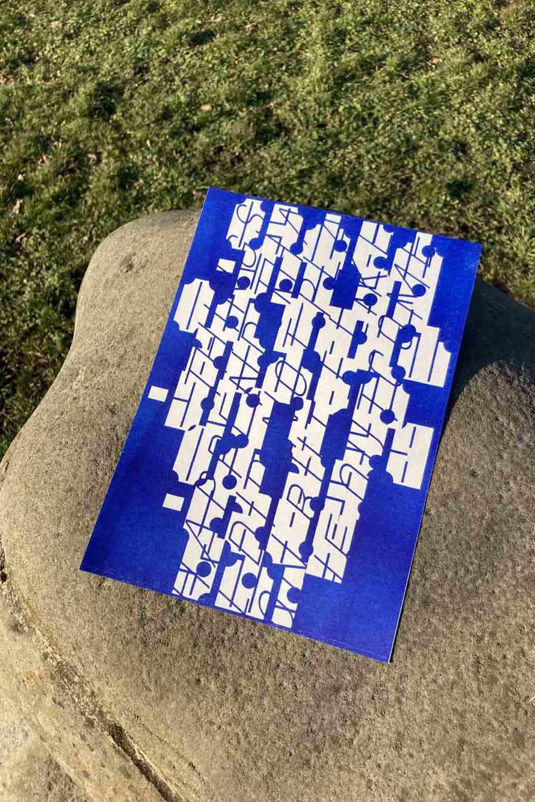
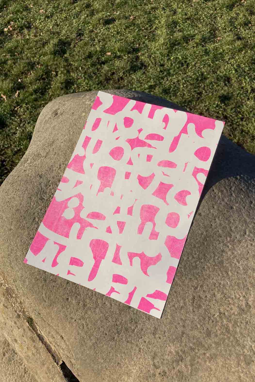
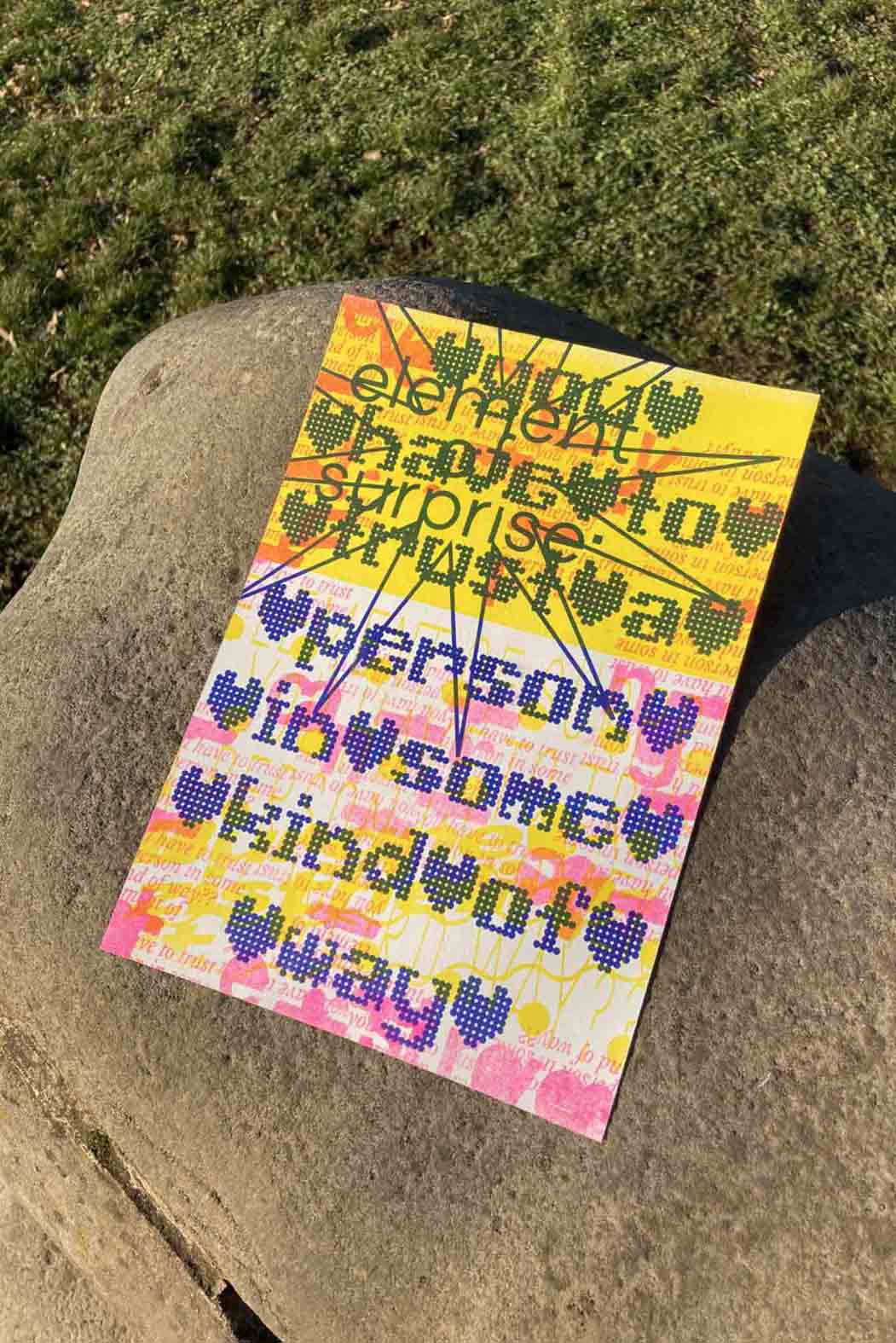
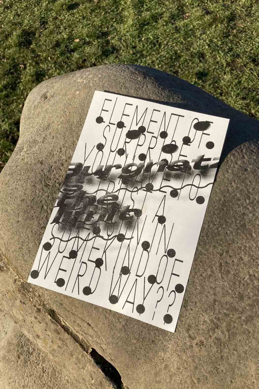
What's my type?
I was interested in how it would be possible to show or use the concept of sharing and participating through type design. After a couple of failed attempts it all became clear… Why don’t I make a typeface for each person in the class and somehow involve them in the process?
Typefaces are sometimes born from abstract and intangible ideas, so their meaning is often determined only when we start using them in a certain context. I wanted to try a different approach, so I defined the meaning of each typeface before designing it. I achieved this by having every classmate participate in the initial phase of the project by answering a questionnaire, which in the end turned out to be pointless... Design choices then had to be based on previous experiences, memories and feelings I had shared with the person I designed the typeface for. You could say that my ideas and choices were also quite abstract in the end. The last stage of the project was the interview/feedback I got from each person. It will be interesting to see how I will remember people not only from the time we shared together but also from how much time I spent designing a typeface for them...
Manifesto for a perfect designers job
Every designer wants a nice career with as little stress as possible.
Every designer wants to work on projects that are unique to him/her.
Every designer wants free time.
Honestly, every designer would like to have a lot of money.
But every designer knows that all of menitoned above is practically impossible.
But is it really?
Is there an overarching principle that could help to achieve designer's overall happiness?
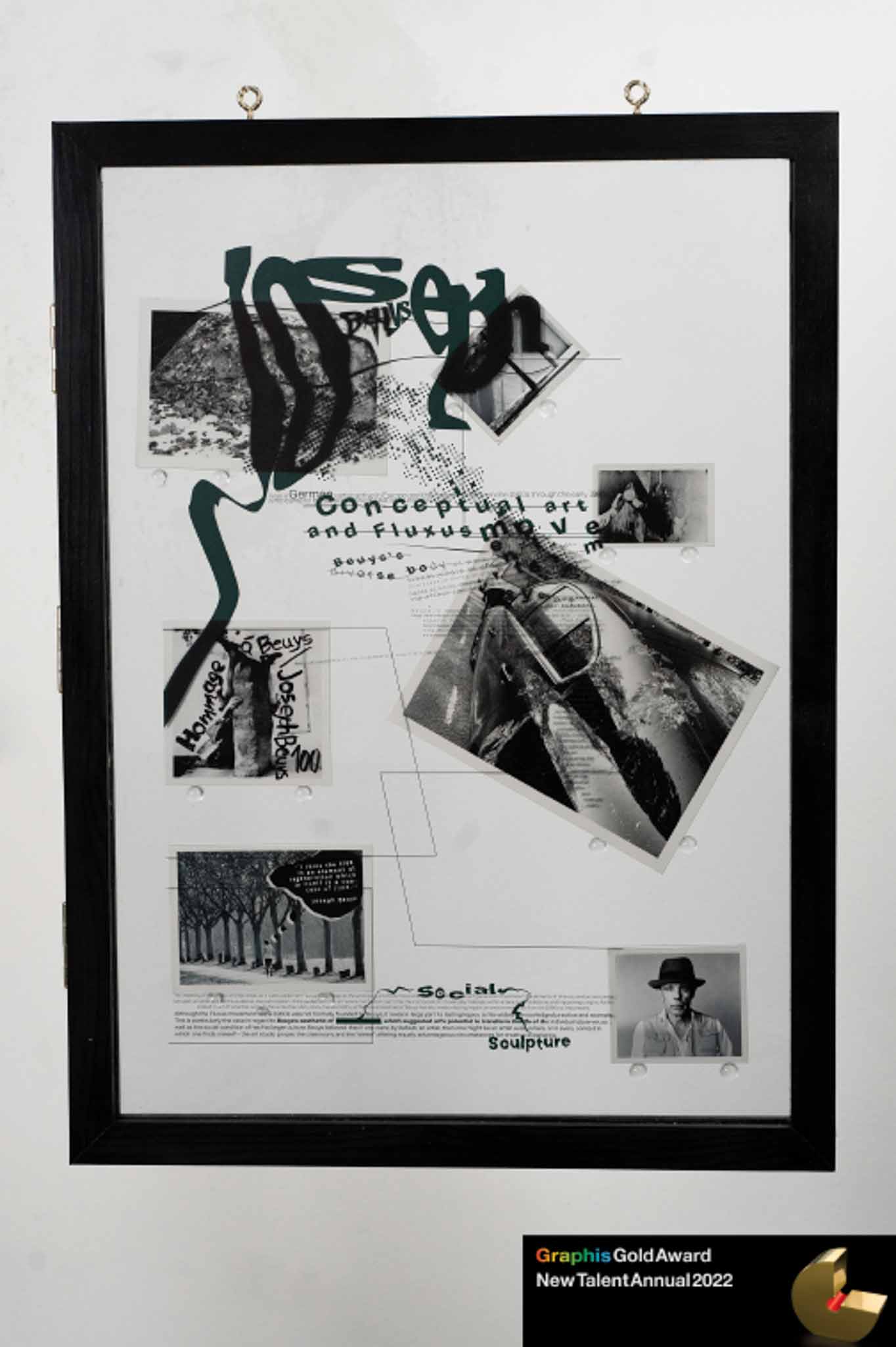
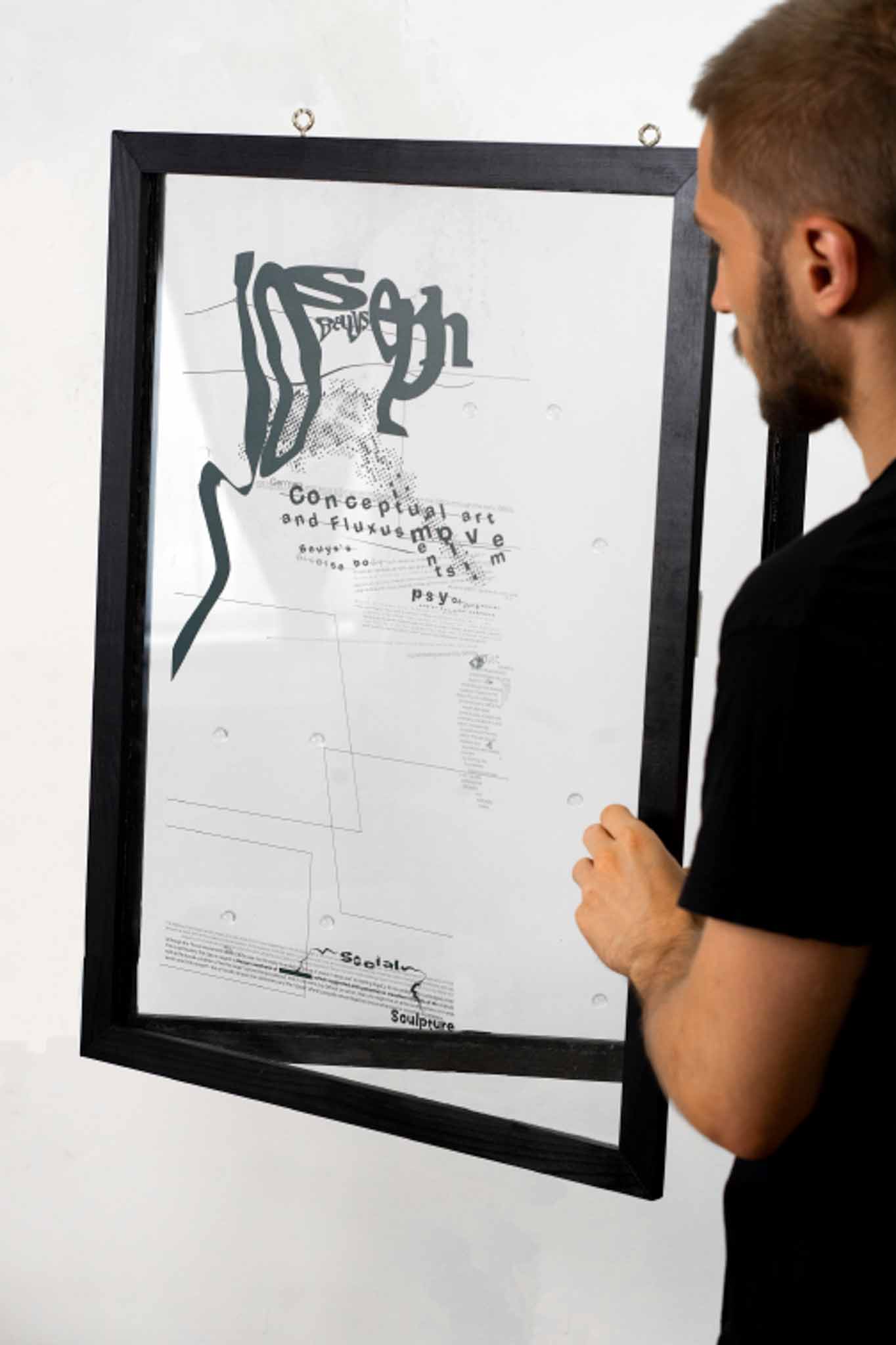
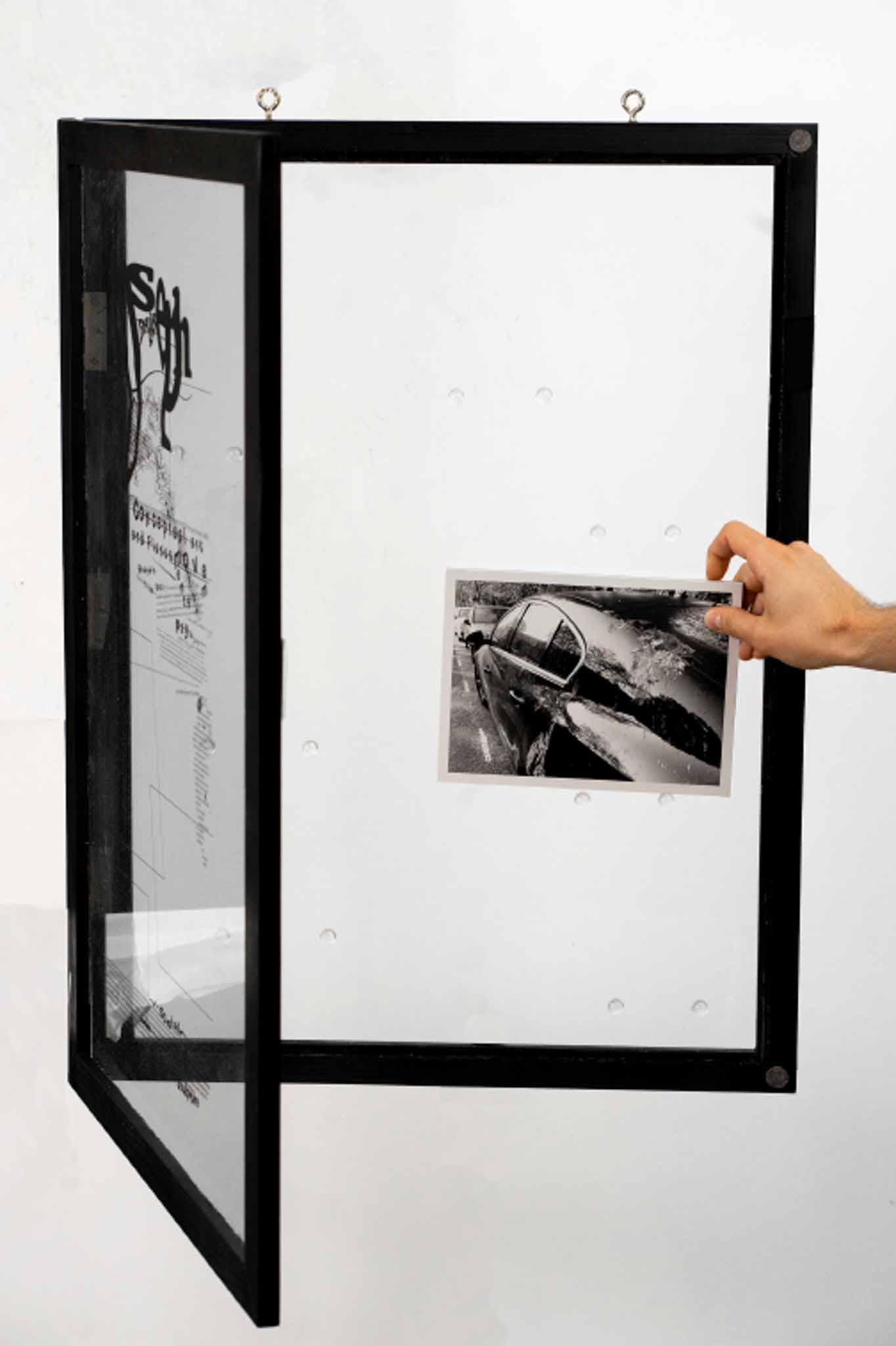
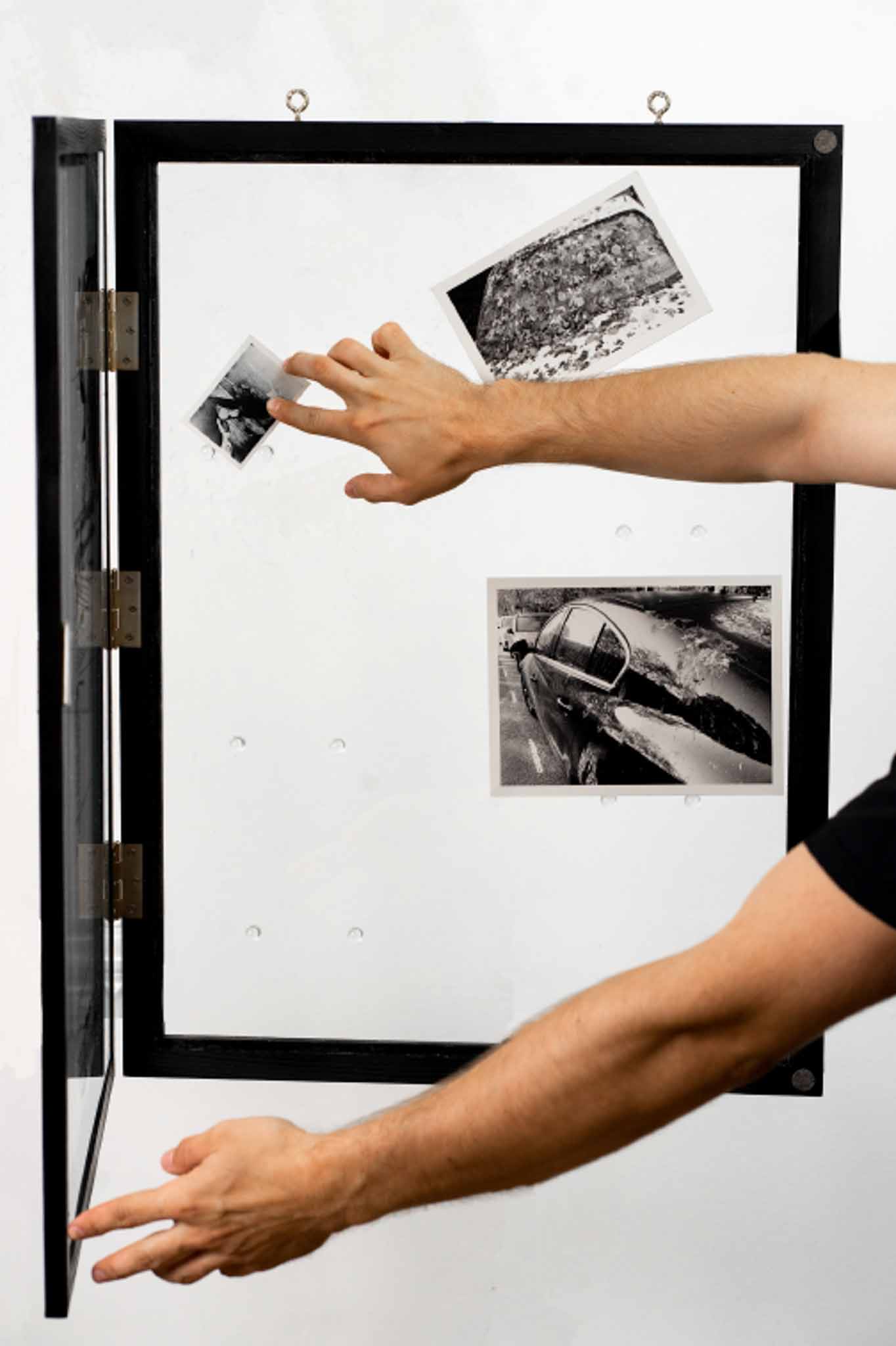
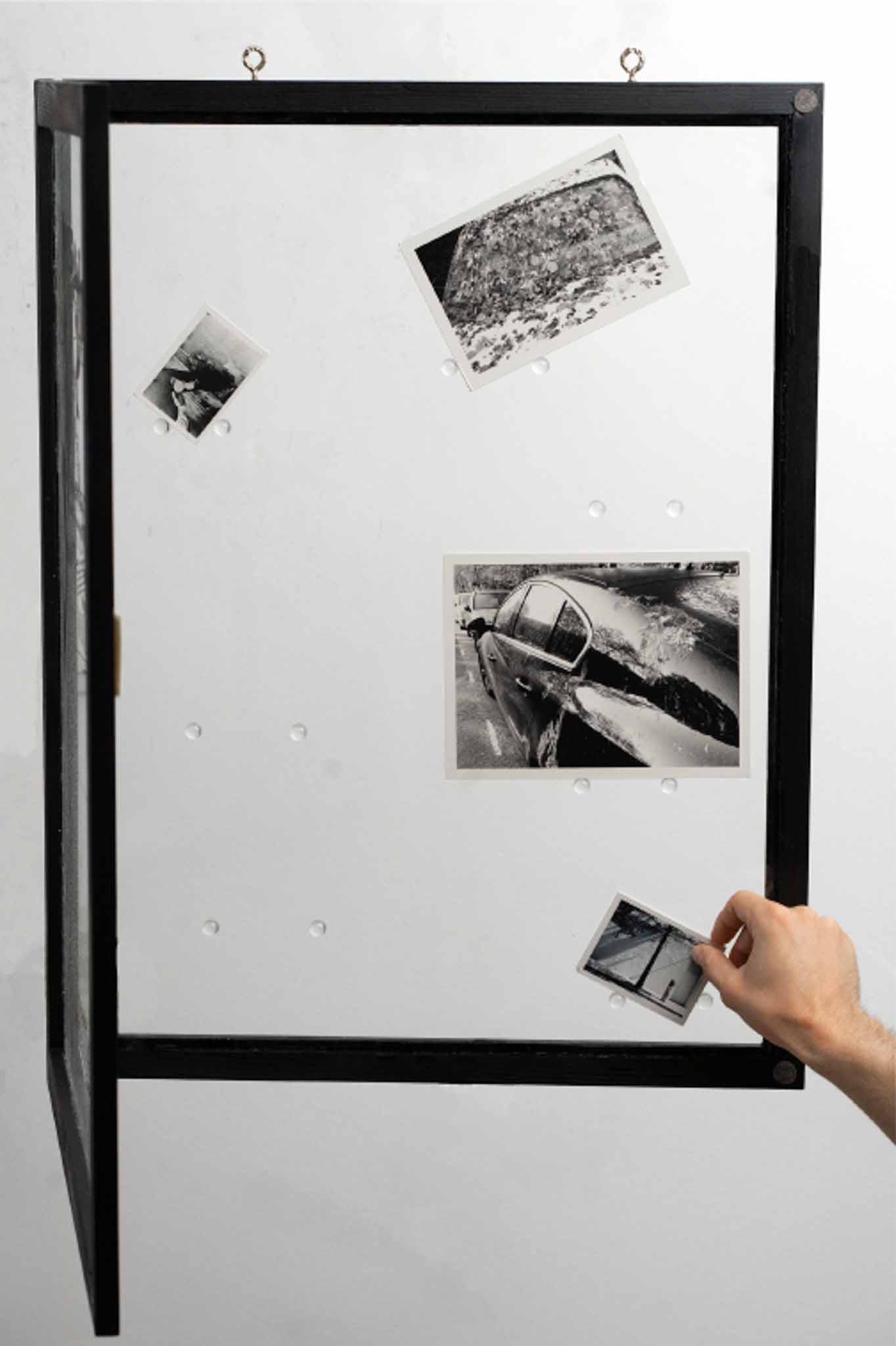
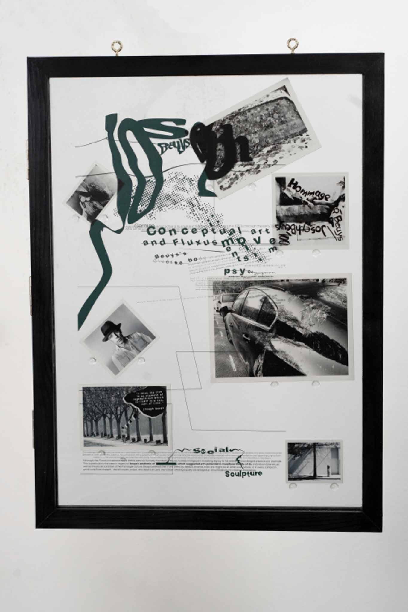
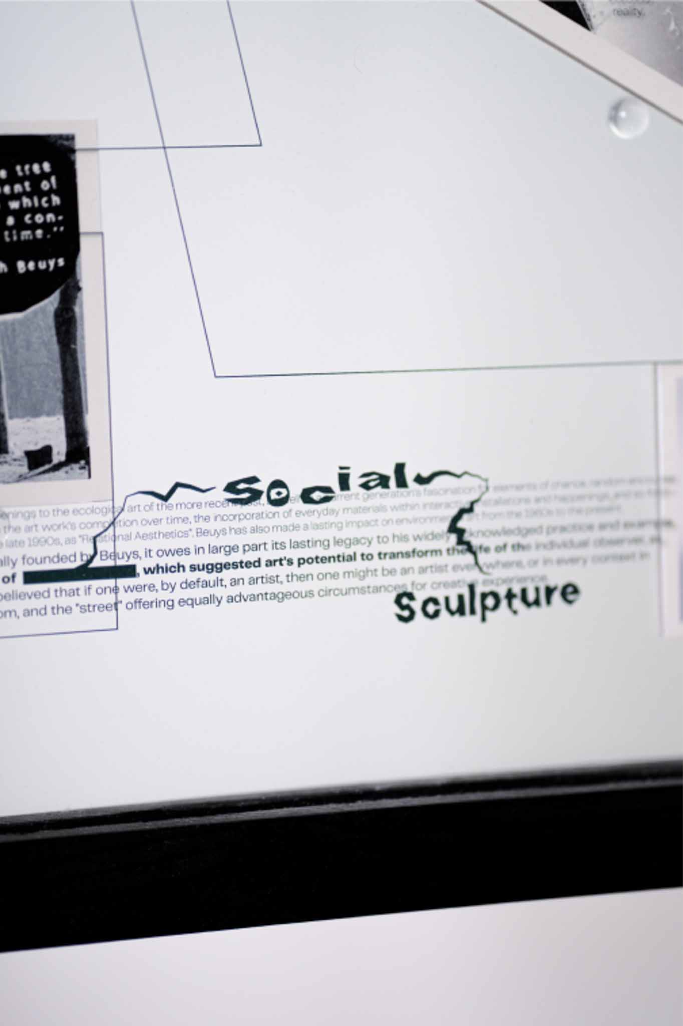
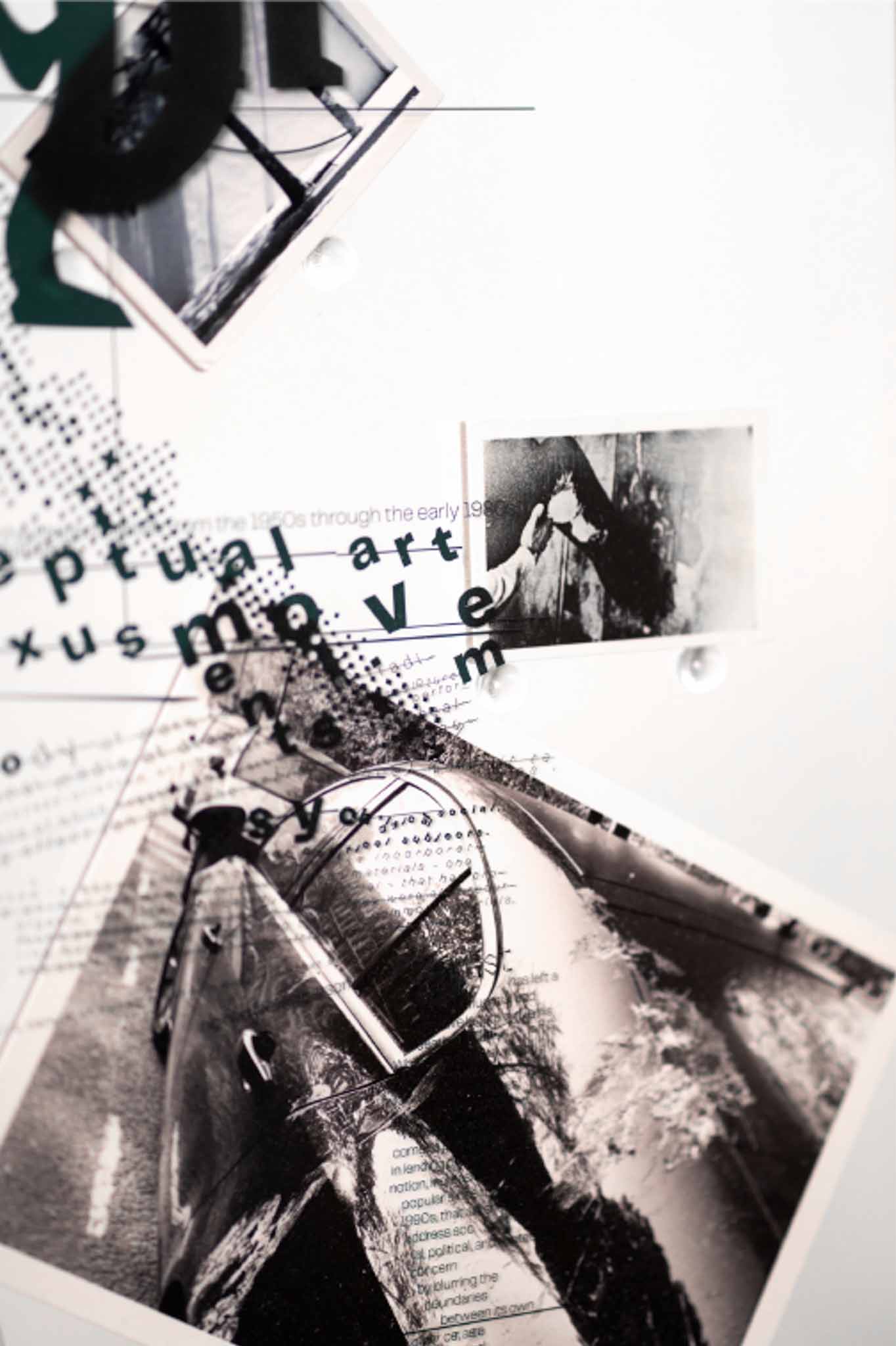
Hommage à Beuys
While researching Beuys' work, his idea that humans and nature are capable of living in perfect harmony despite all the odds, attracted me the most. But on the other hand I've never fully agreed with it.
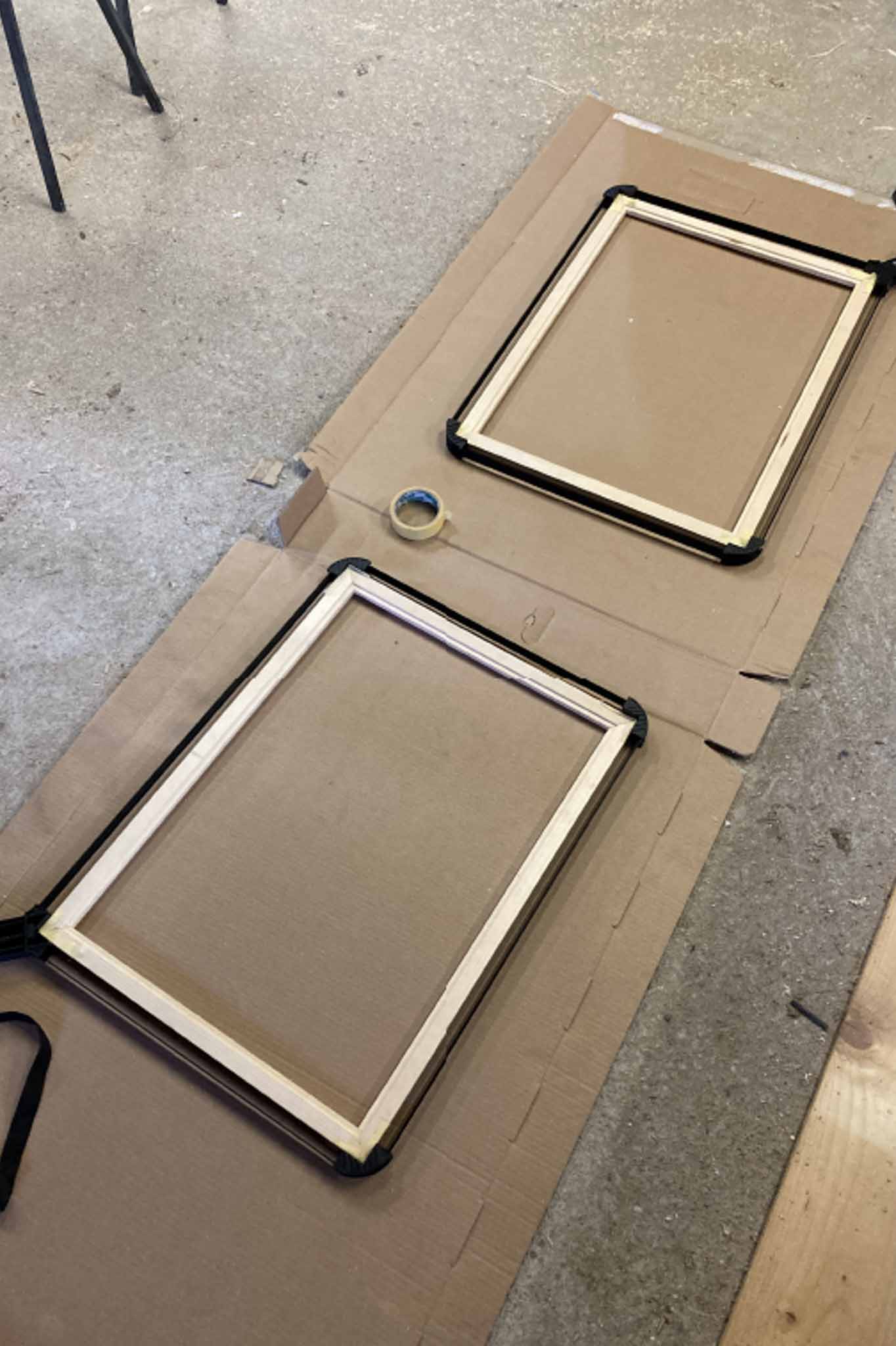
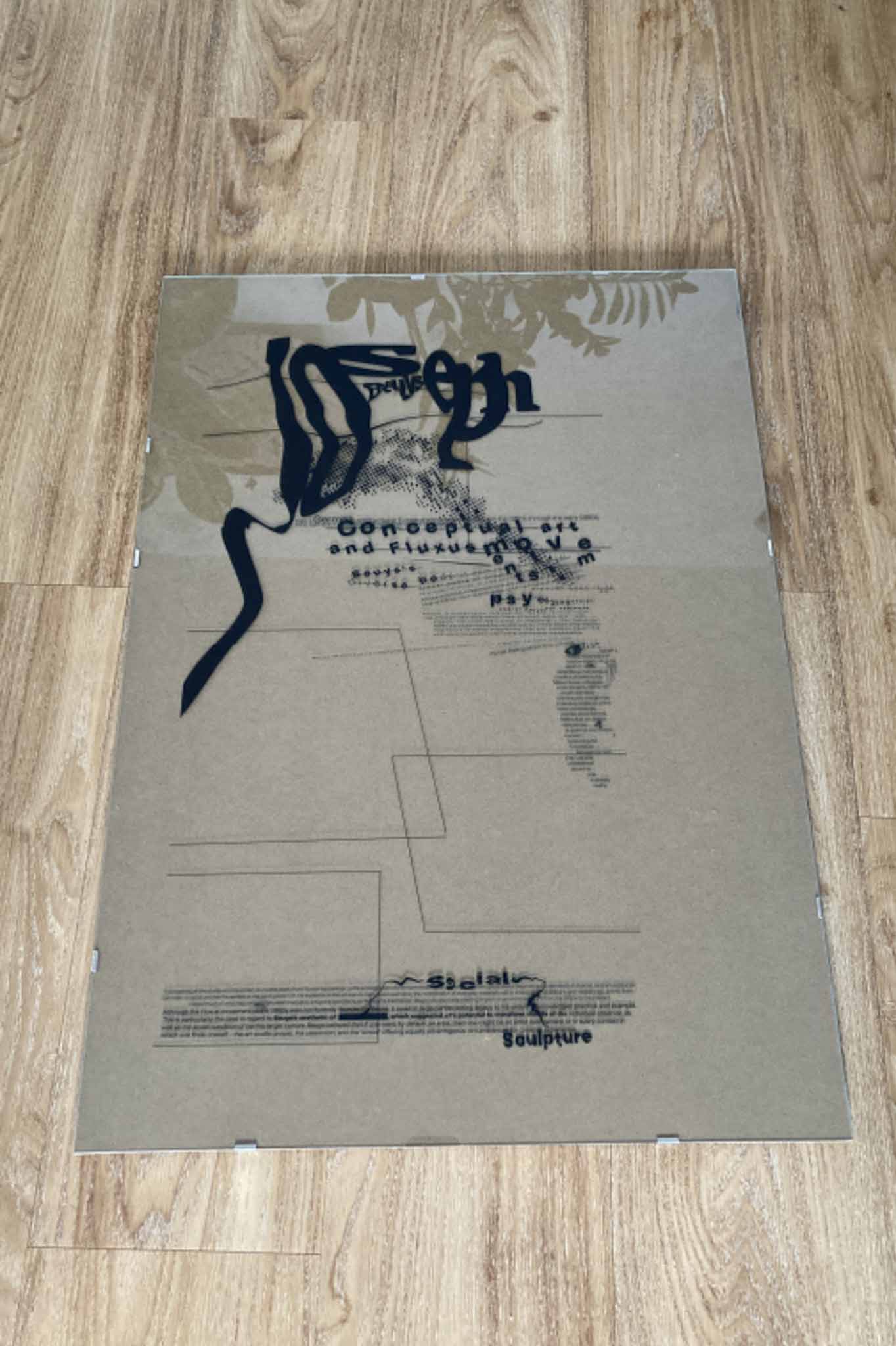
To design the frame/poster, I chose his 7000 oak trees project, in which Beuys started planting 7000 oak trees and placed a granite cube next to each one in Kassel, Germany, 1982. I was wondering if these trees are really good for the people who live there. Trees attract birds, and the birds defecate on the cars parked beneath them. The frame/poster can be opened and offers the option to viewer of re-aranging photos to his or her own taste. You can move pictures of cars up and save them from Beuys' oaks and nasty birds.
Whole poster and frame were hand made in one unique edition.
Project got a gold award at Graphis New talent annual competition in from New York.
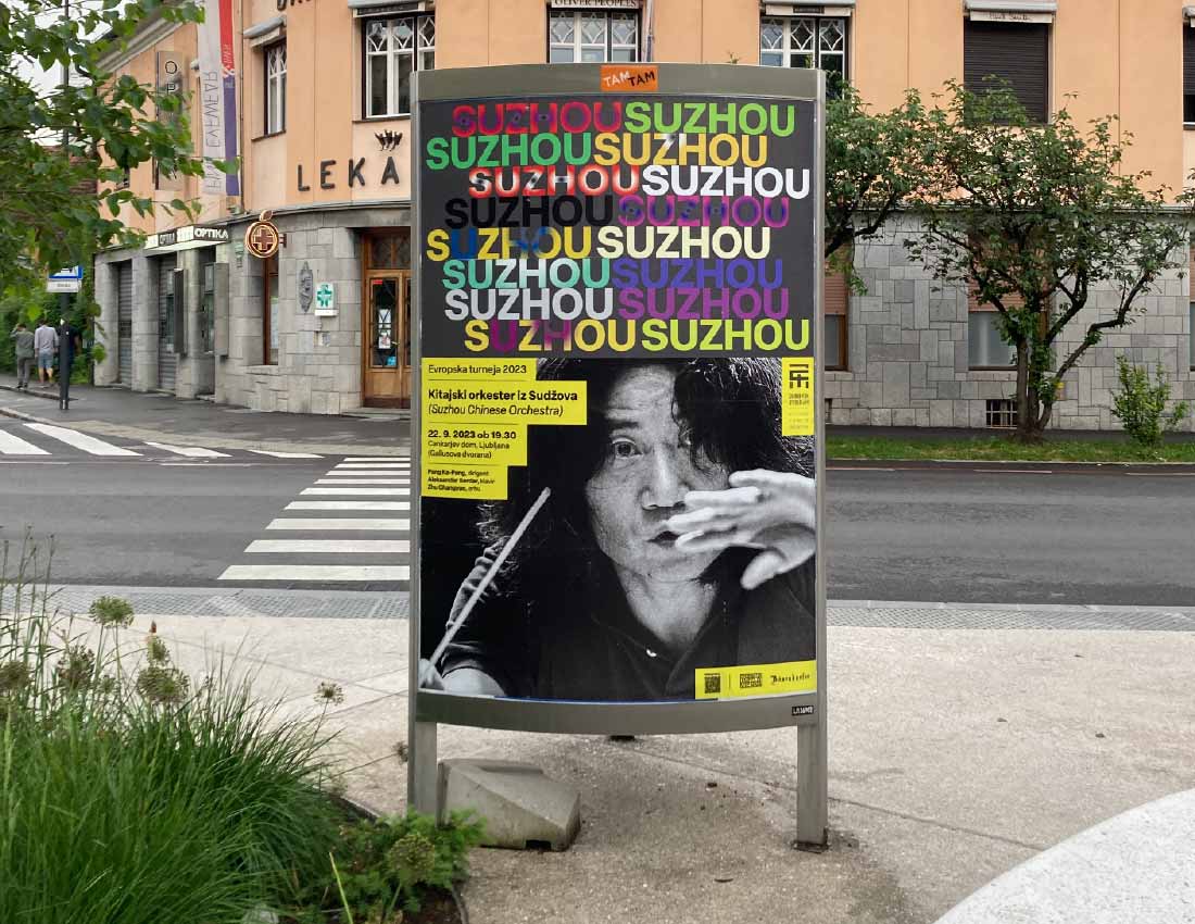
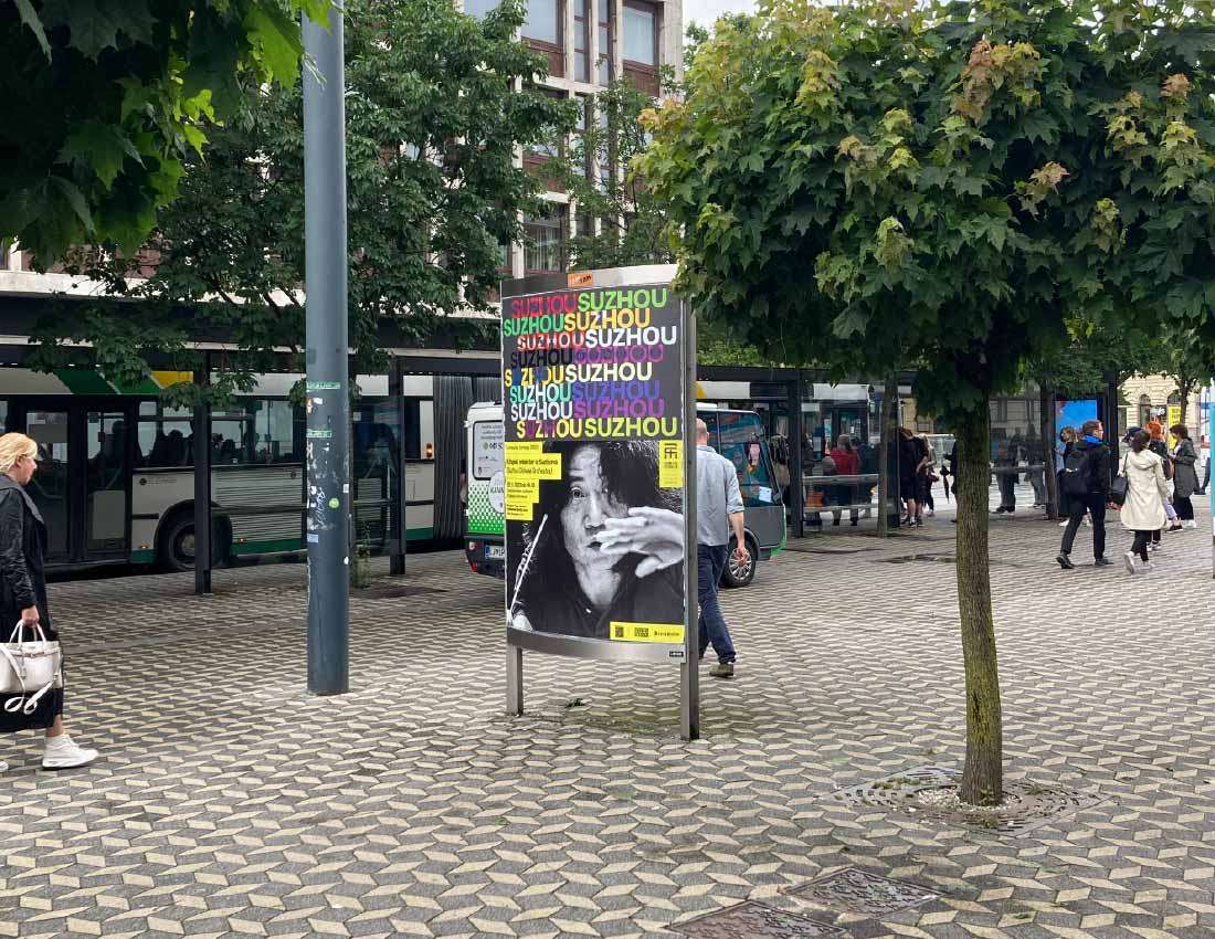
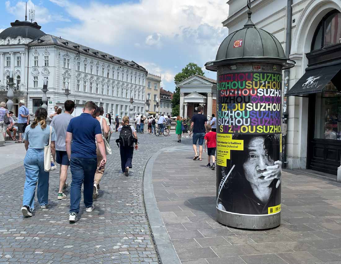
Poster for Suzhou Chinese orchestra
The Suzhou Chinese Orchestra was founded five years ago in the canal-lined city of Suzhou with its artfully landscaped parks. In their own concert hall, the young musicians, with an average age of under 30, create entirely new timbres through the interplay of traditional Chinese instruments and instruments of Western classical music. With this unusual approach, they are winning the hearts of young Chinese audiences.
Visual identity for 10th season of ALUO Uho talks
This year I was chosen to design the visual identity of the 10th season of the ALUO UHO event. ALUO UHO is a series of talks/presentations organized by the academy. With the presentations of artists, designers and other creative people, the aim is to present the post study life to all students who would be interested in it.
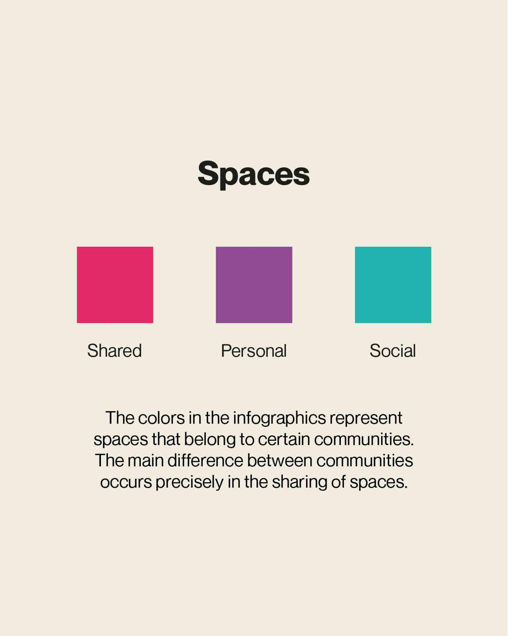
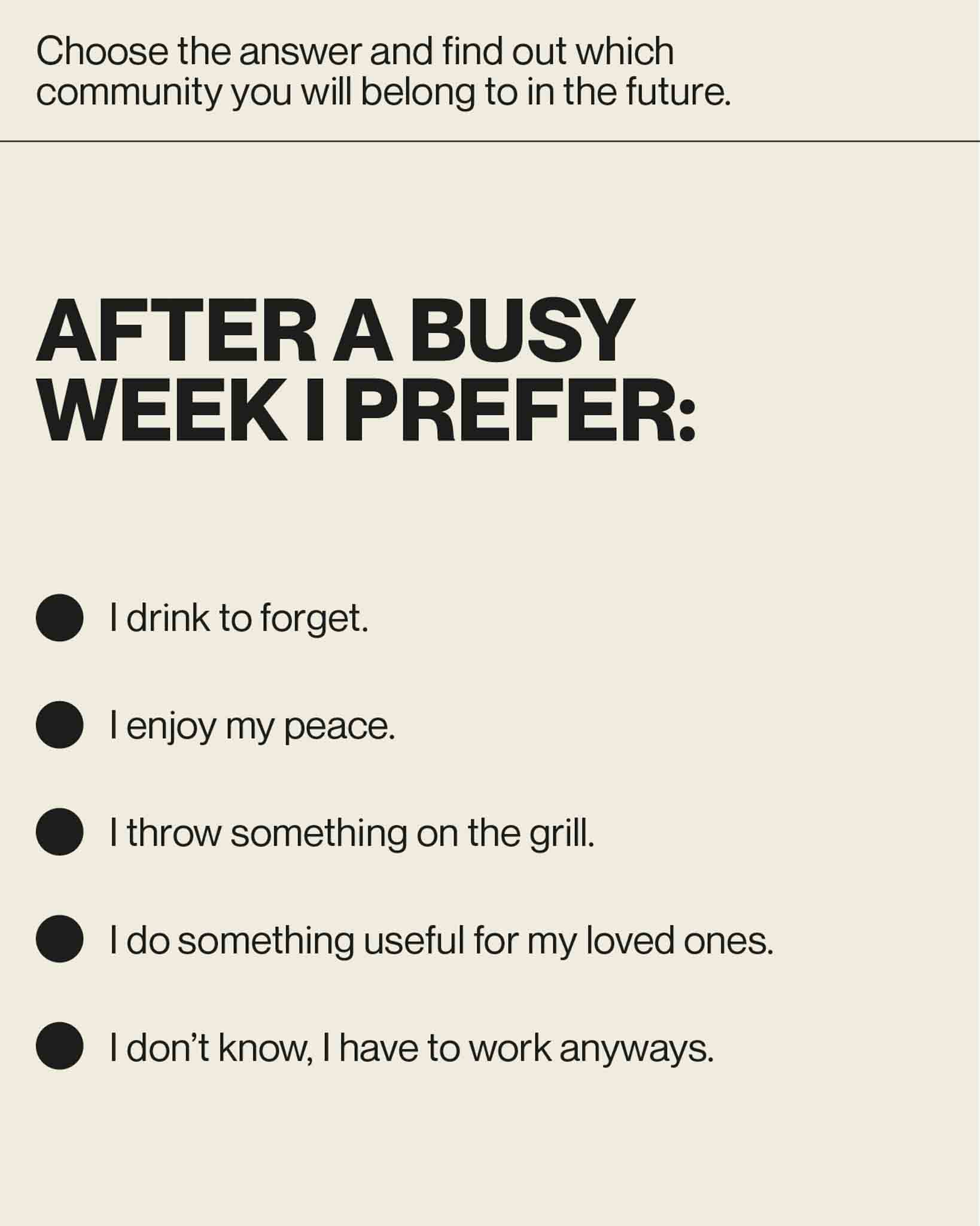
Future of co-living
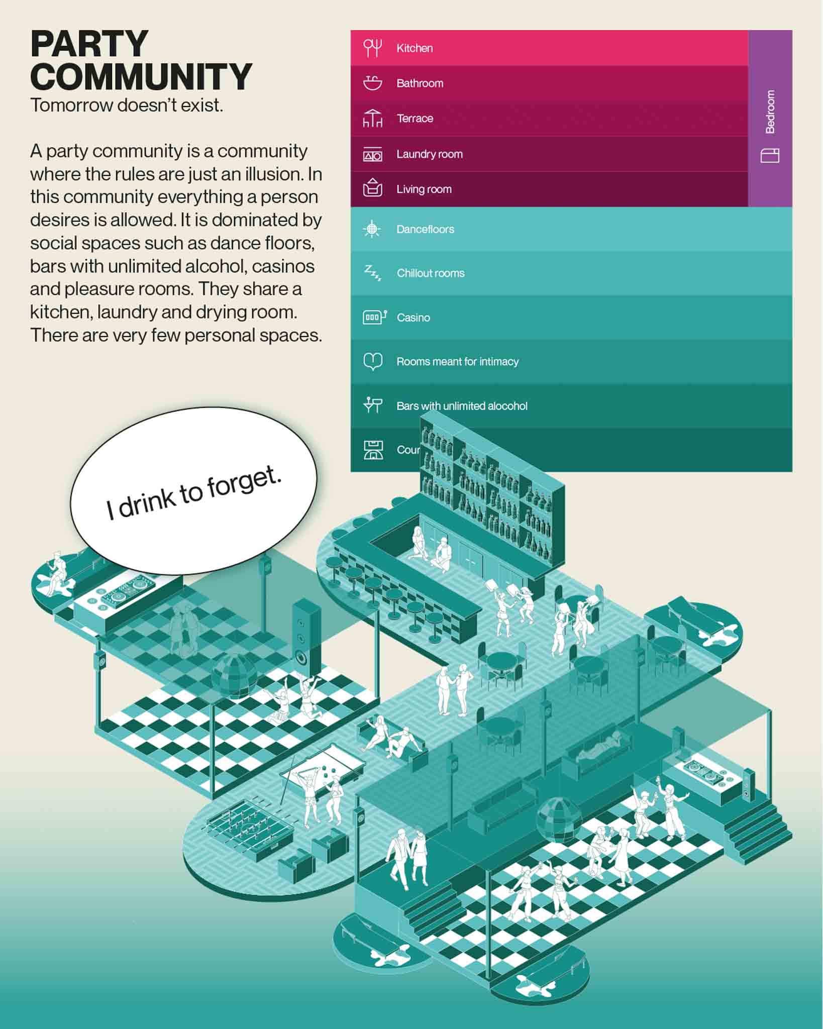
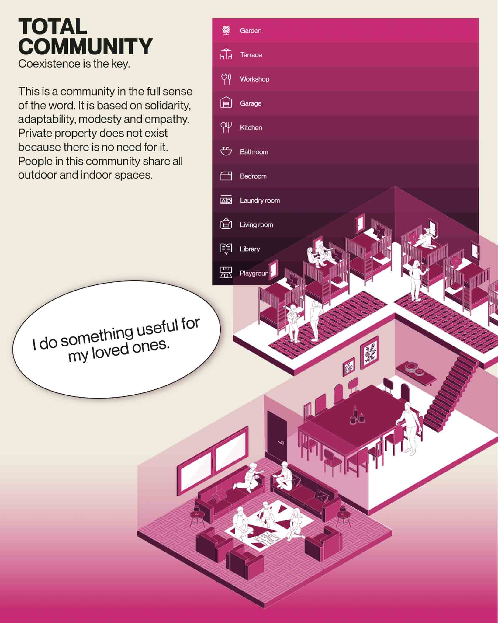
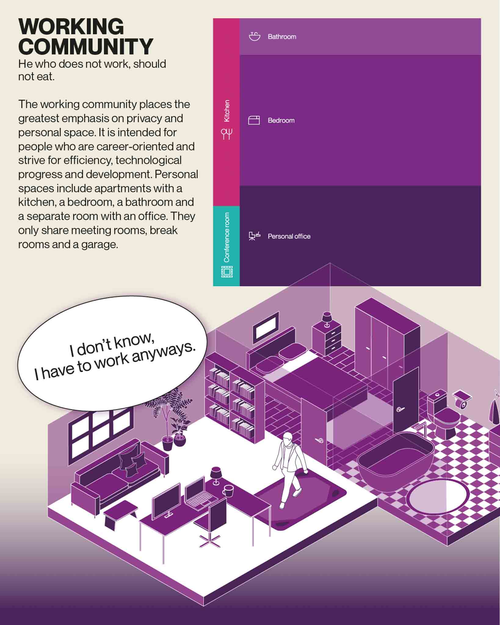
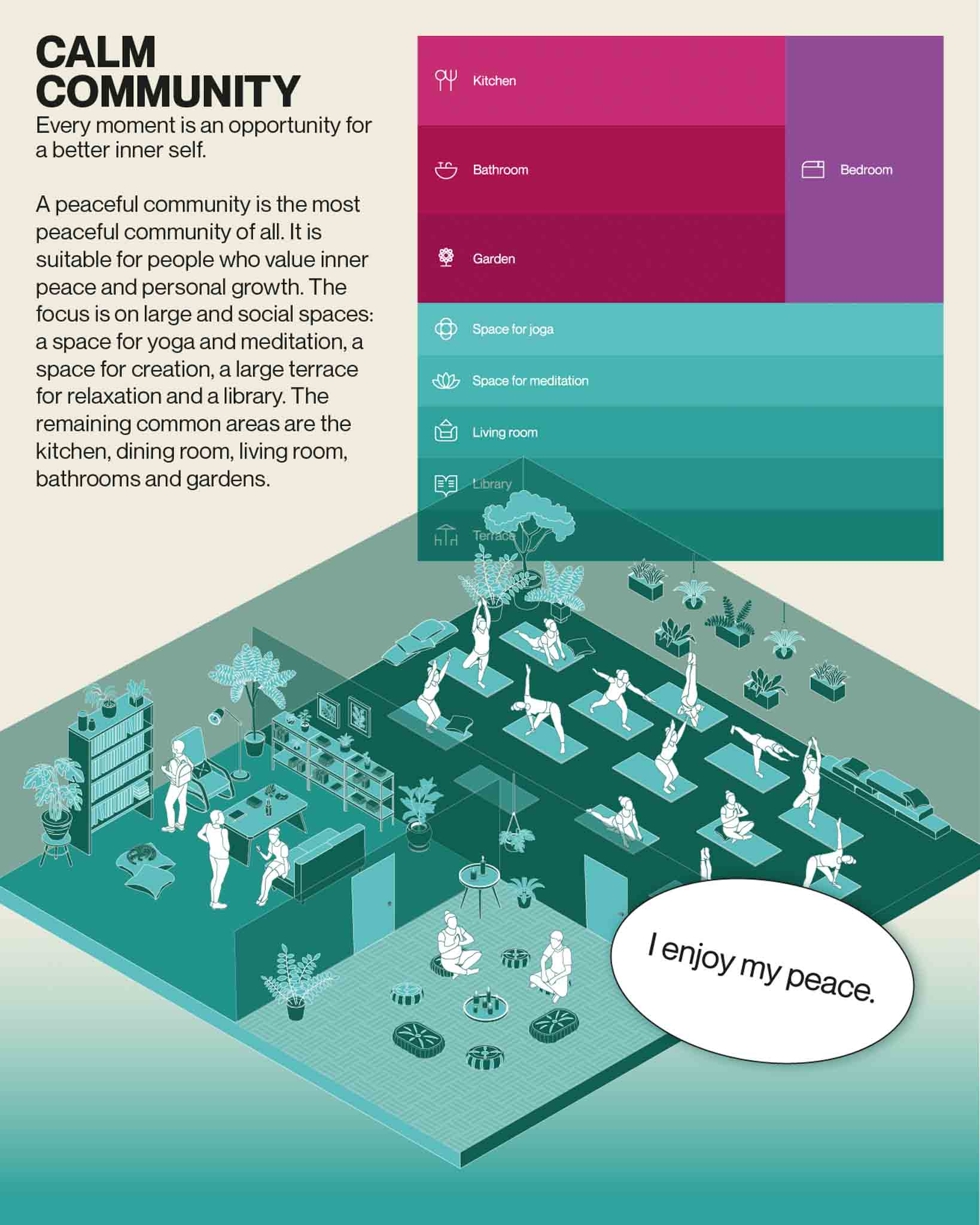
As we face the pressing issue of the housing crisis, we believe that the solution lies in fostering a sense of community and coexistence. To that end, we have established five distinct communities, each with its own unique blend of social, communal, and personal spaces. We've taken great care to ensure that individuals residing within each community share common values, interests, and worldviews, facilitating a strong sense of camaraderie and mutual understanding. If you're curious about which community you might belong to, we invite you to answer to our quiz and you will find out.
w/ Zala Čujež and Špela Muha
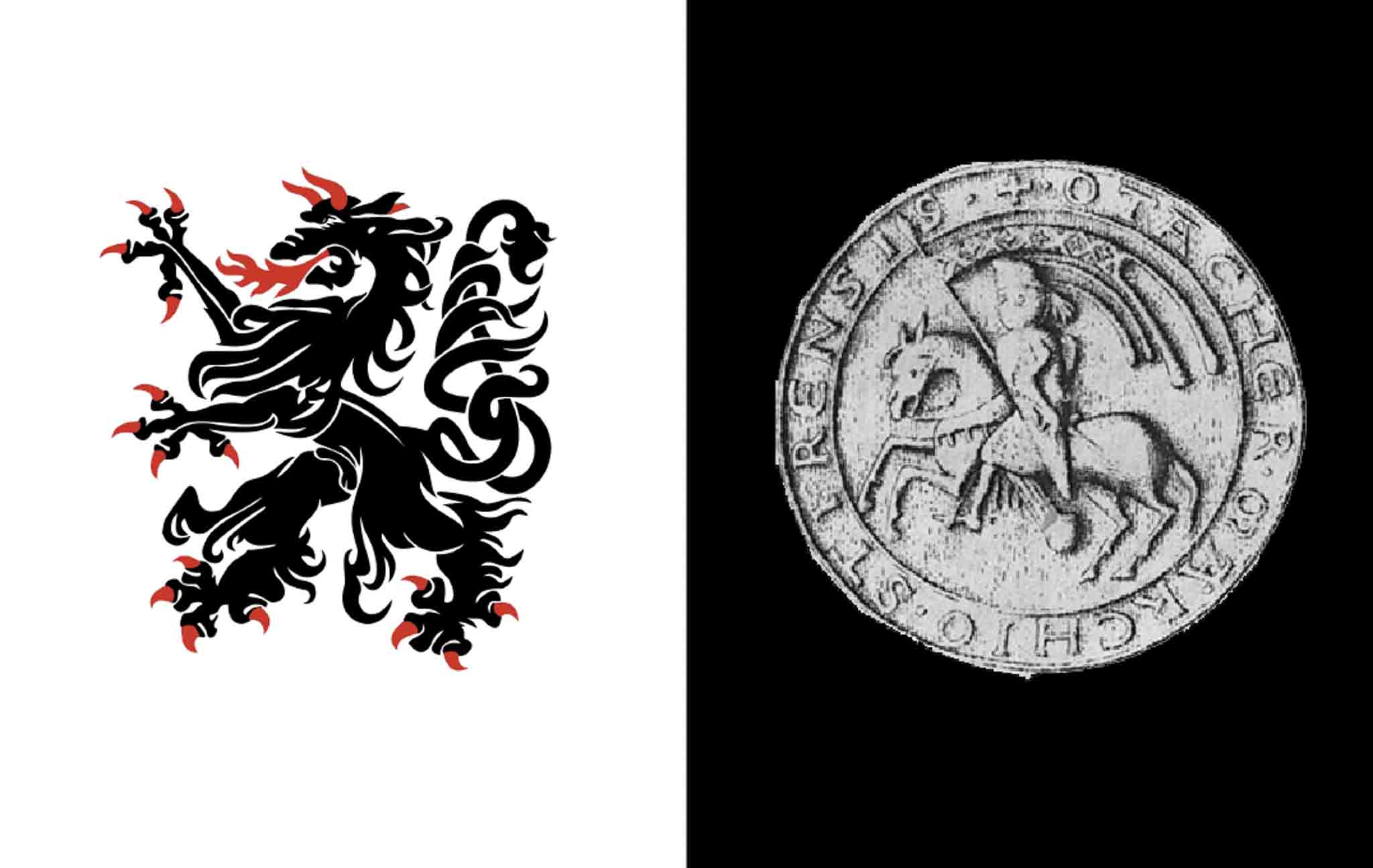
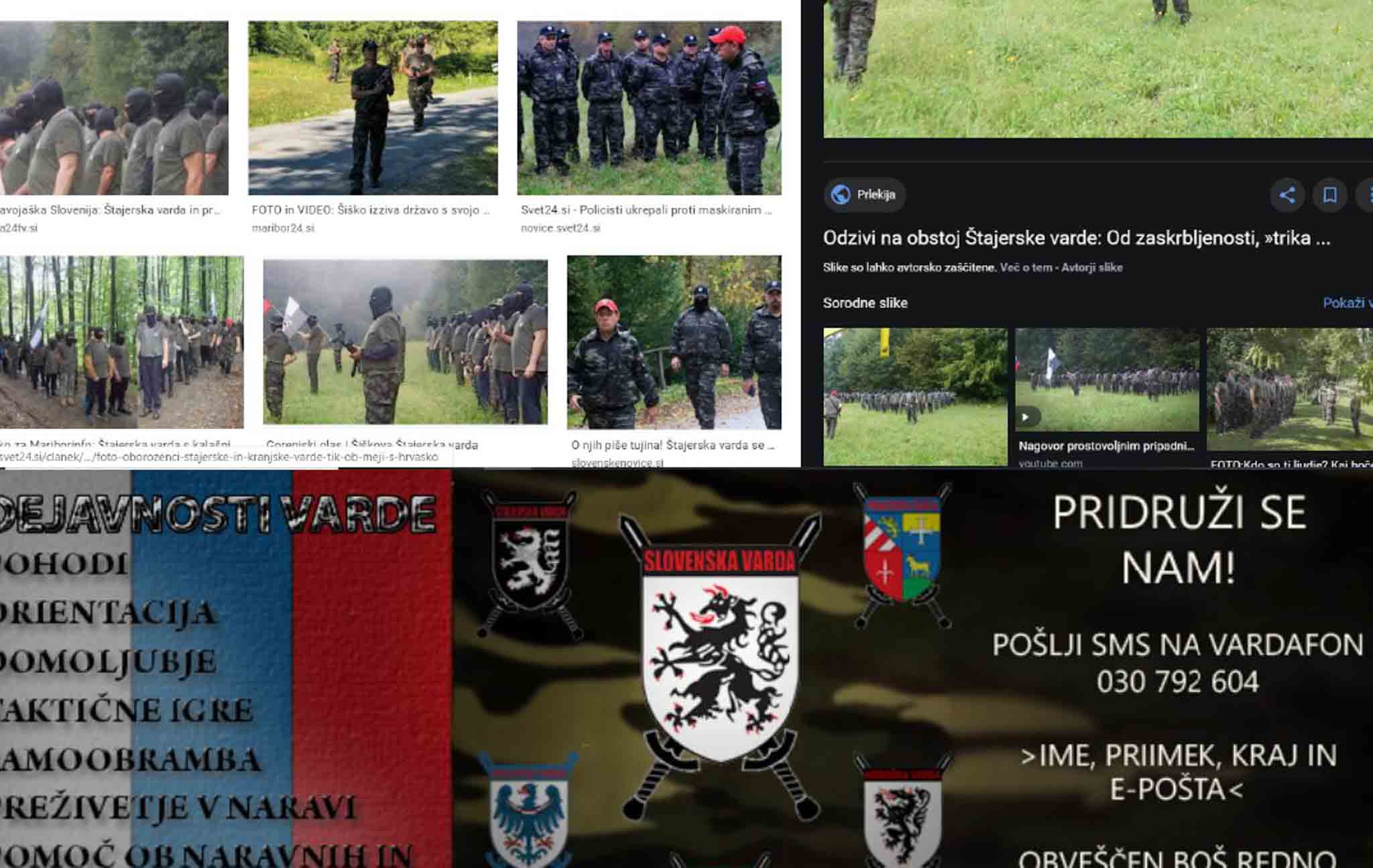
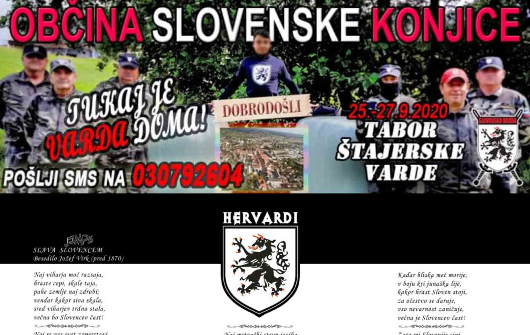
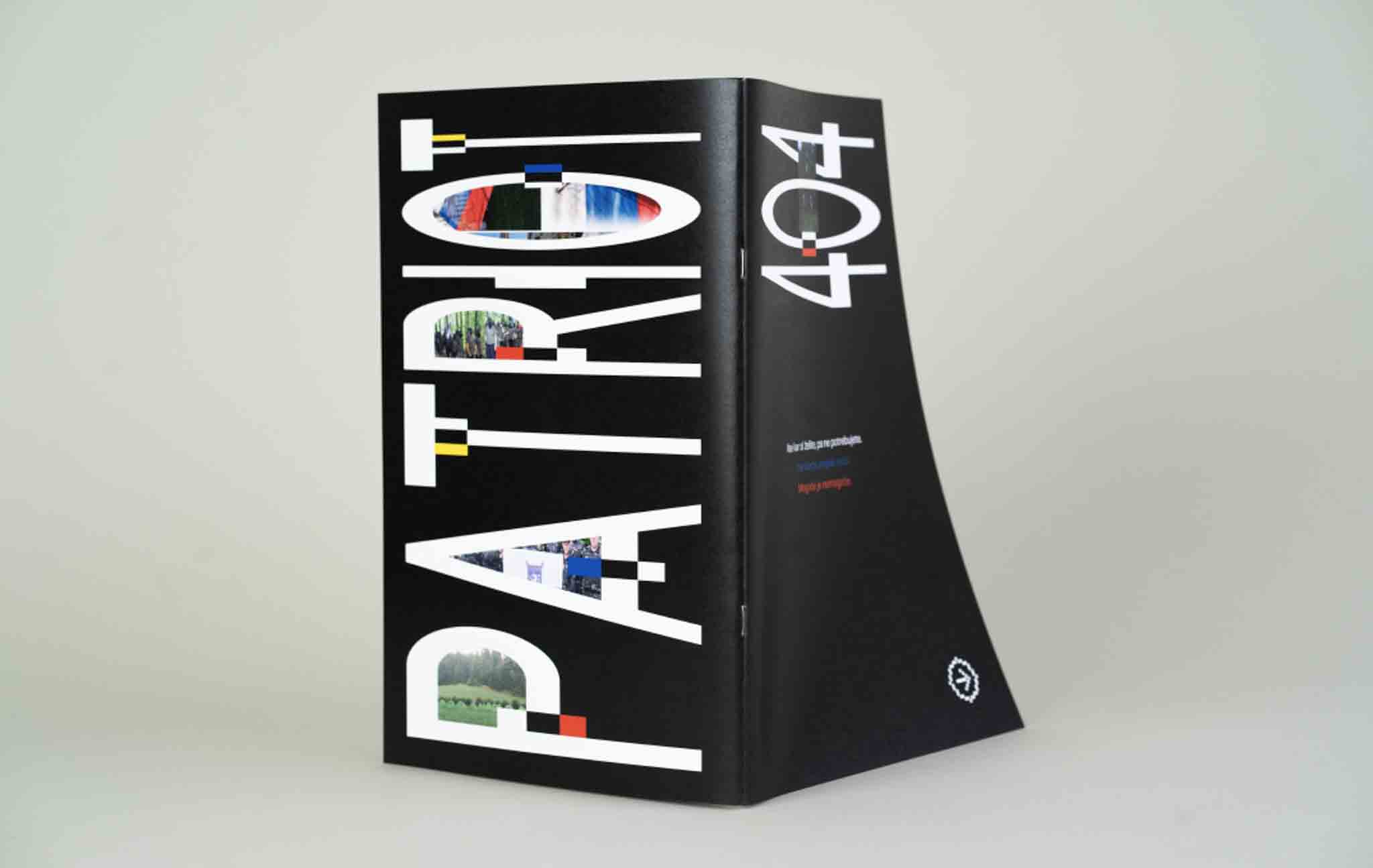
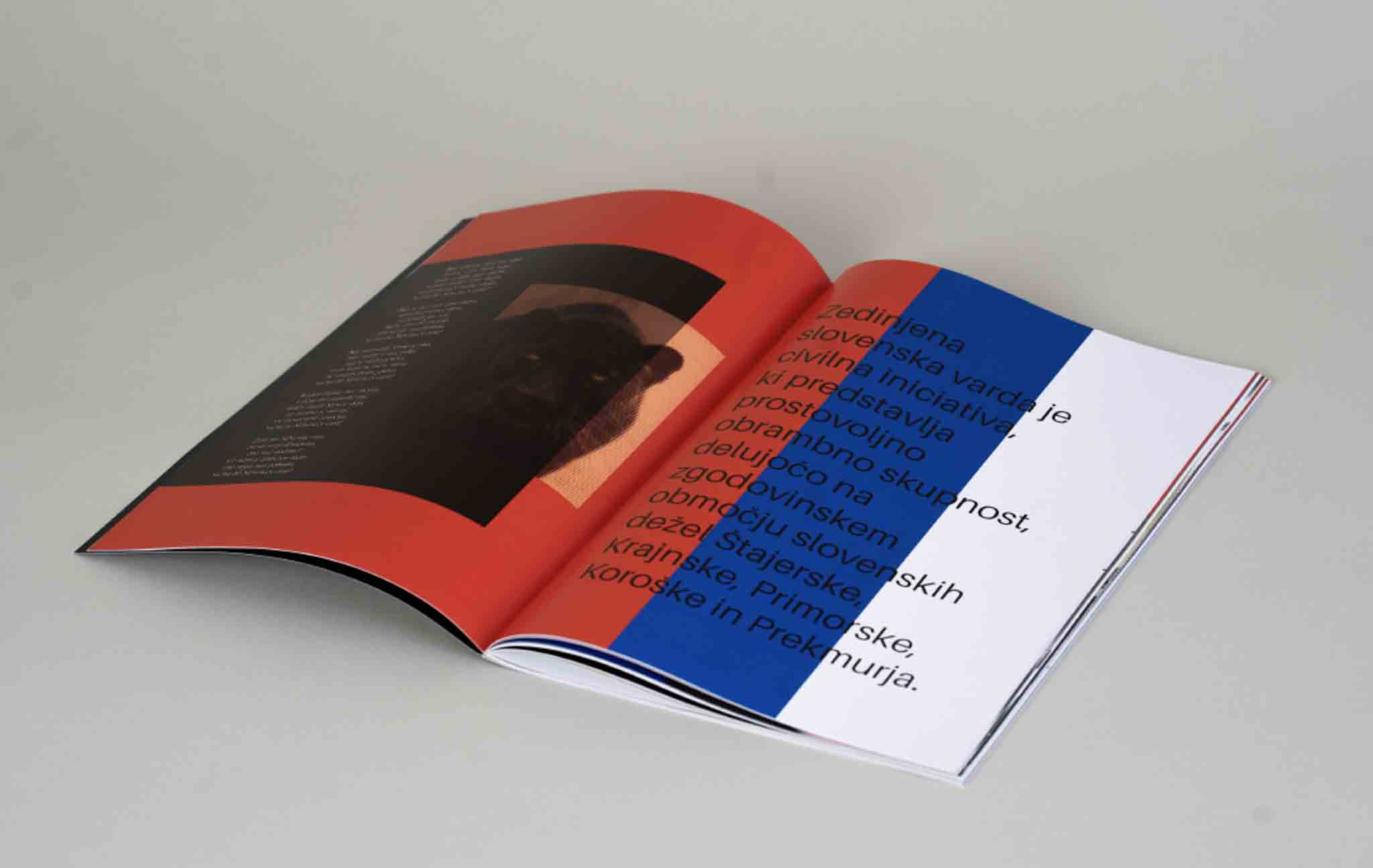
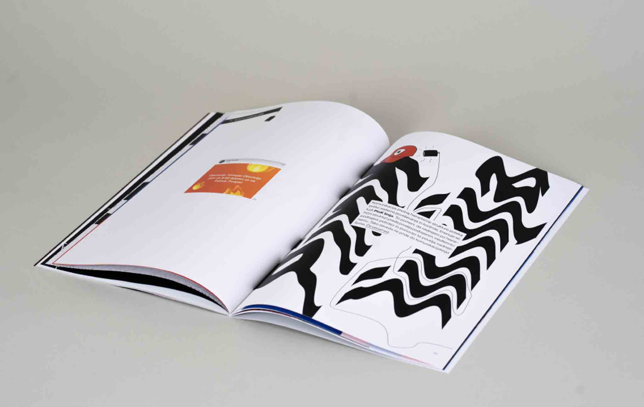
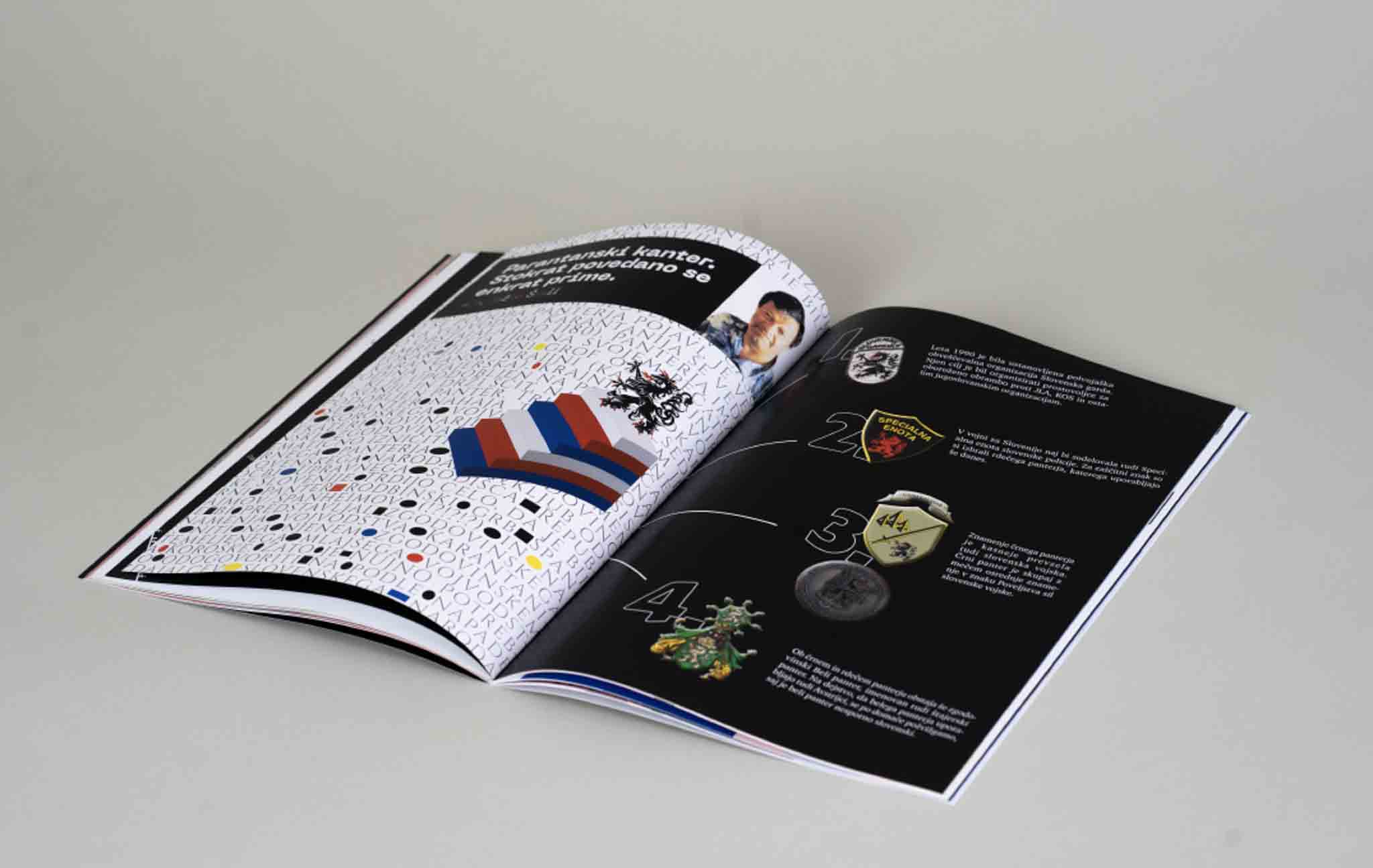
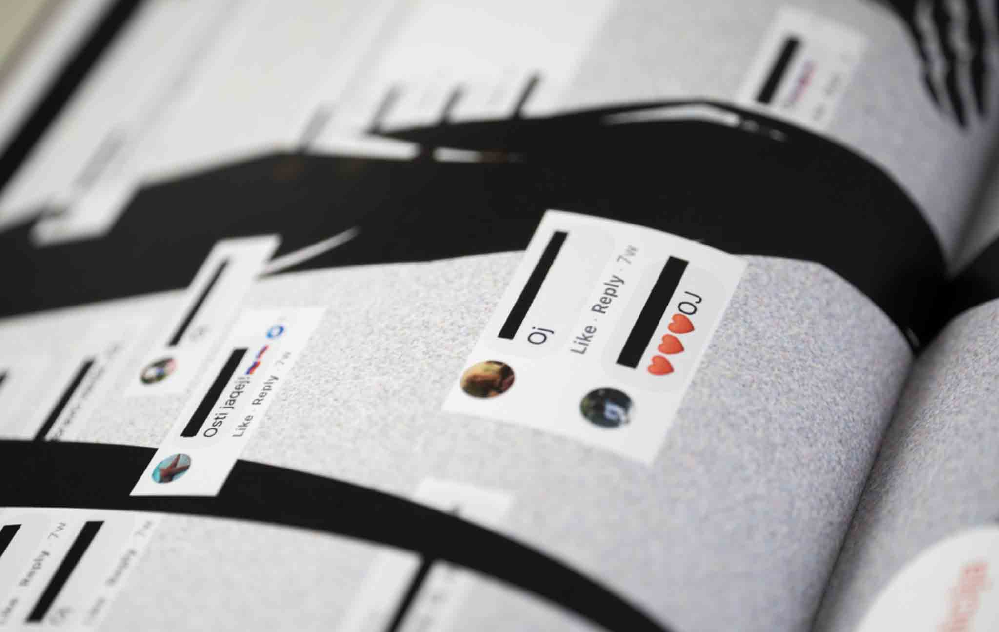
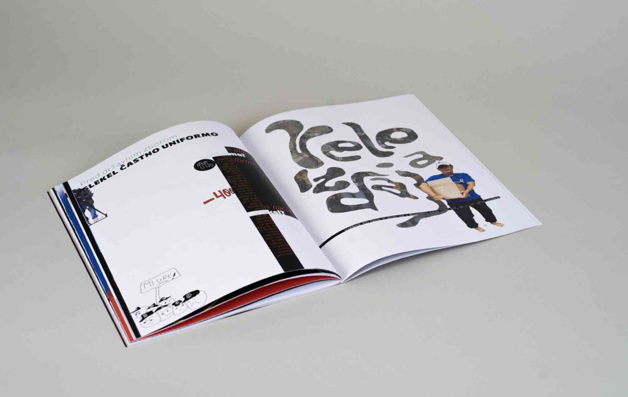
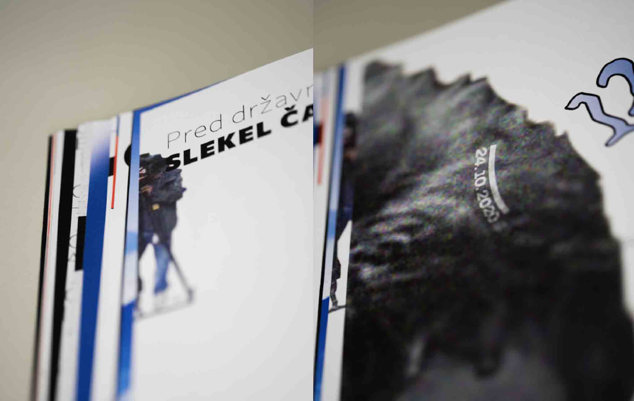
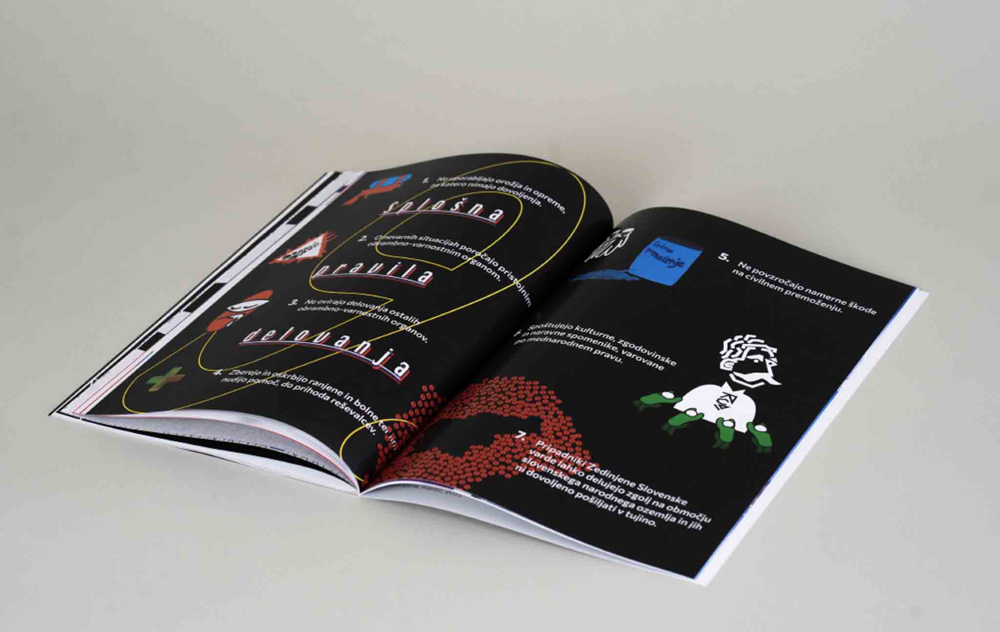
Visual research of paramilitary
group Slovenska varda
In my diploma thesis I dealt with the visual research of the paramilitary far right group Slovenian varda which became active on september 2018. In the research I focused on a closer insight into their work, appearance, environment, history, consequences, way of communication and socio/political influence they had on Slovenes. Because of their lack of understanding of the basic principles of visual communication and ways of spreading the propaganda, I was interested in which design discipline such a social theme can be questioned through.
The result of the task is a visual solution in the form of publication, which describes the rules of the Štajerska varda in more detail, the idea and mode of operation, but with a critical distance from their activities, as I do not support the resistance of the system in this way.
By literally reinterpreting their content, I presented Štajerska varda in a cyncal way and at the same time drew attention to the threat that such an organisation could pose.
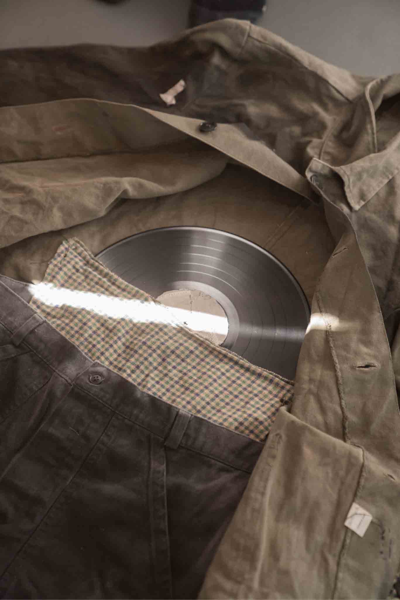
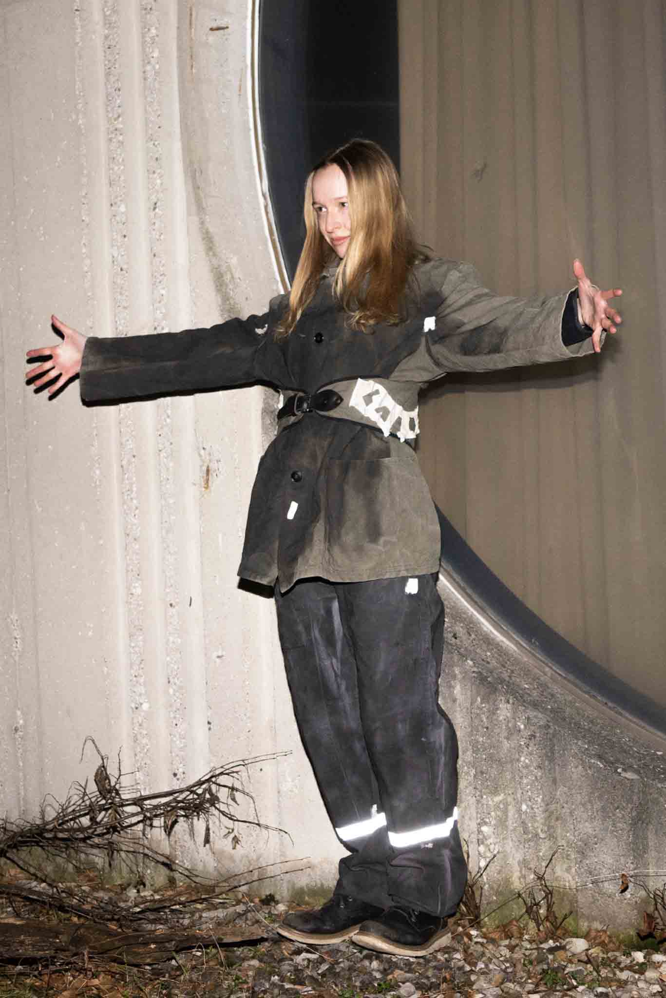
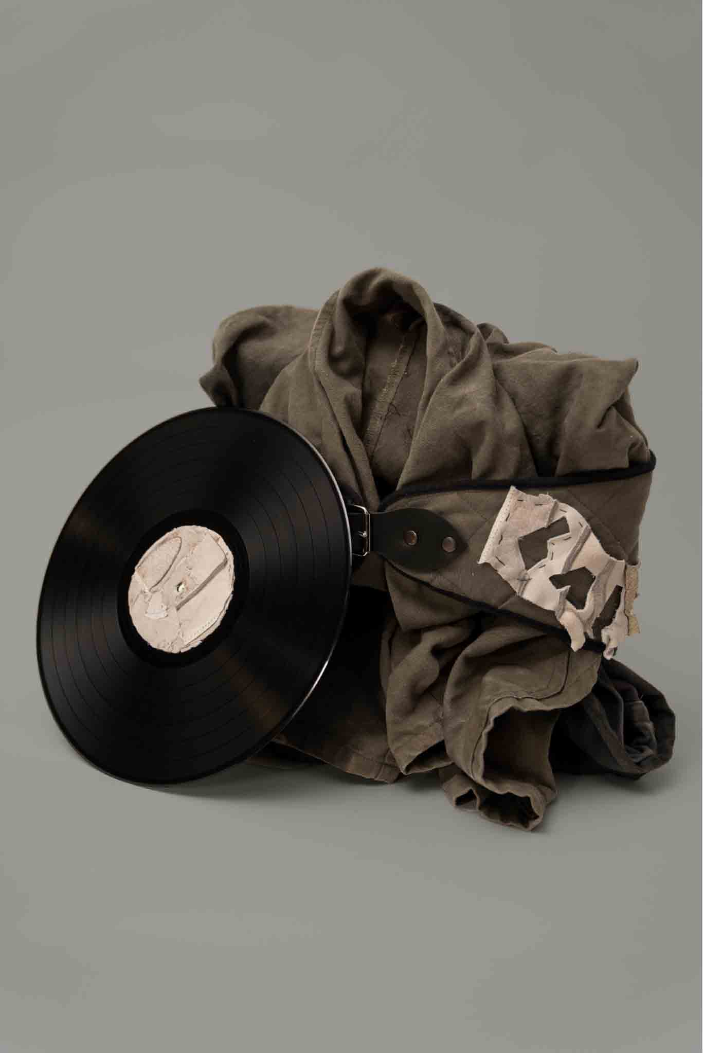
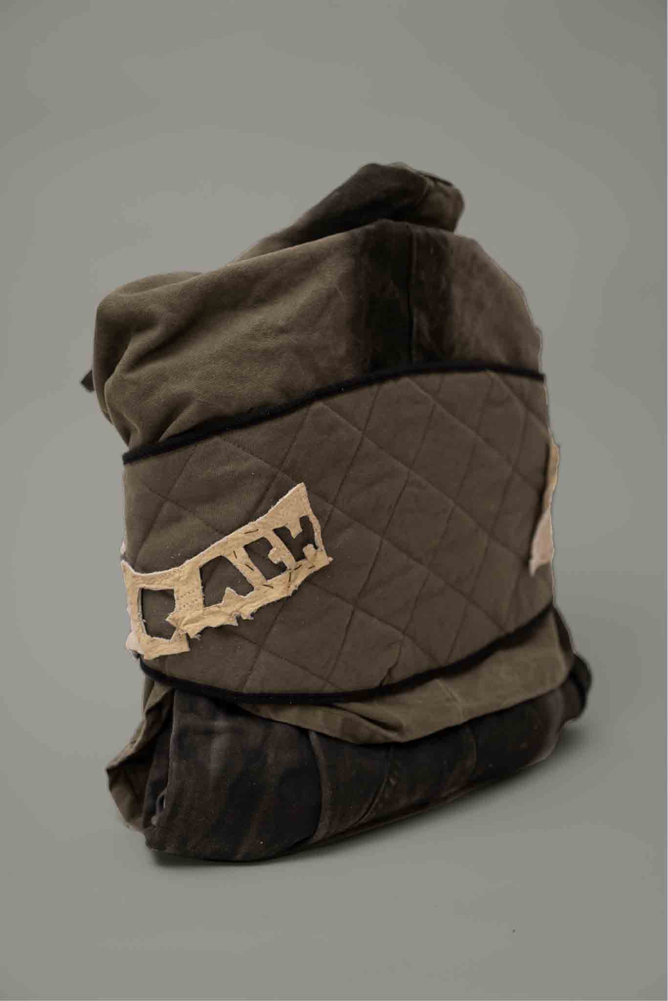
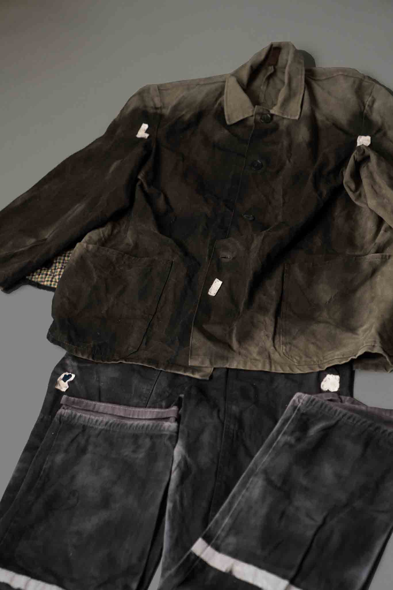
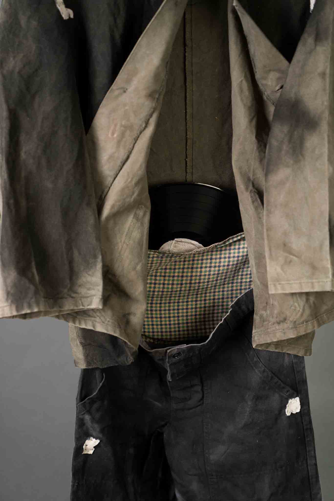
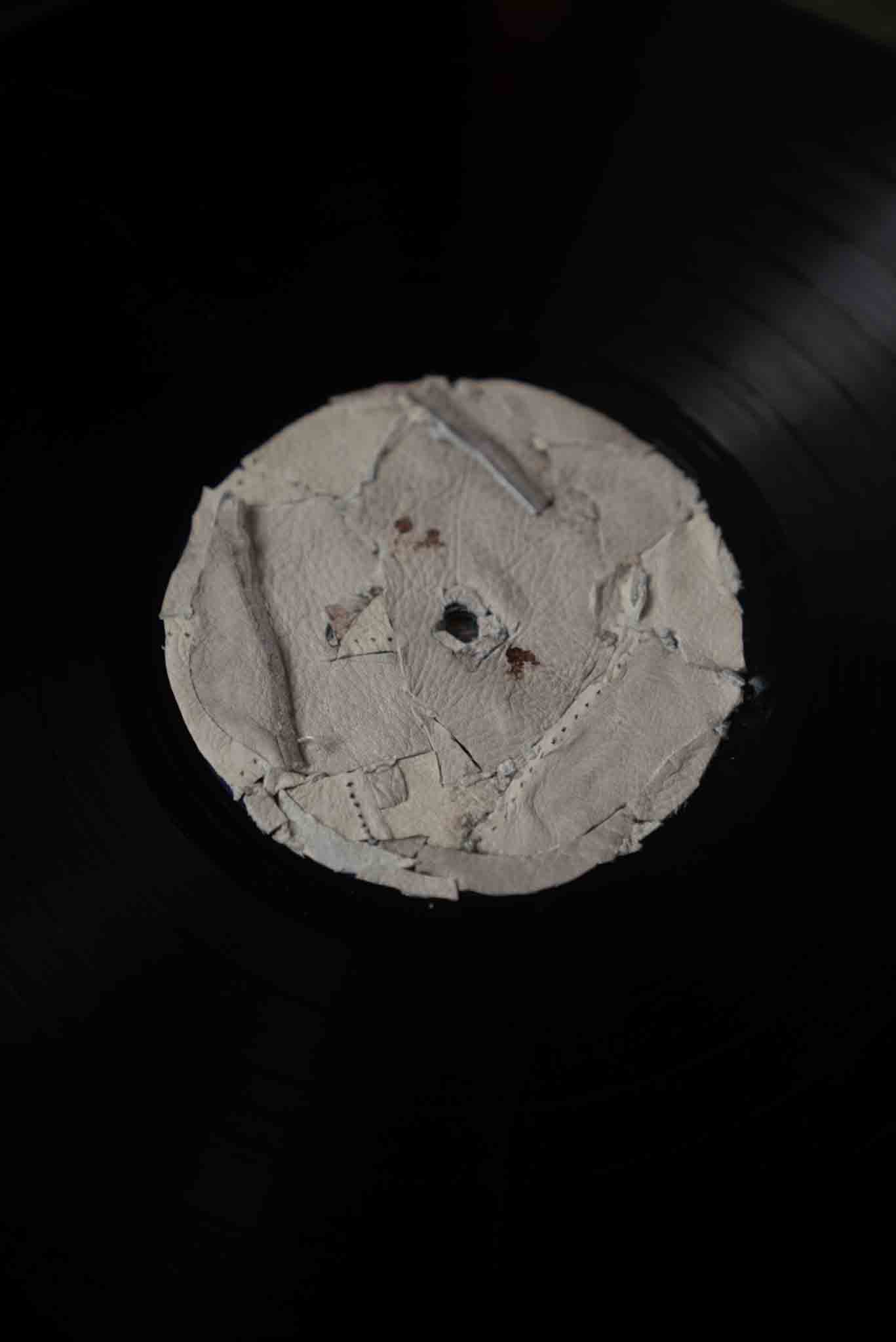
LP cover, poster and sticker design for Laibach
In light of Laibach's consistent utilization of pre-existing materials, my decision was to eschew the pursuit of novelty and instead focus on the transformation of a familiar object. The miner's uniform set is an exemplary representation of Laibach and the era from which it originated. To ensure that the redesign did not overemphasize any particular aspect, the set's functionality was limited to that of a poster, sleeve, and record label. Whether unfolded, hung, or worn, the outfit serves as a striking poster, with letters fashioned from cut-out workers' gloves sewn onto the garment. Upon opening the outfit, one discovers an interior pocket that houses a vinyl record, upon which the sticker features cut-up mining gloves affixed with a suggestion of blood, the consequence of the cutting and stitching process.
This project was awarded Brumen recognition for outstanding Slovenian design and was exhibited in the National Gallery in Ljubljana.
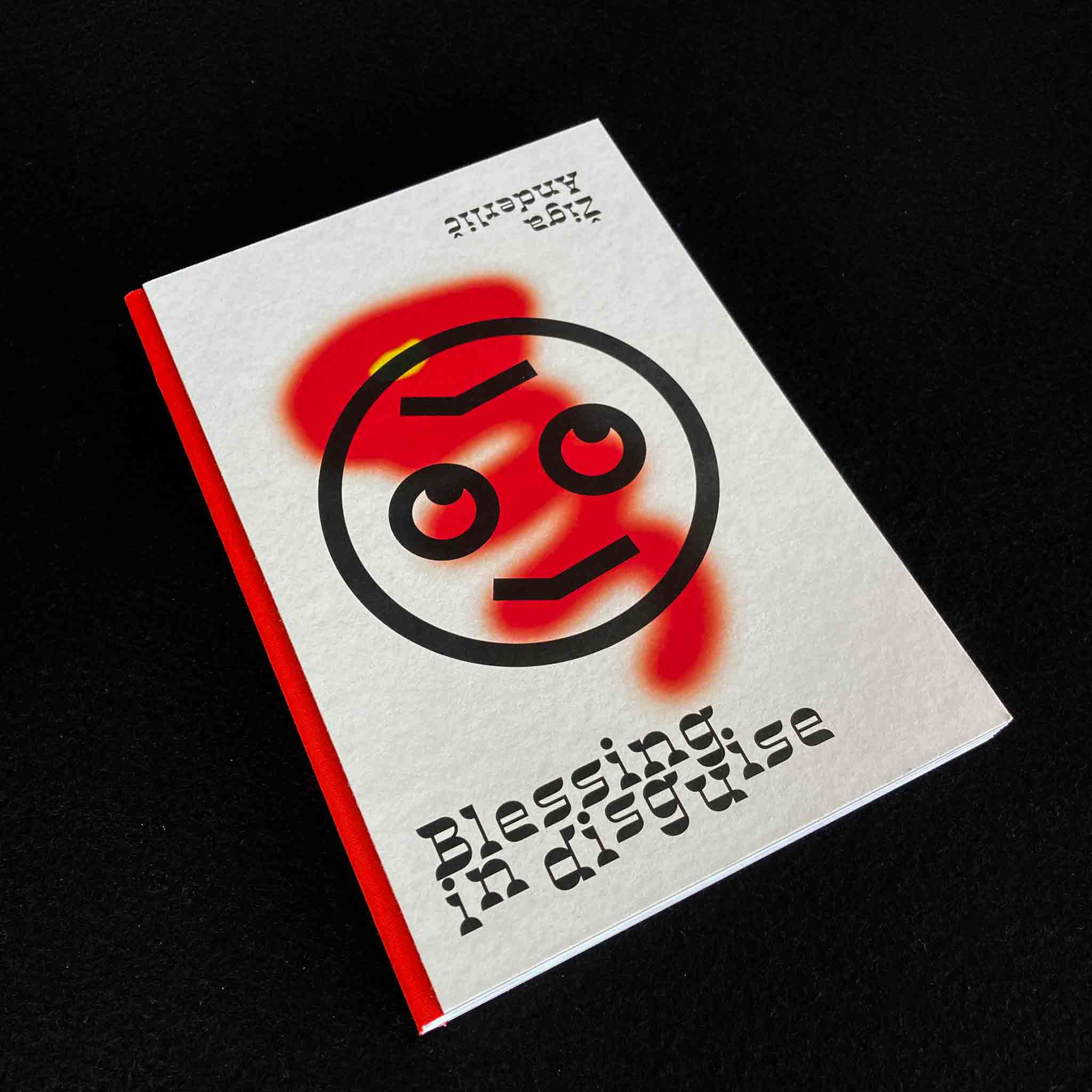
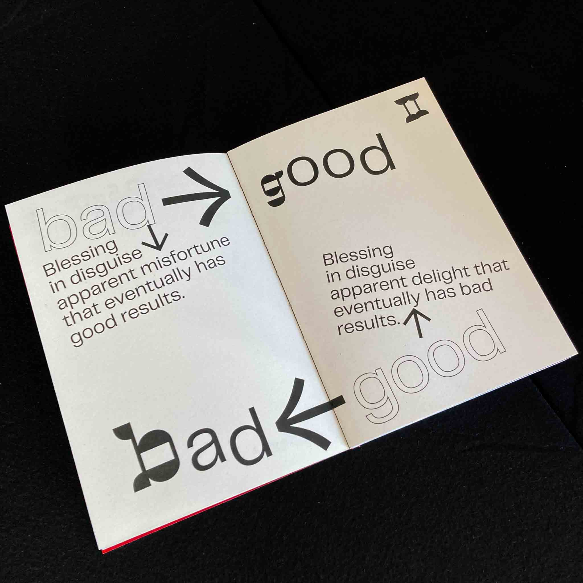
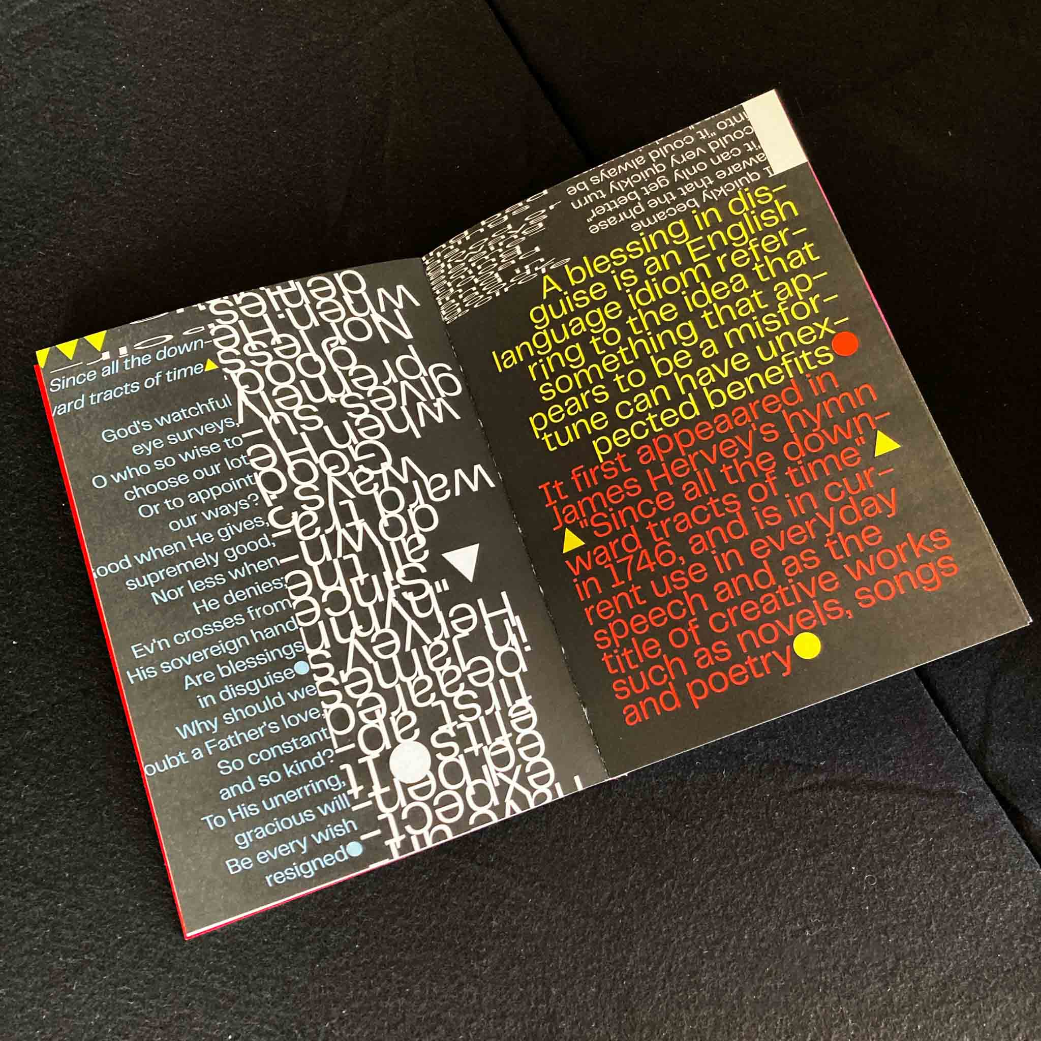
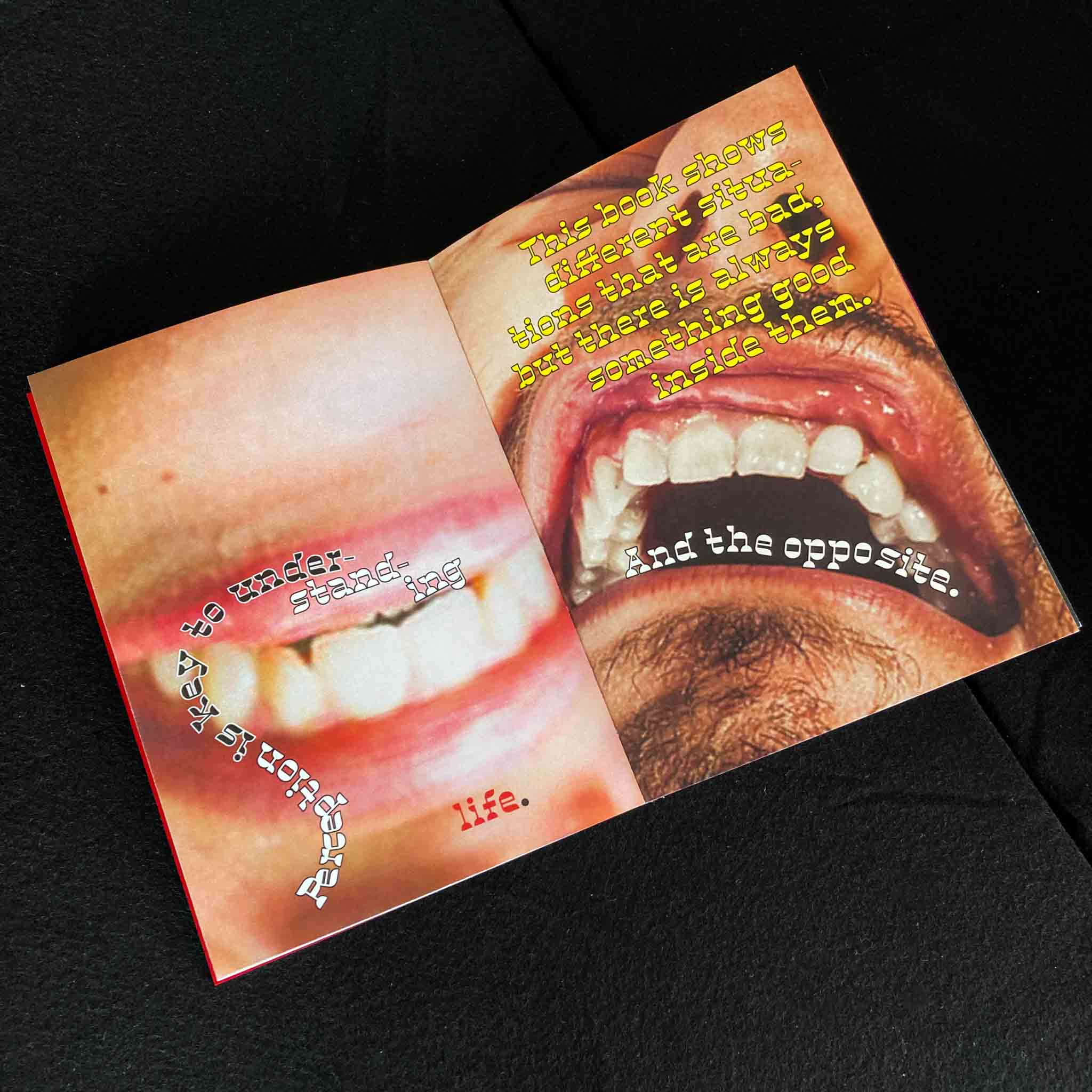
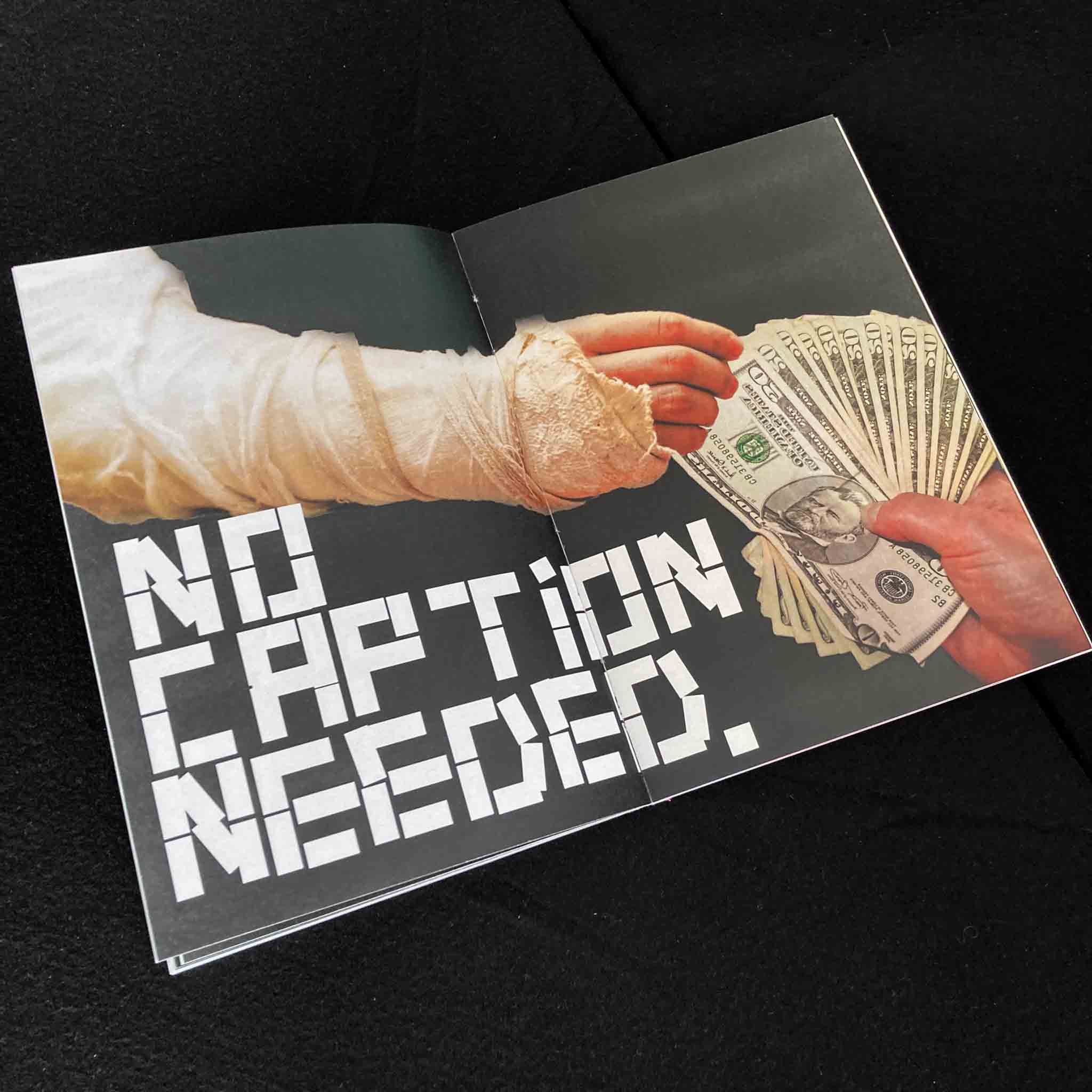
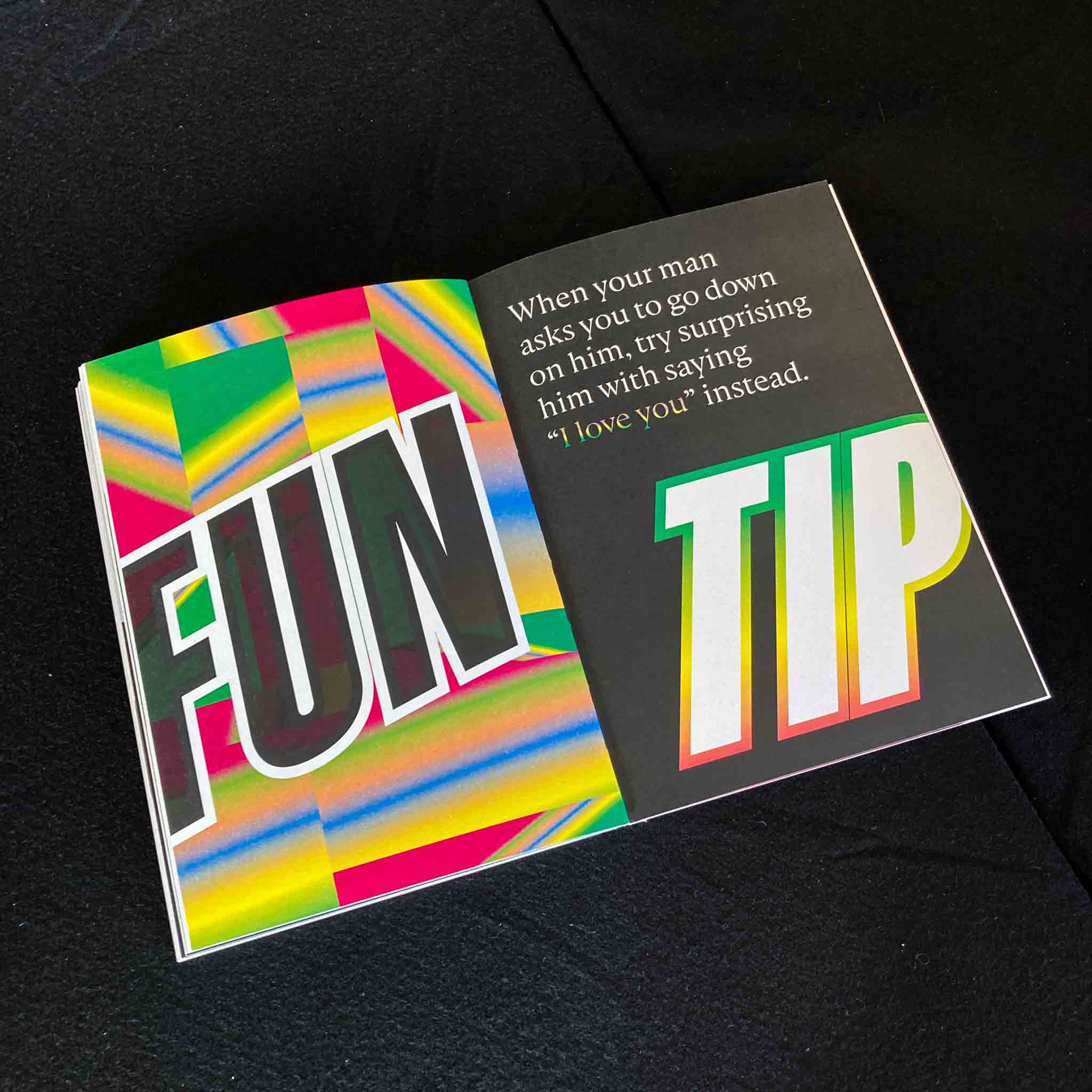
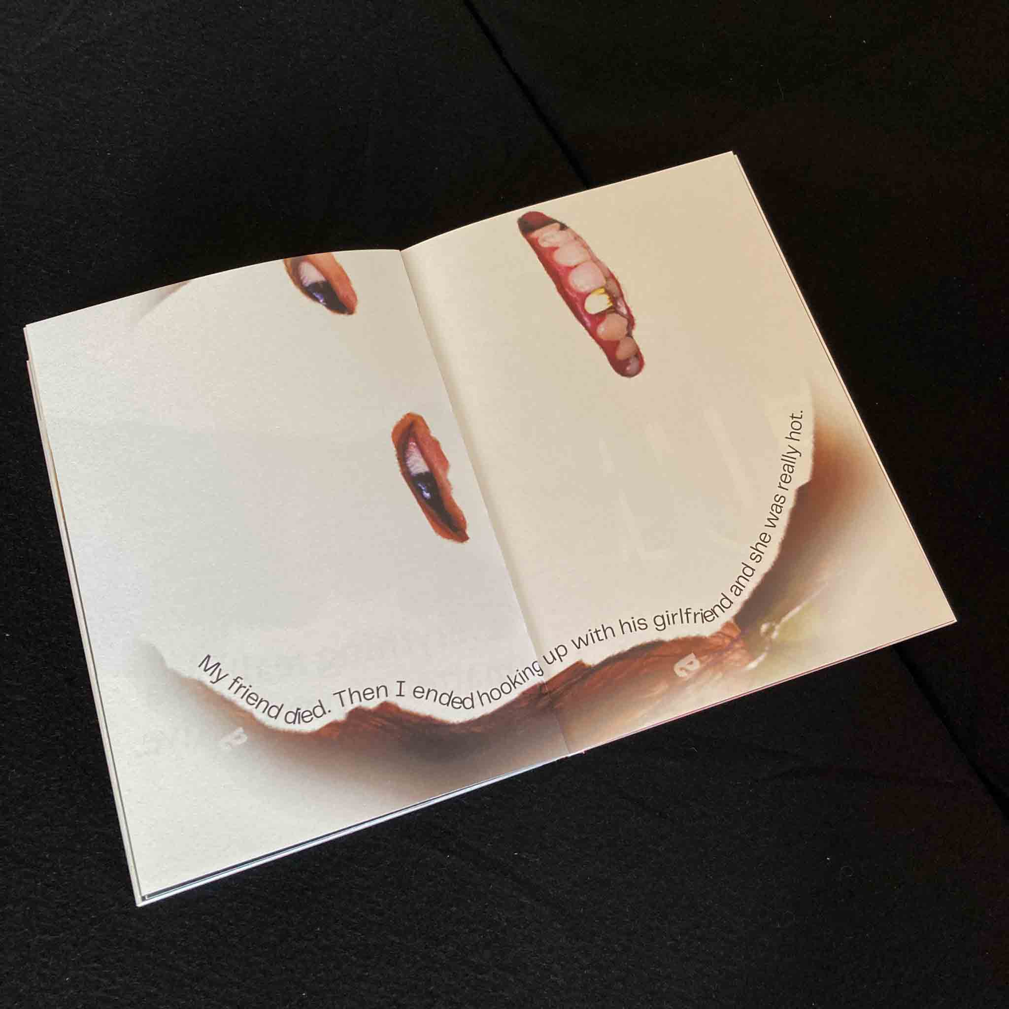
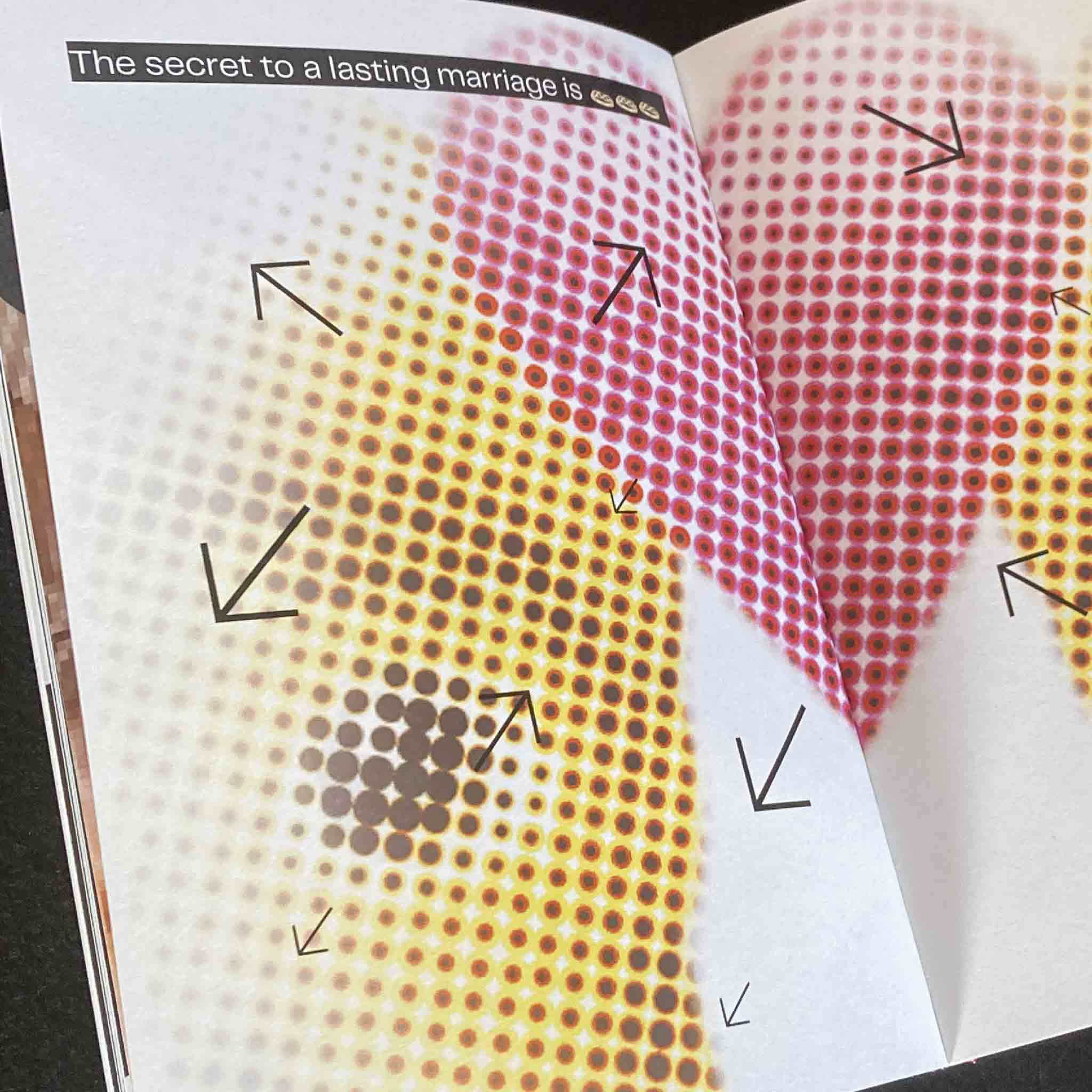
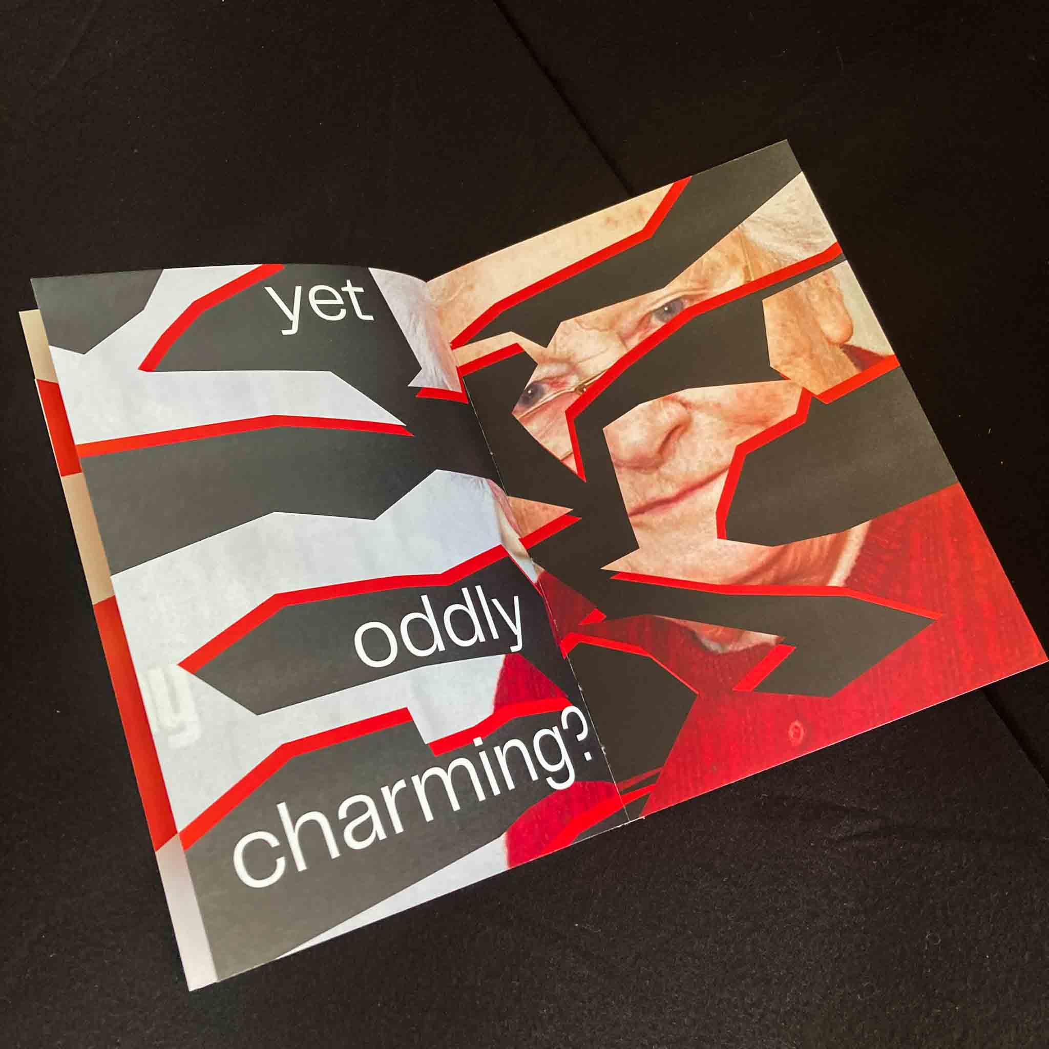
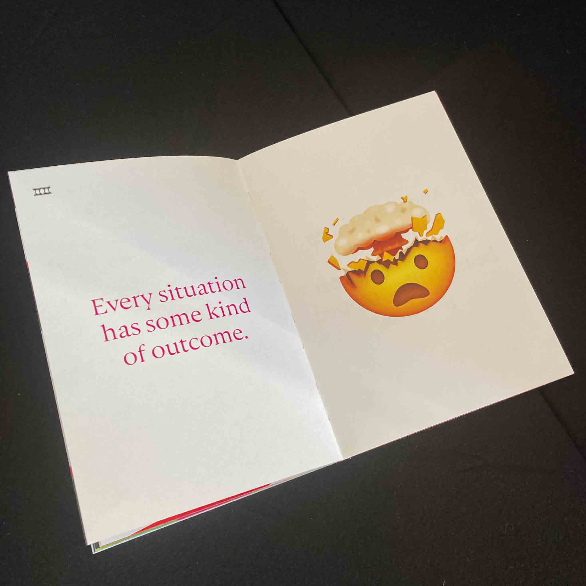
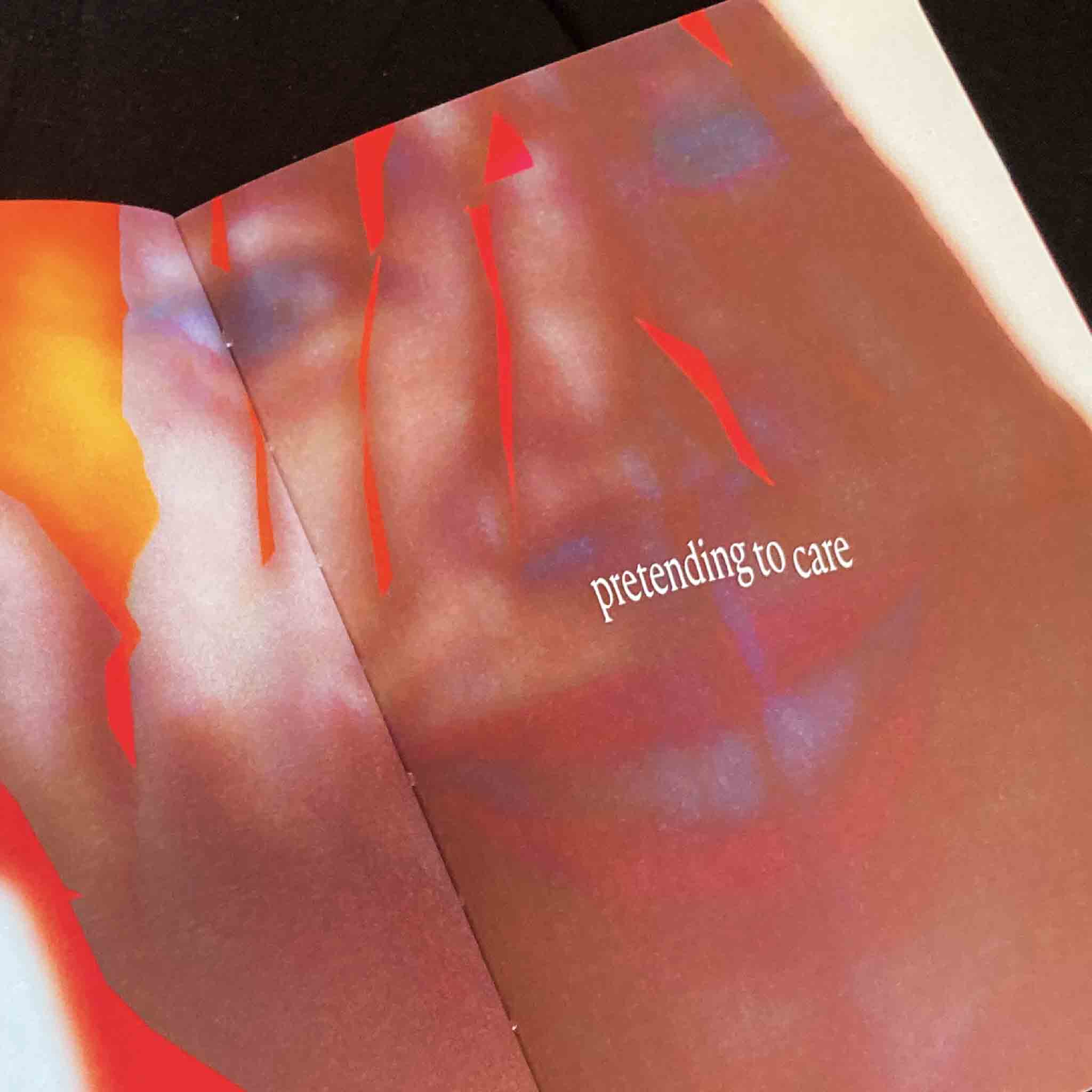
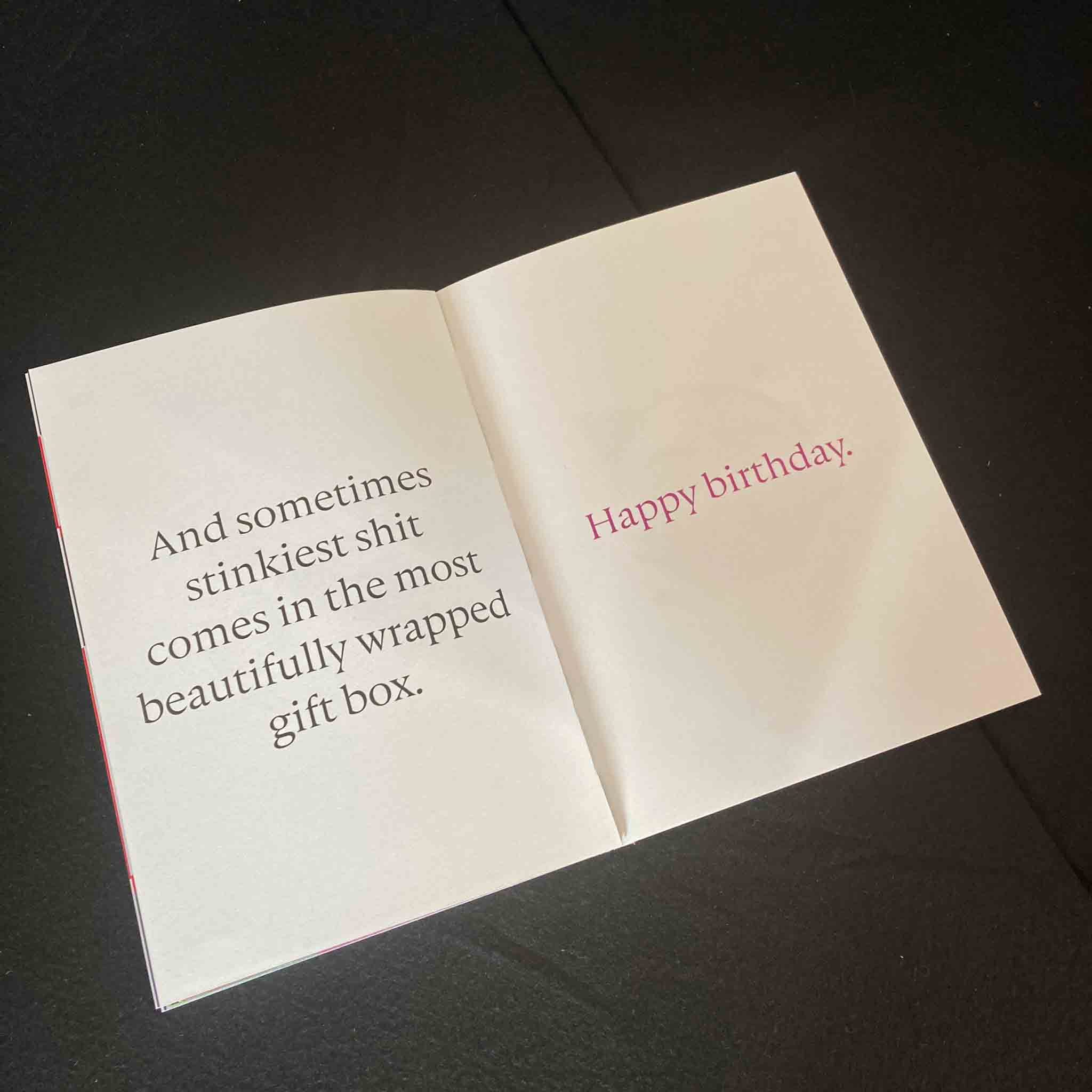
Book: Idiom, Blessing in disguise
The phrase "Blessing in Disguise" is a common expression that refers to a situation where an event, initially perceived as negative or unfortunate, ultimately yields unexpected benefits or advantages. This phrase is a powerful reminder that what may initially appear to be a setback or failure can, in fact, pave the way for positive outcomes in the long run - or, conversely, what may seem like a stroke of good luck may ultimately prove to be detrimental.
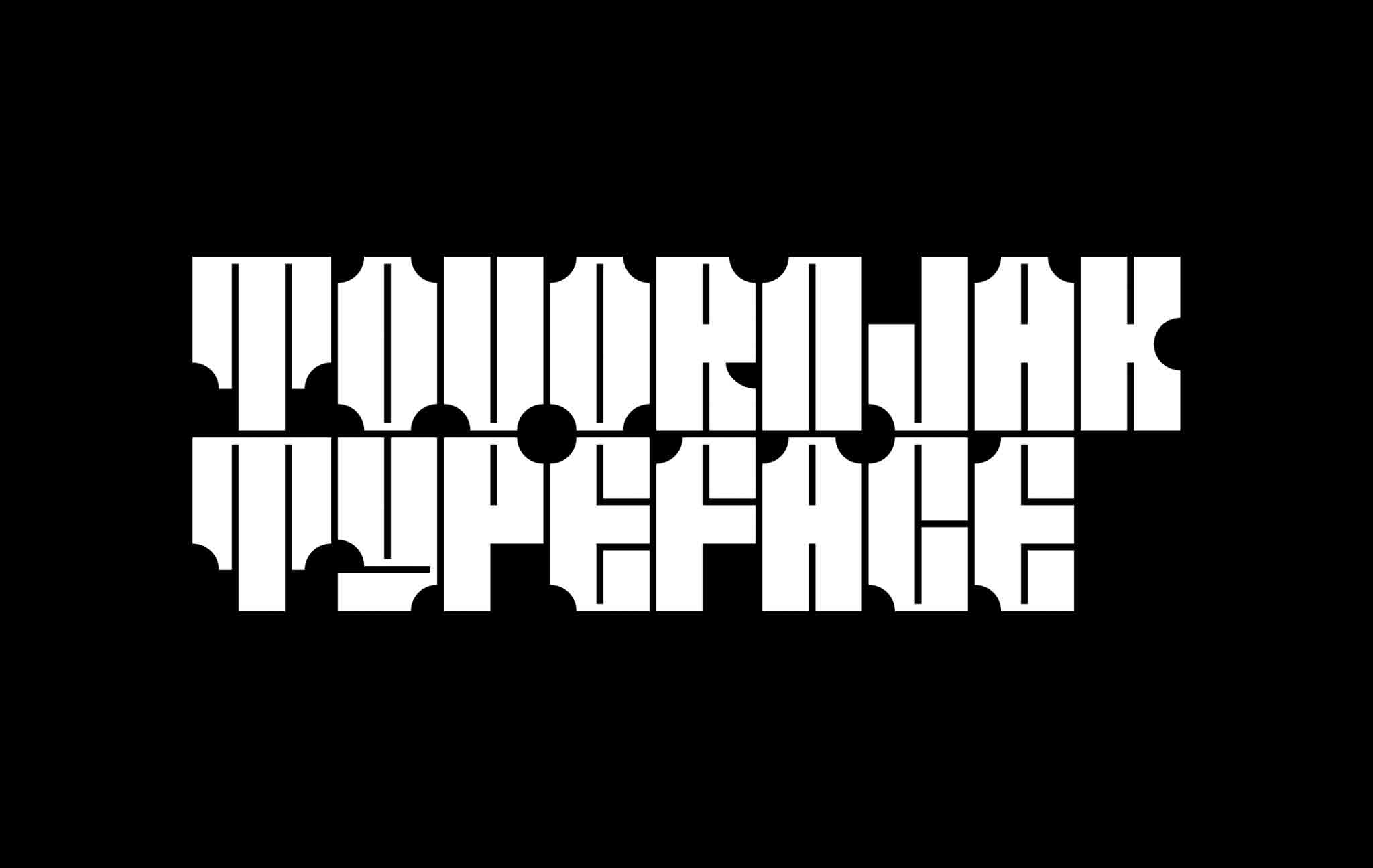
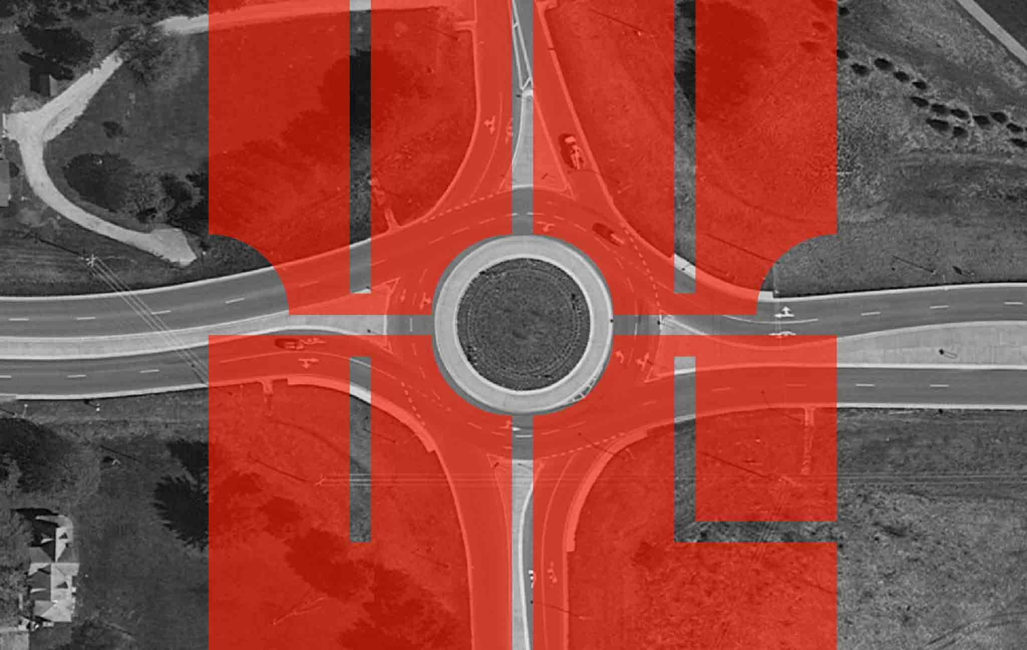
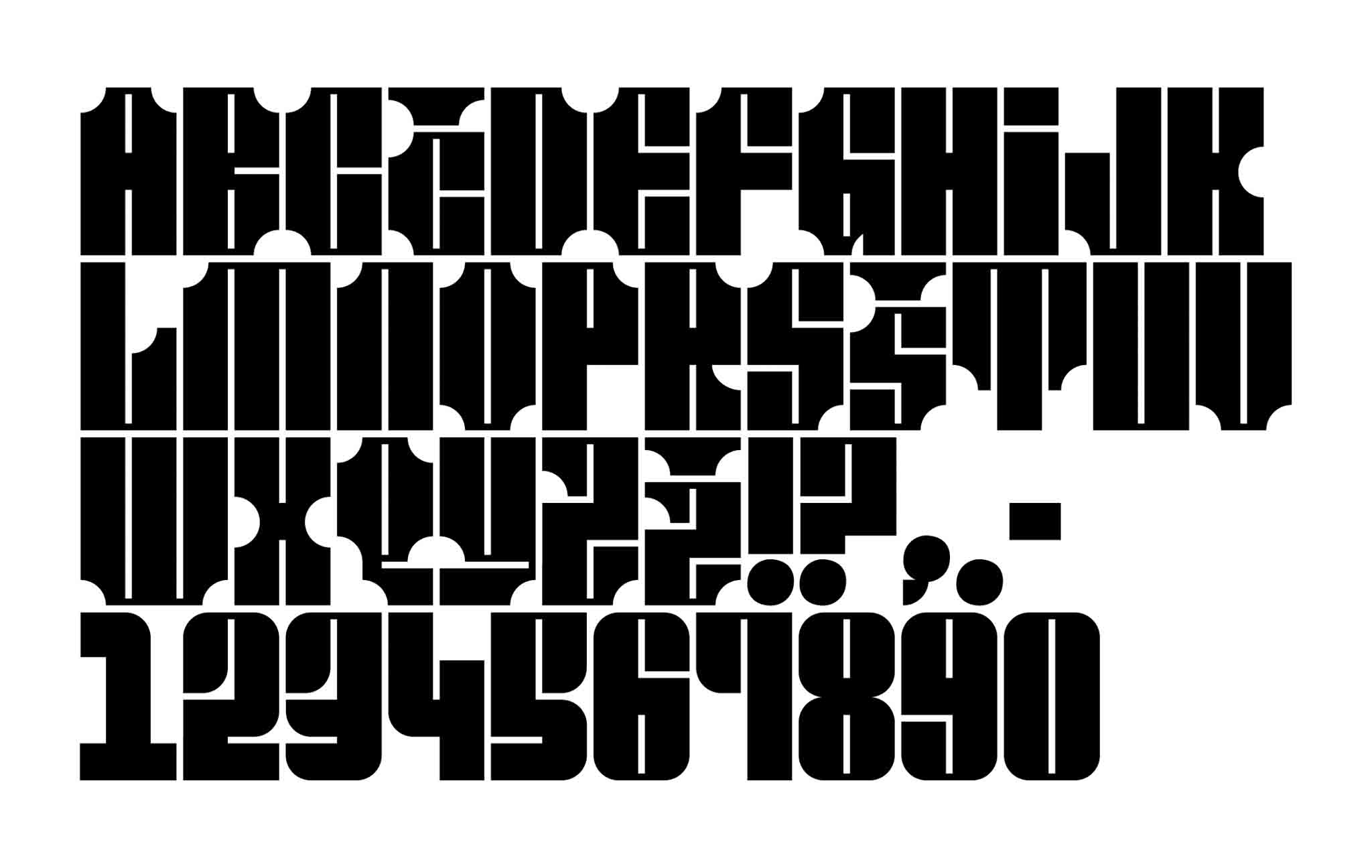
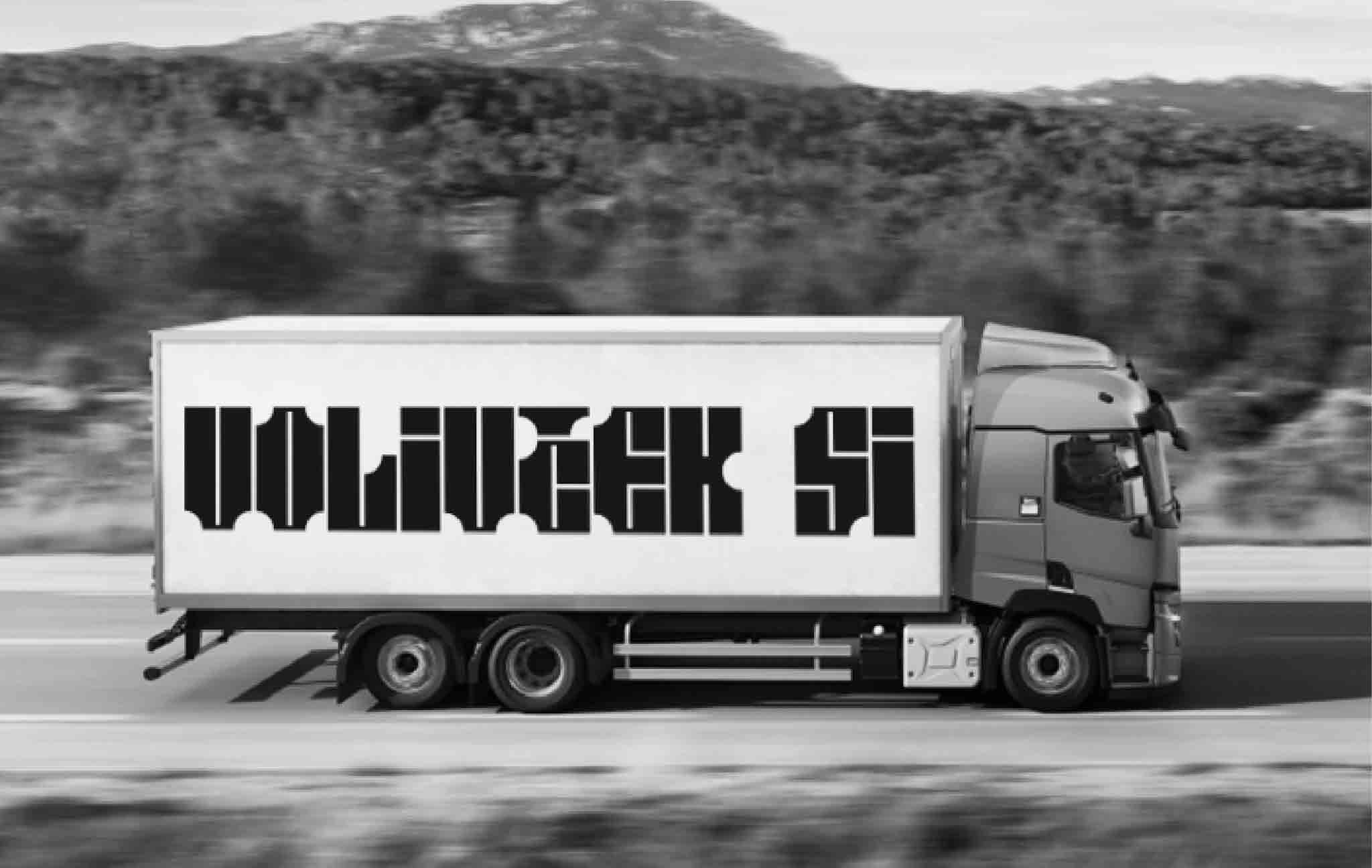
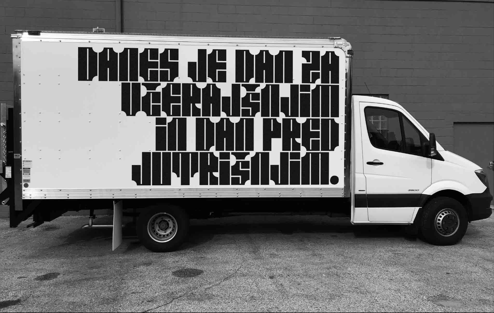
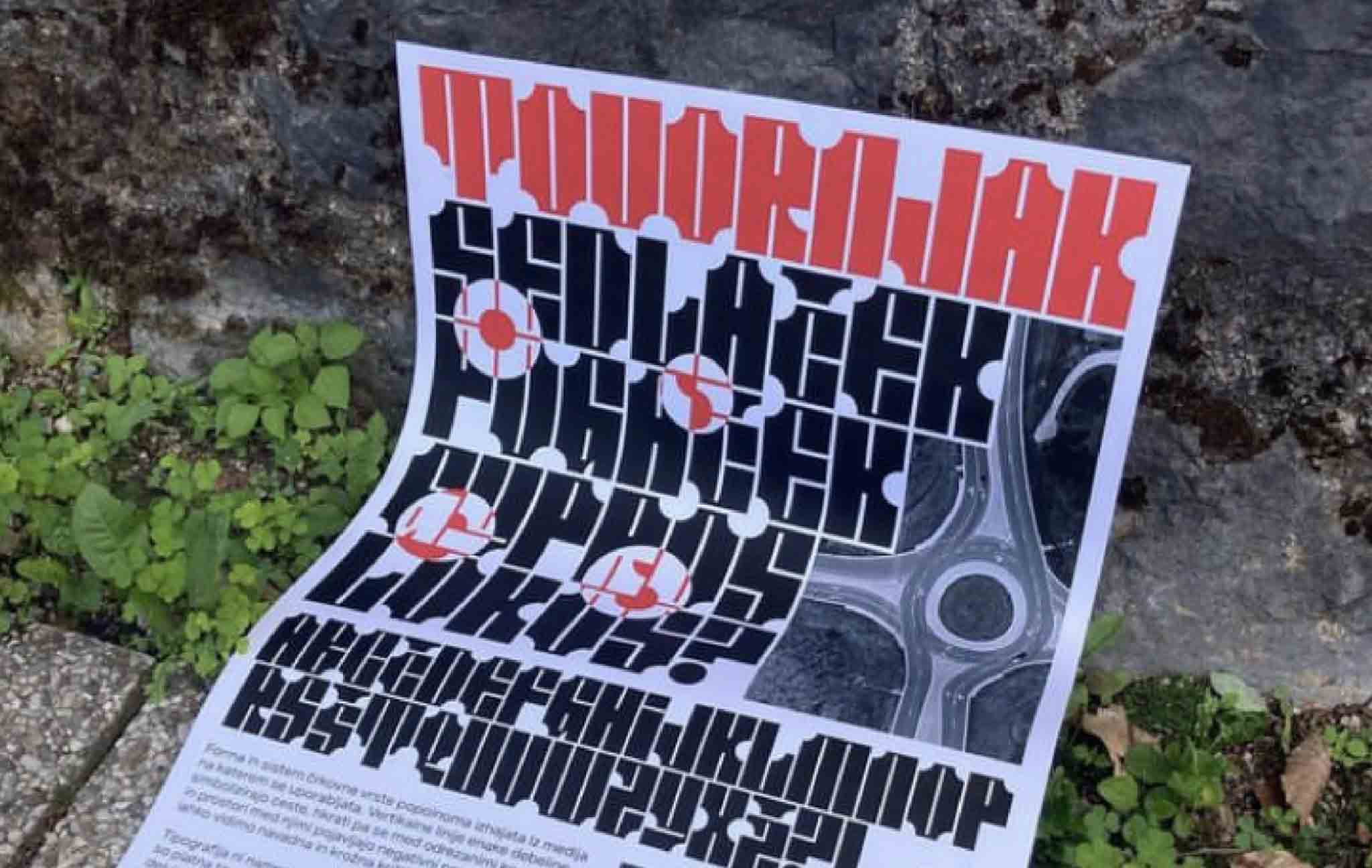
Tovornjak typeface
The objective of this exercise was to craft a politically charged slogan, taking into account Slovenia's complex political history, and consider how best to convey its message to the populace in order to inspire voter turnout.
The chosen slogan and typography were designed to be prominently displayed on blank truck canvases, with inspiration drawn from the graffiti art on trains that seeks to disseminate messages and author names as widely as possible. This approach ensures that the message subtly reaches a broad audience, including those in transit.
The typeface's design and structure were intentionally derived from the medium on which it is to be used, with uniform vertical lines symbolizing roads. However, the negative spaces between the cut ends of the letters and the spaces between them reveal regular and roundabout road intersections, further reinforcing the underlying message.
Glasbeni dialogi/Dialoghi musicali
Dialoghi musicali are a concert cycle that was performed for the first time in 2022 in Koper, Slovenia. In it, the idea is to present one musical landscape to the audience every year. This edition features Hungary. In the cycle, the audience was presented with three different projects on the theme of this region and, with the help of musical language. We wanted to try to bring Hungary and its diversity closer to the Koper audience where event took place.
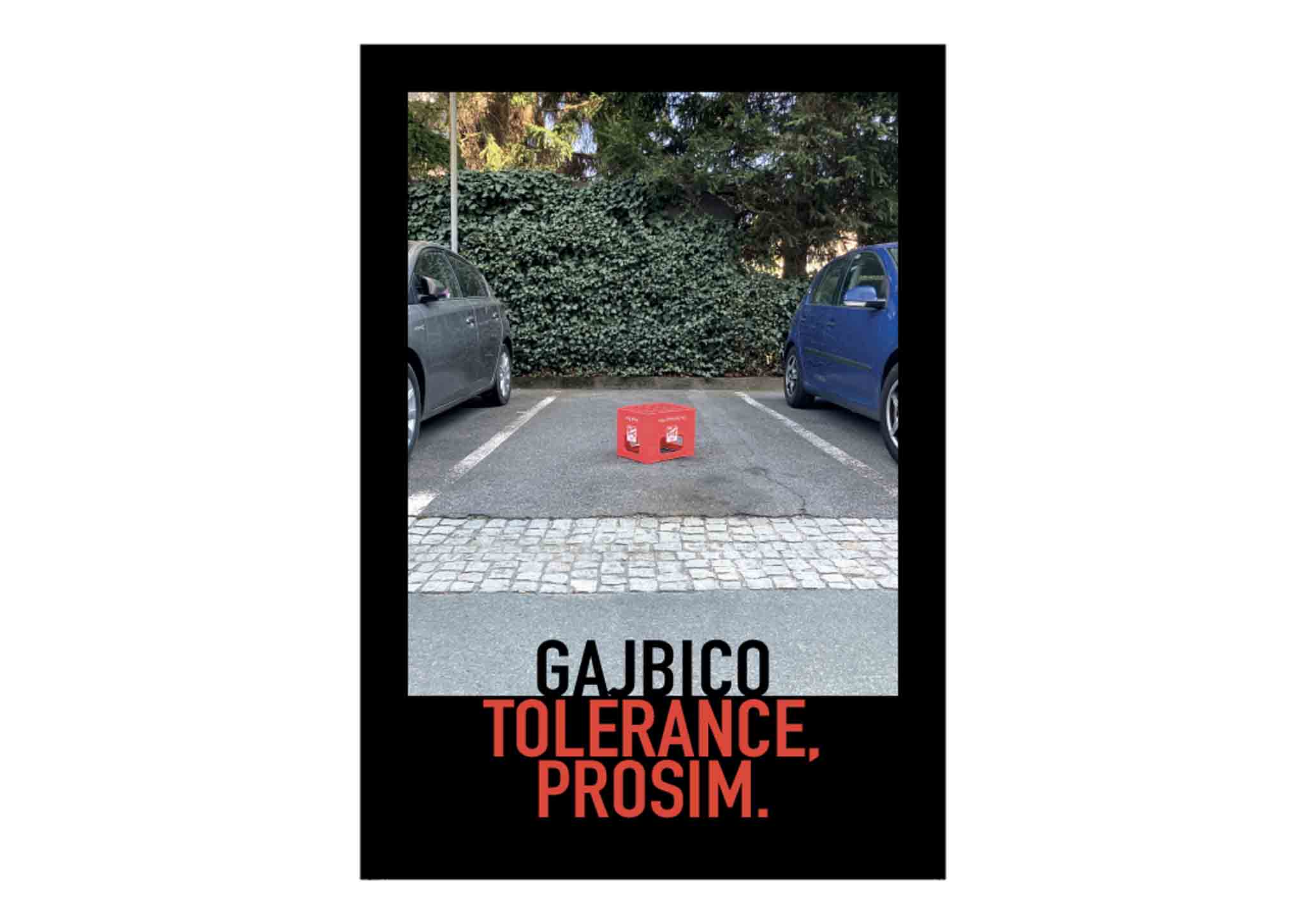
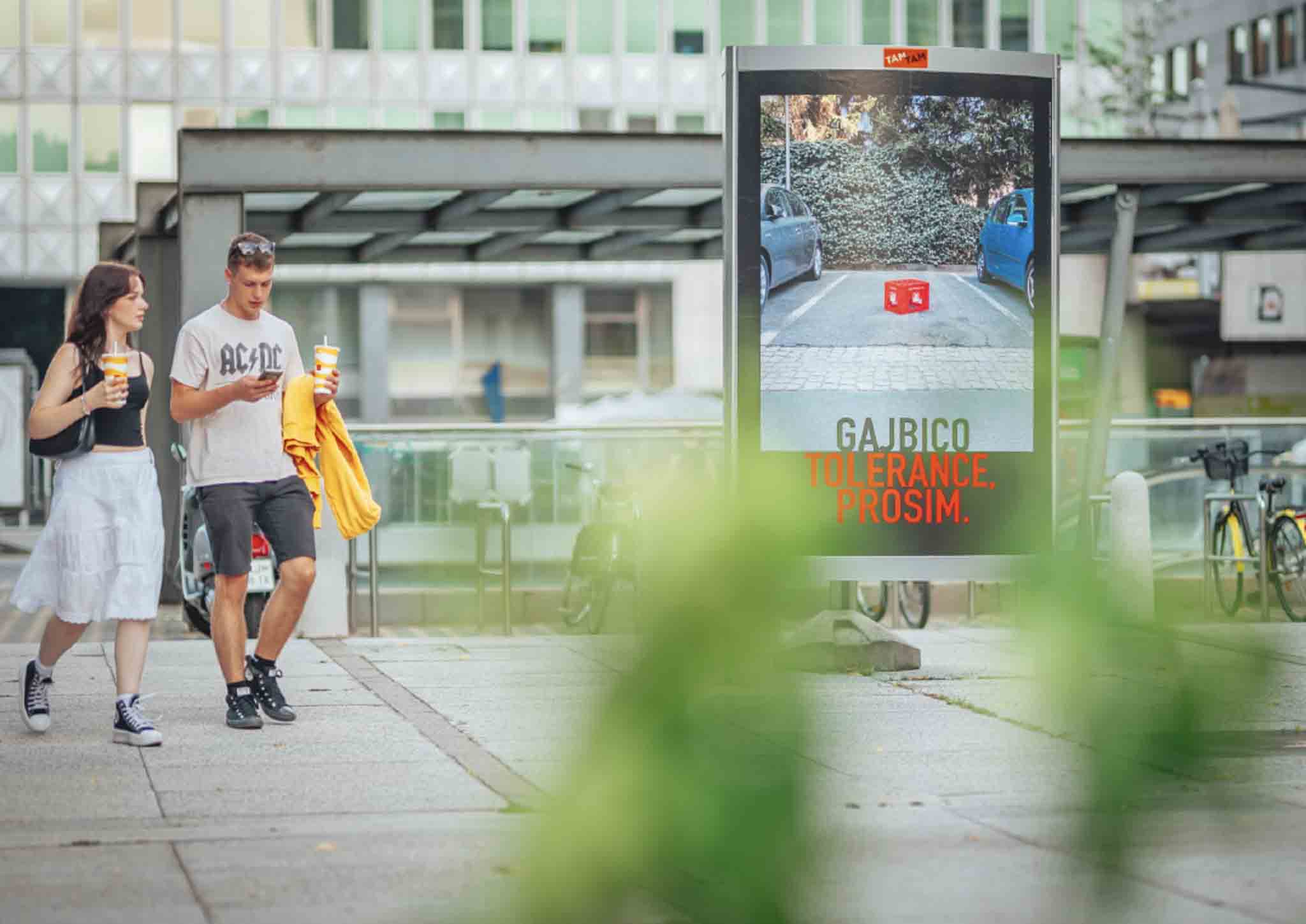
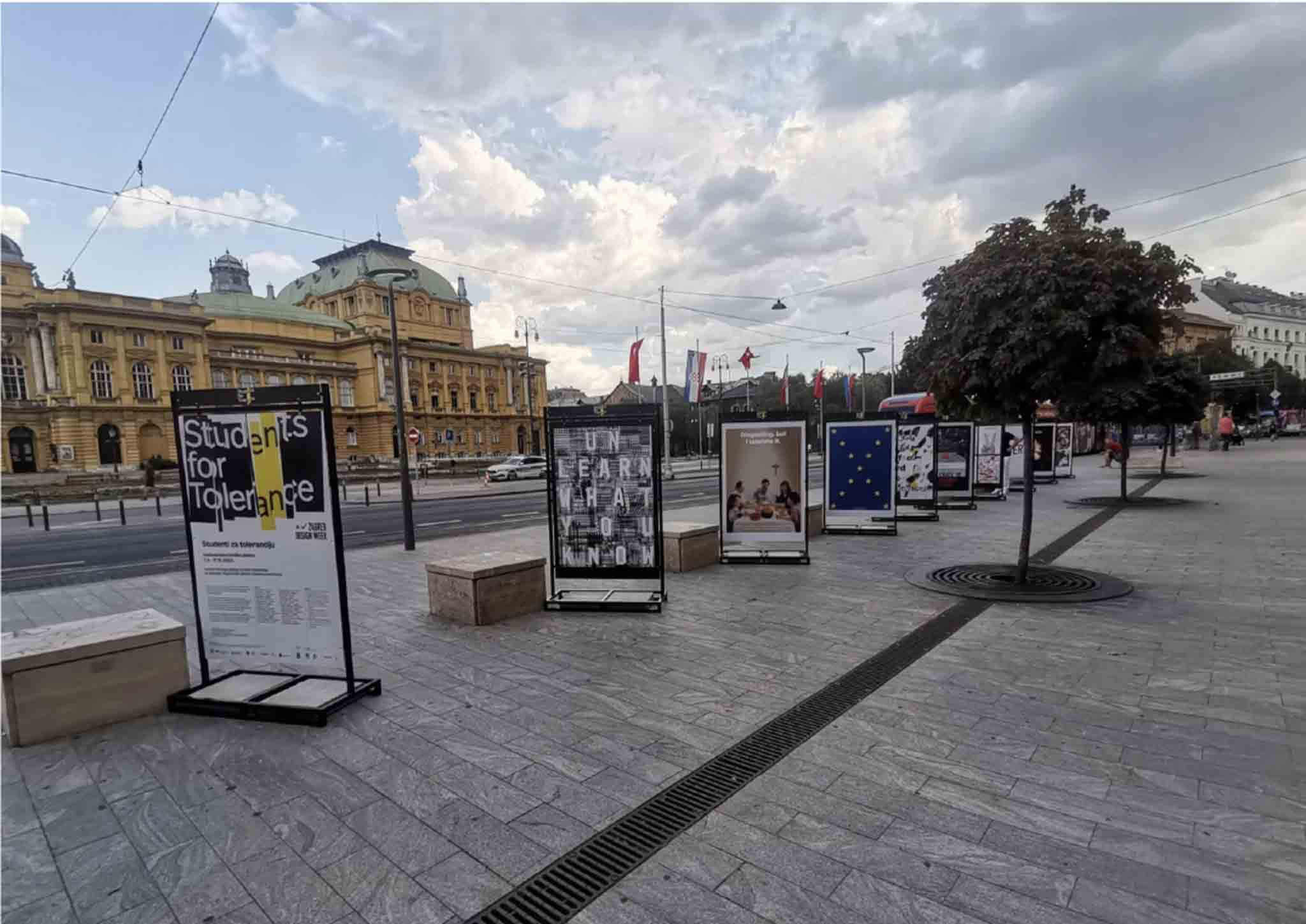
Students for tolerance
The project is based on the high-profile project Tolerance by the world-renowned Croatian designer Mirko Ilić and is the result of a successful international collaboration between four European universities. In their works, the artists address the issue of tolerance through various visual concepts. The artists of the works presented in the exhibition are students who participated in a one-week intensive design workshop in Graz, where they focused on the meaning of tolerance in present times under the mentorship of Tomislav Bobinac (Institute of Design and Communication, FH Joanneum, Graz), Roger Walk (Faculty of Design, Dortmund), Marija Juza (Faculty of Architecture, University of Zagreb) and Domen Fras (UL ALUO, Ljubljana).
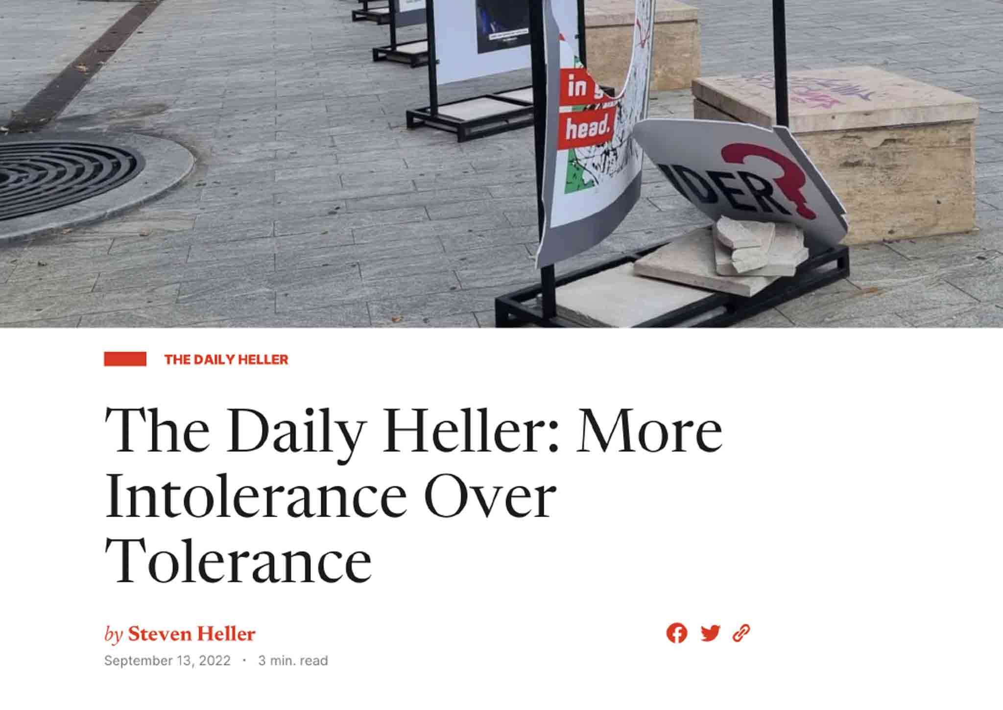
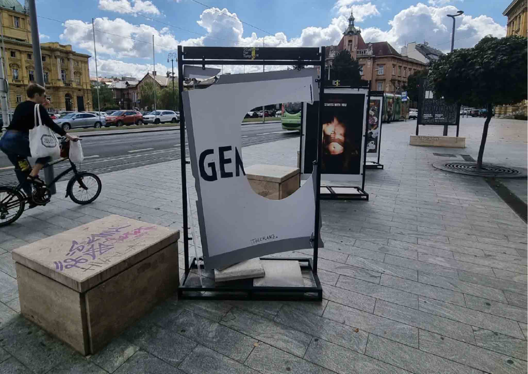
When exhibition moved to Zagreb, it was attacked and damaged at the night by unknown group of people, incident was featured in The Daily Heller section written by Steven Heller himself at Print Magazine.
Personal project of mine, designing stuff and making bad mockups out of it.
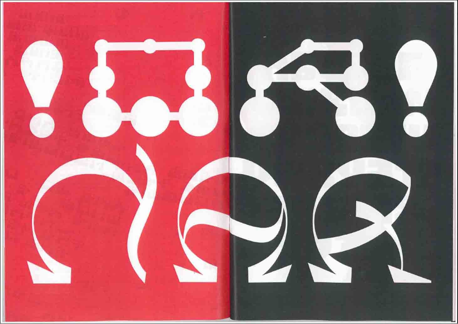
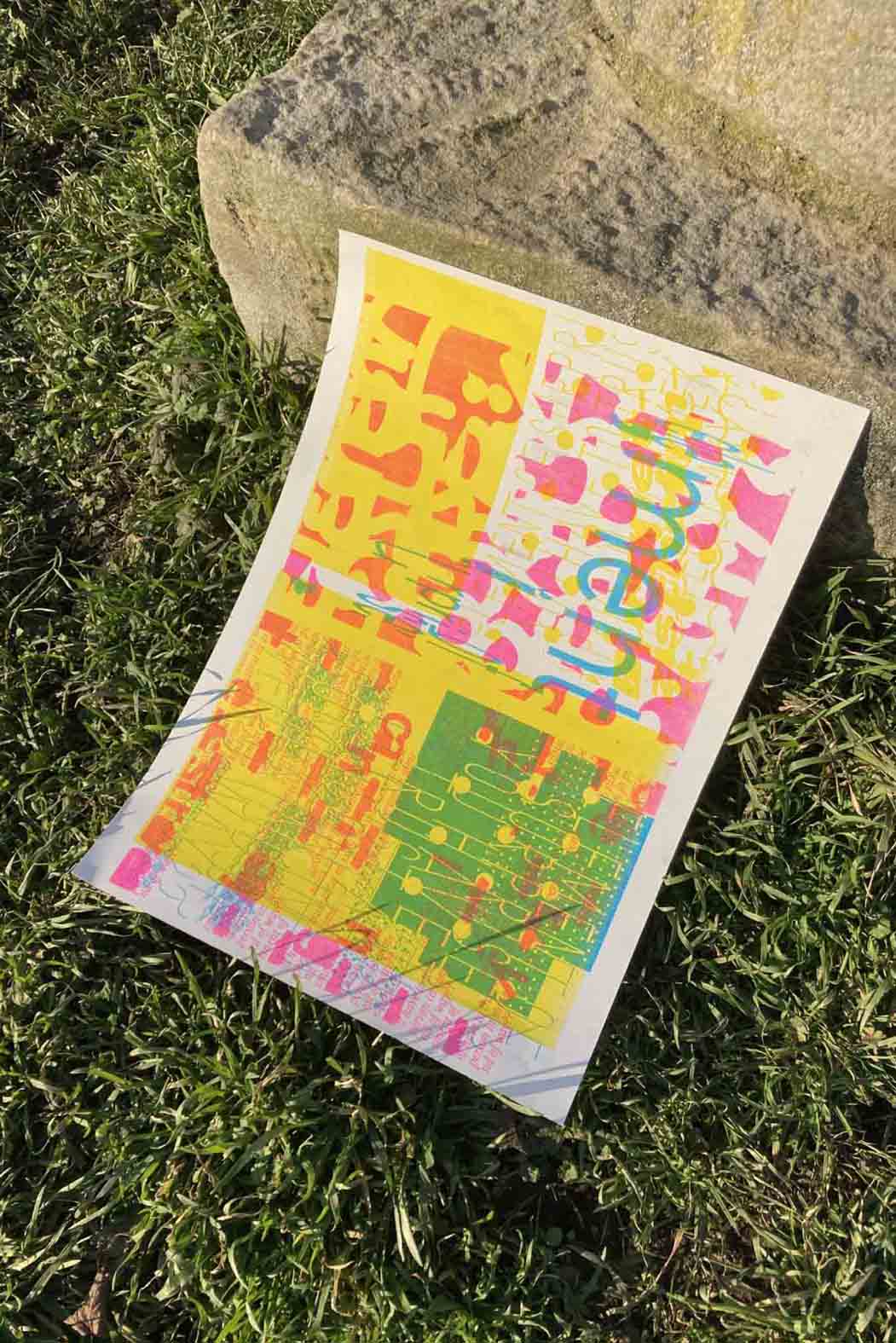
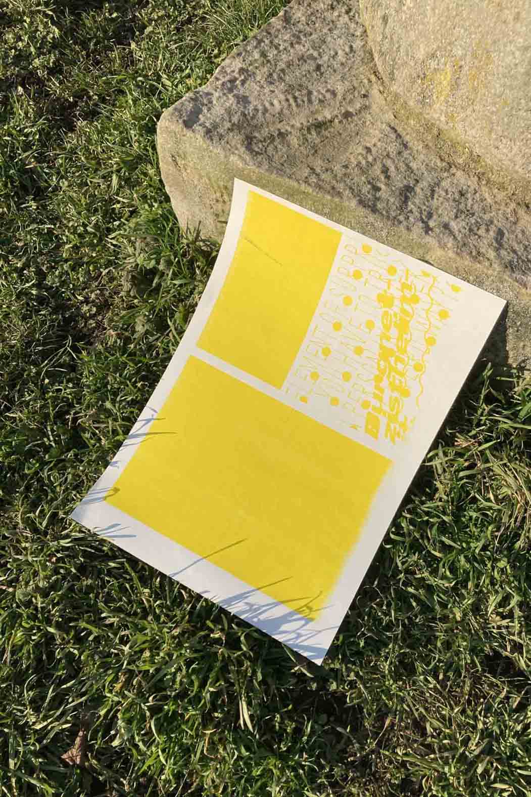
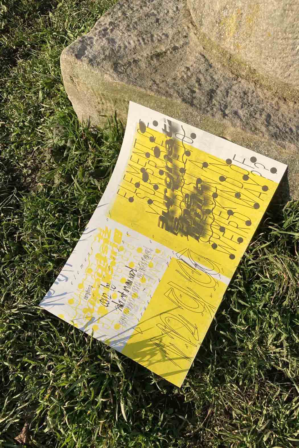
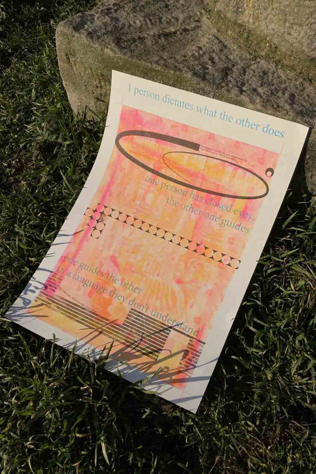
A babble, a chit-chat, a dialogue
From a linguistic point of view, the word “dialogue” does not describe the number of speakers, but “being between words”. Dialogue therefore also refers to the spaces between words and the relationship between words.
Dialogue often sits as an “in-
between” next to chairs—the dialogue
between state and society, the dialogue
between human and machine, the dialogue
between theory and application, the
dialogue between generations or the
dialogue between cultures. Where are
these dialogues conducted? At the round
table? On the street? In the chat inter-face? In an exchange of letters?
Ultimately, dialogue raises many
design questions: How do we actually
enter into conversation? And how do we
conduct a conversation at all? What
agreements do the speakers need to make?
And what tools and skills enable dia-
logue? Are there dialogue scenarios
that we should revive? Or those that we
should fundamentally discard? Finally,
can we develop and design new formats
of dialogue together?
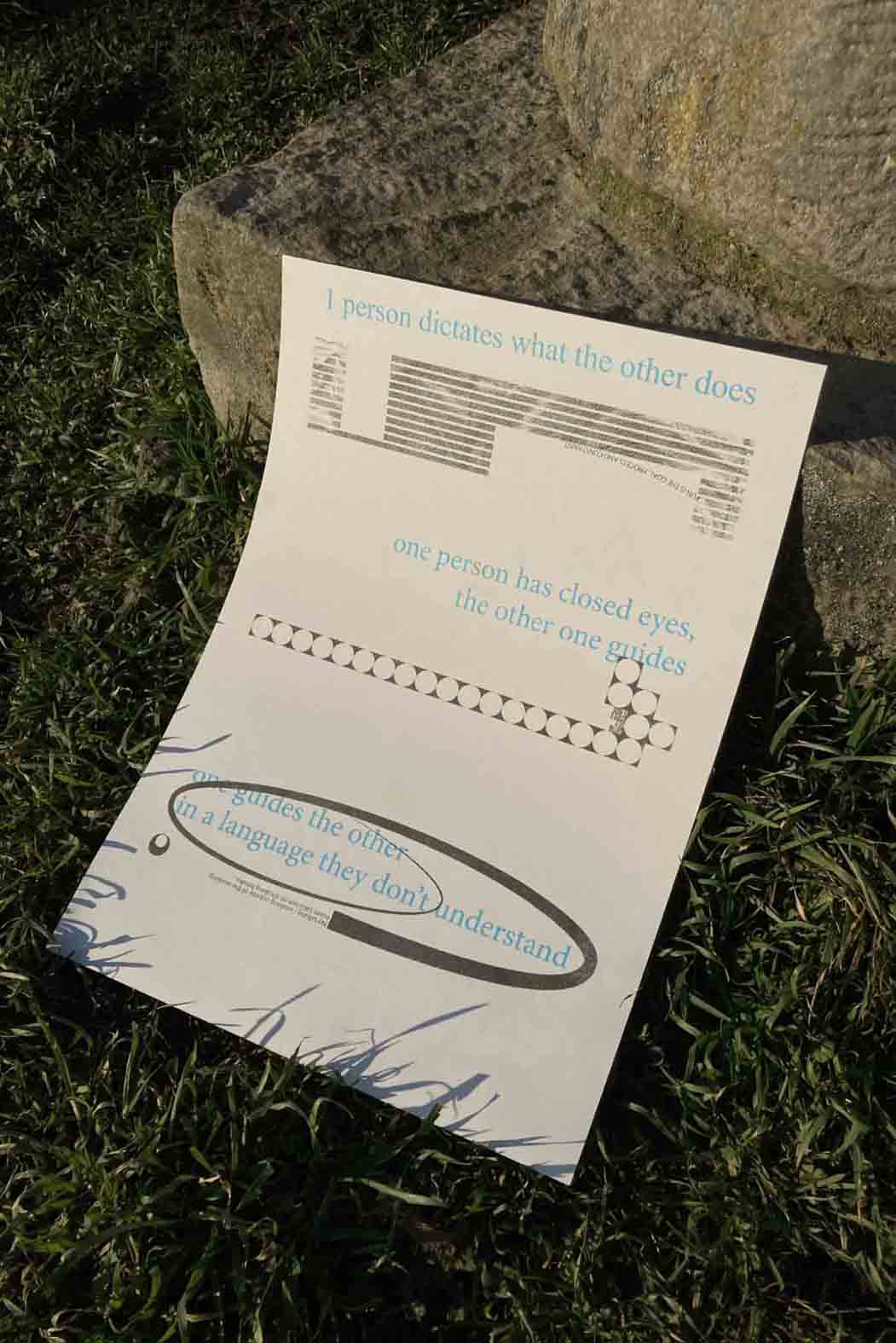
Me and Hannah found ur own method of communicating through designing posters with a ping-pong style. We developed our manifesto and then started designing. First each person designed in his/her way, then we exchanged files and so on... The main thing we learned was that we designers often get too emotionally attached to our work. We wanted to avoid that, so destroying and changing eachother posters was allowed and somehow praised in the process.
w/Hannah Lentz
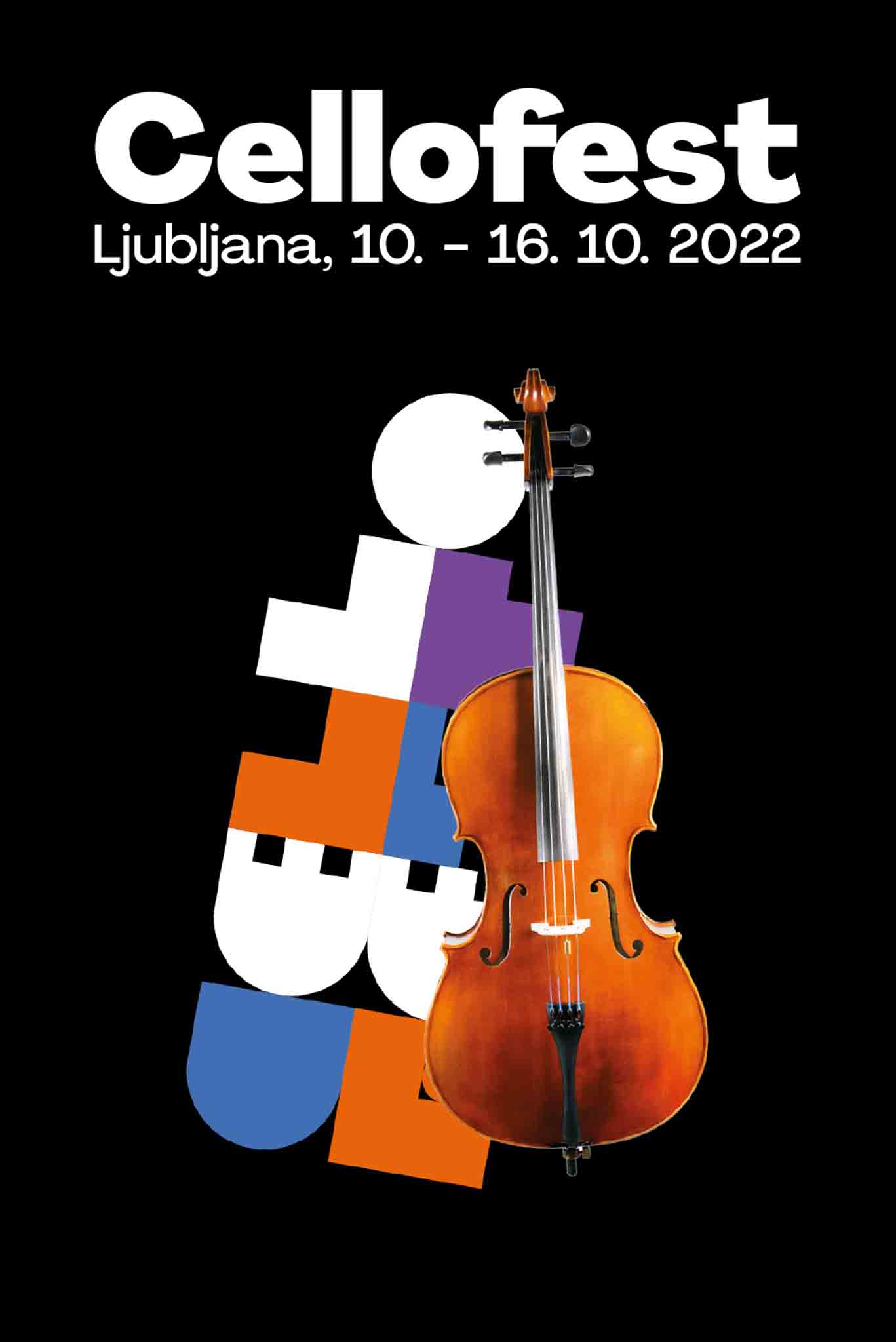
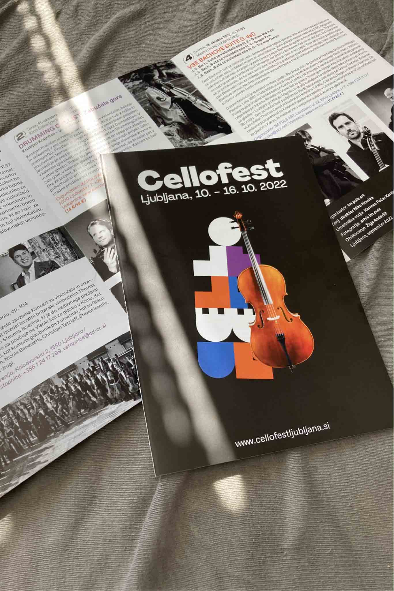
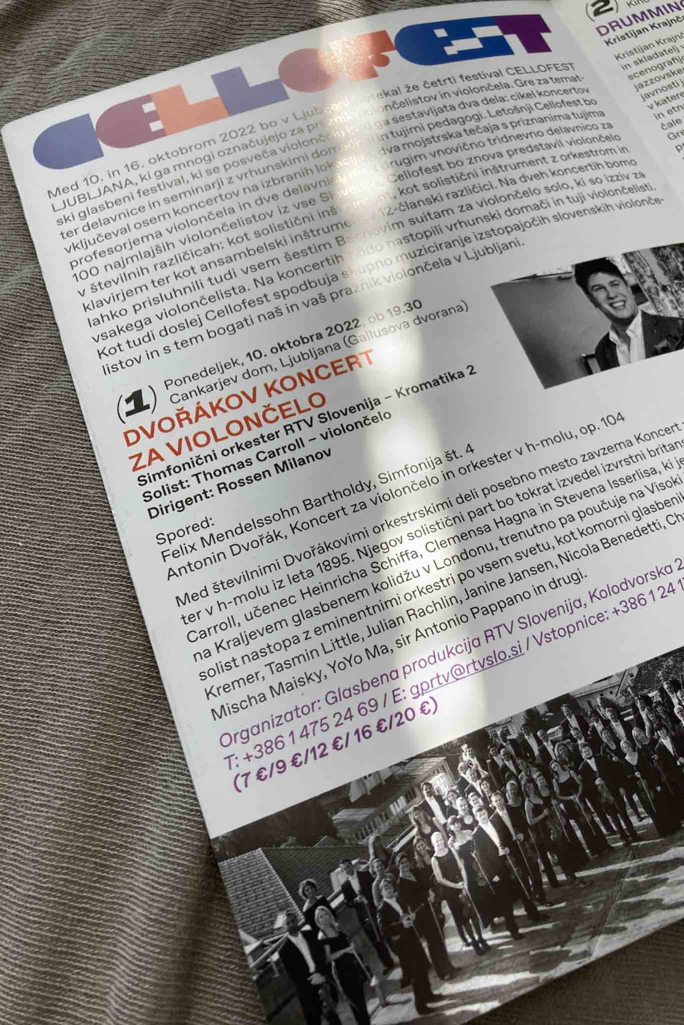
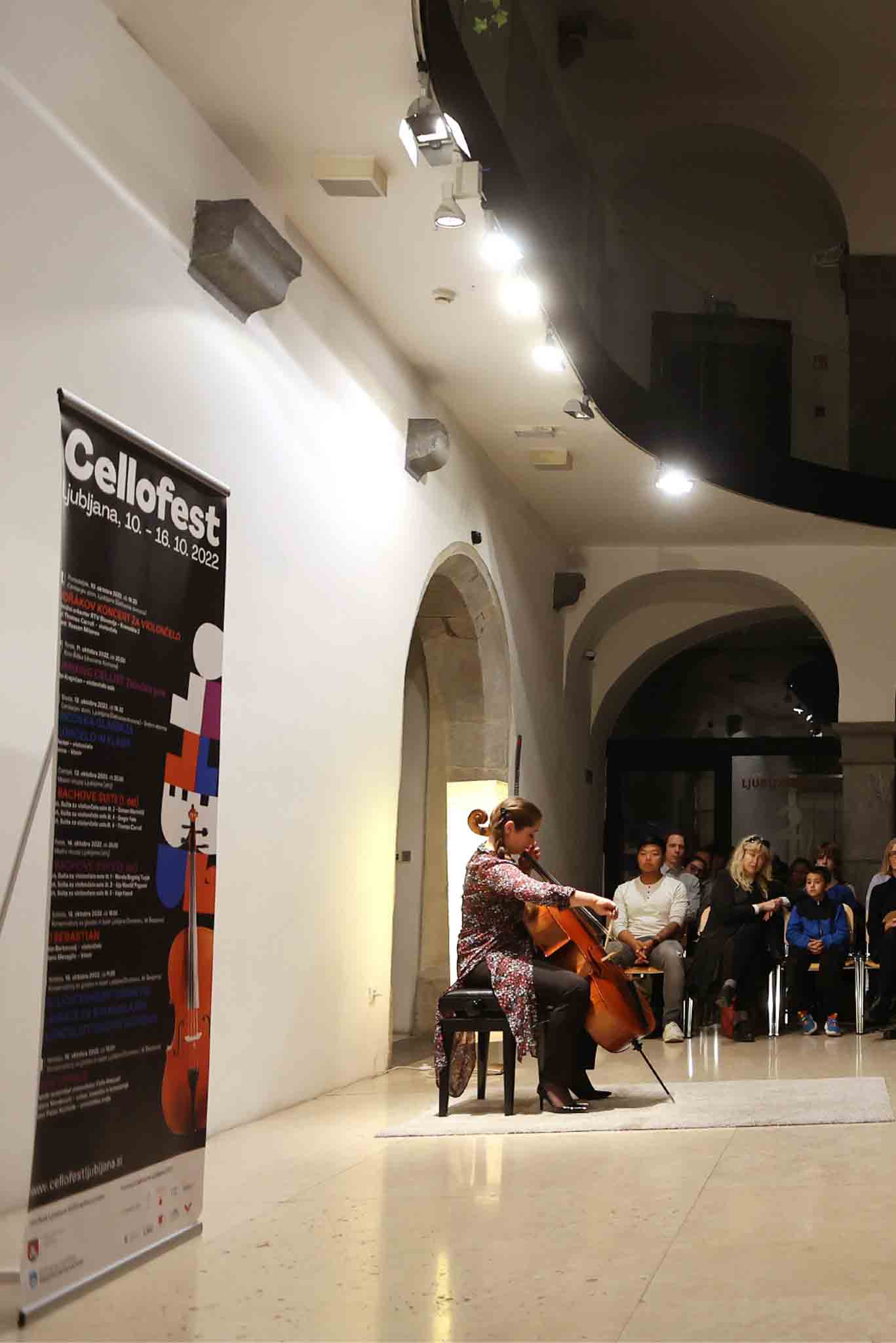
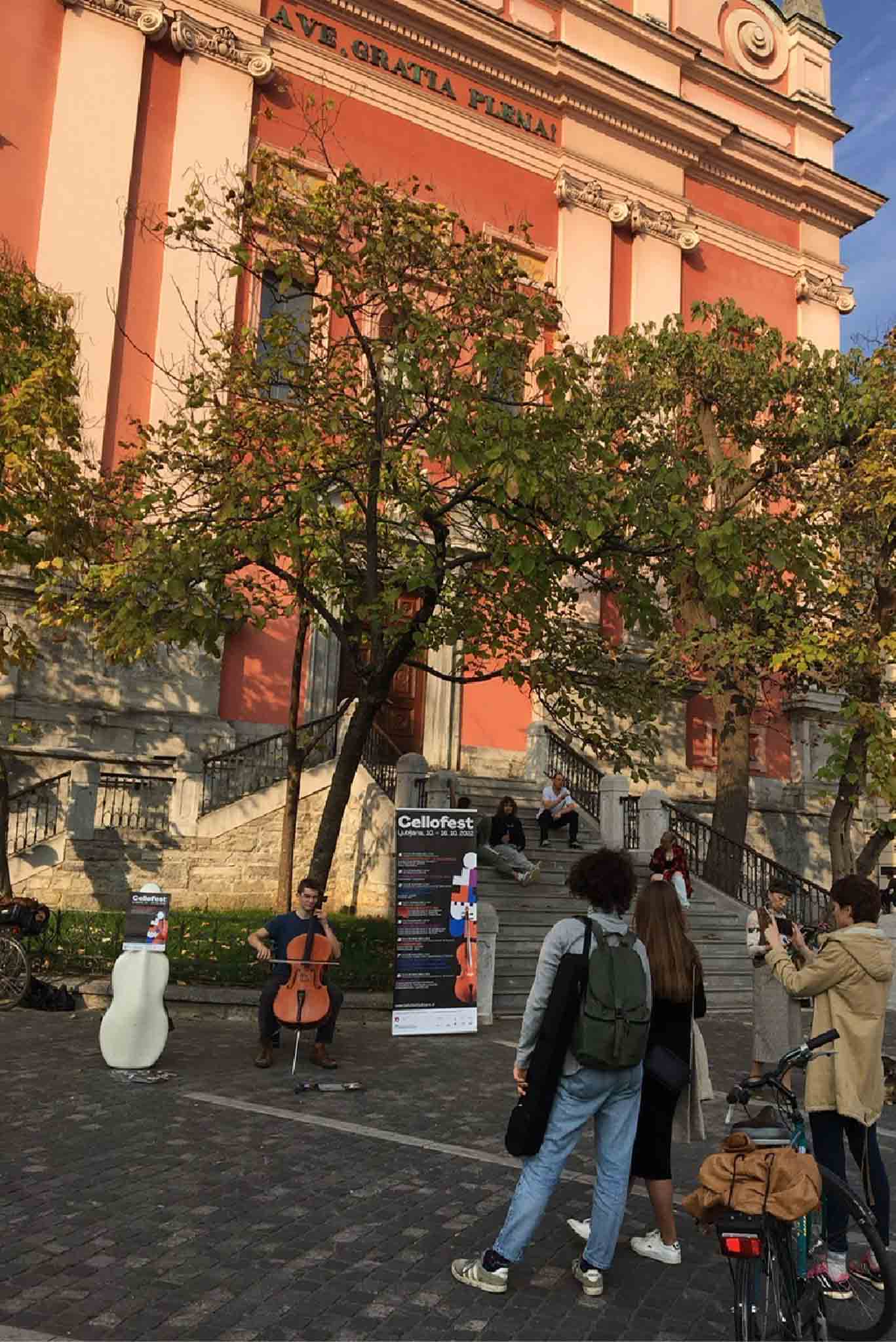
Visual identity for Cellofest in Ljubljana
The fourth Cellofest LJUBLJANA festival, which many call the festival of cellists and cellos. It is a thematic music festival dedicated to the cello and consisting of two parts: a cycle of concerts, workshops and seminars with top domestic and foreign teachers. Last year's Cellofest included eight concerts at selected locations, two master classes with renowned foreign cello professors and two workshops - including another three-day workshop for 100 of the youngest cellists from all over Slovenia.
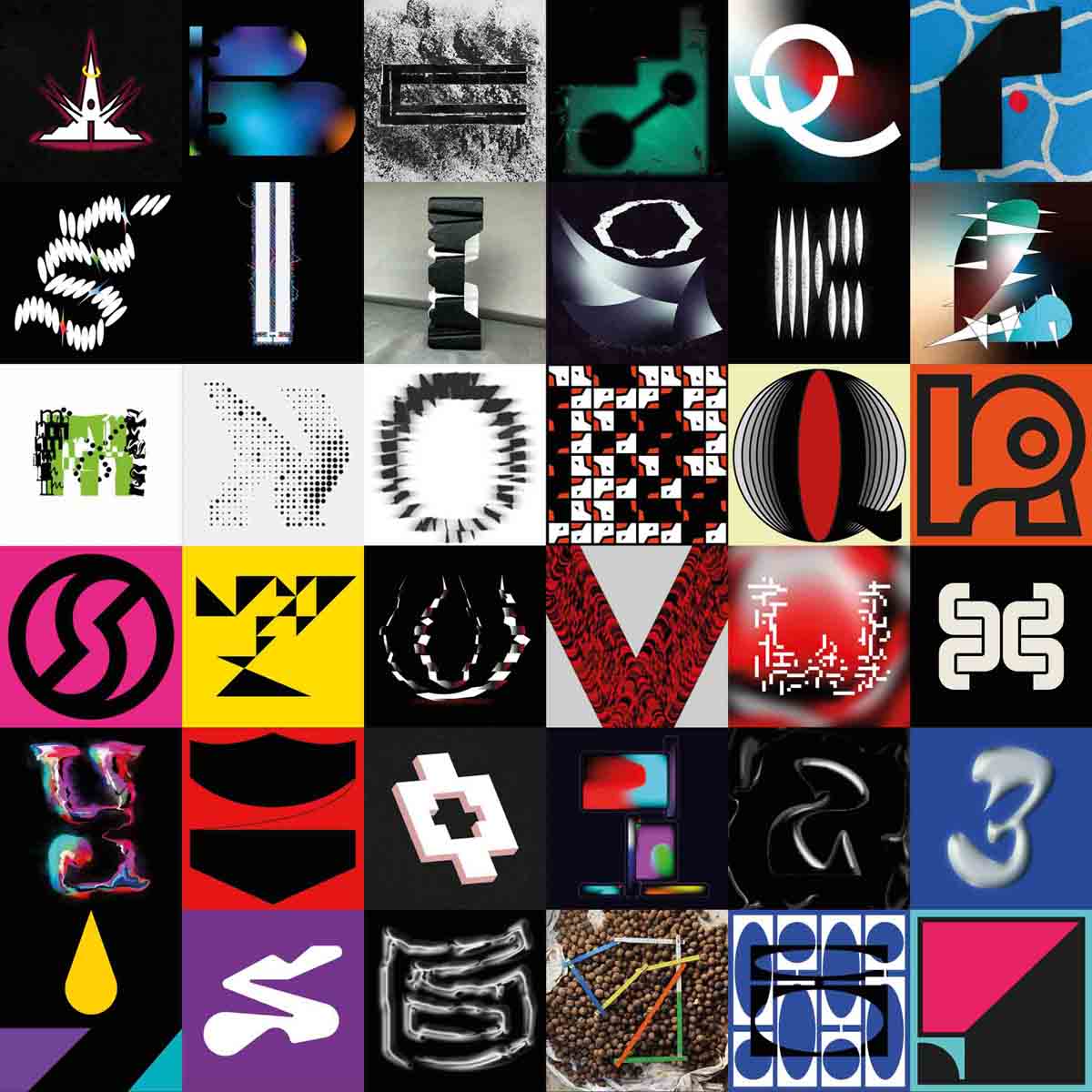
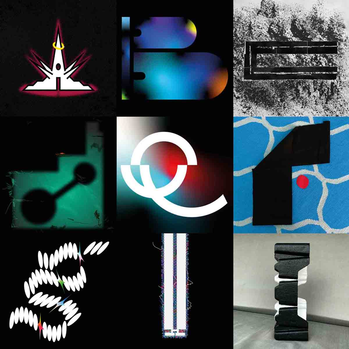
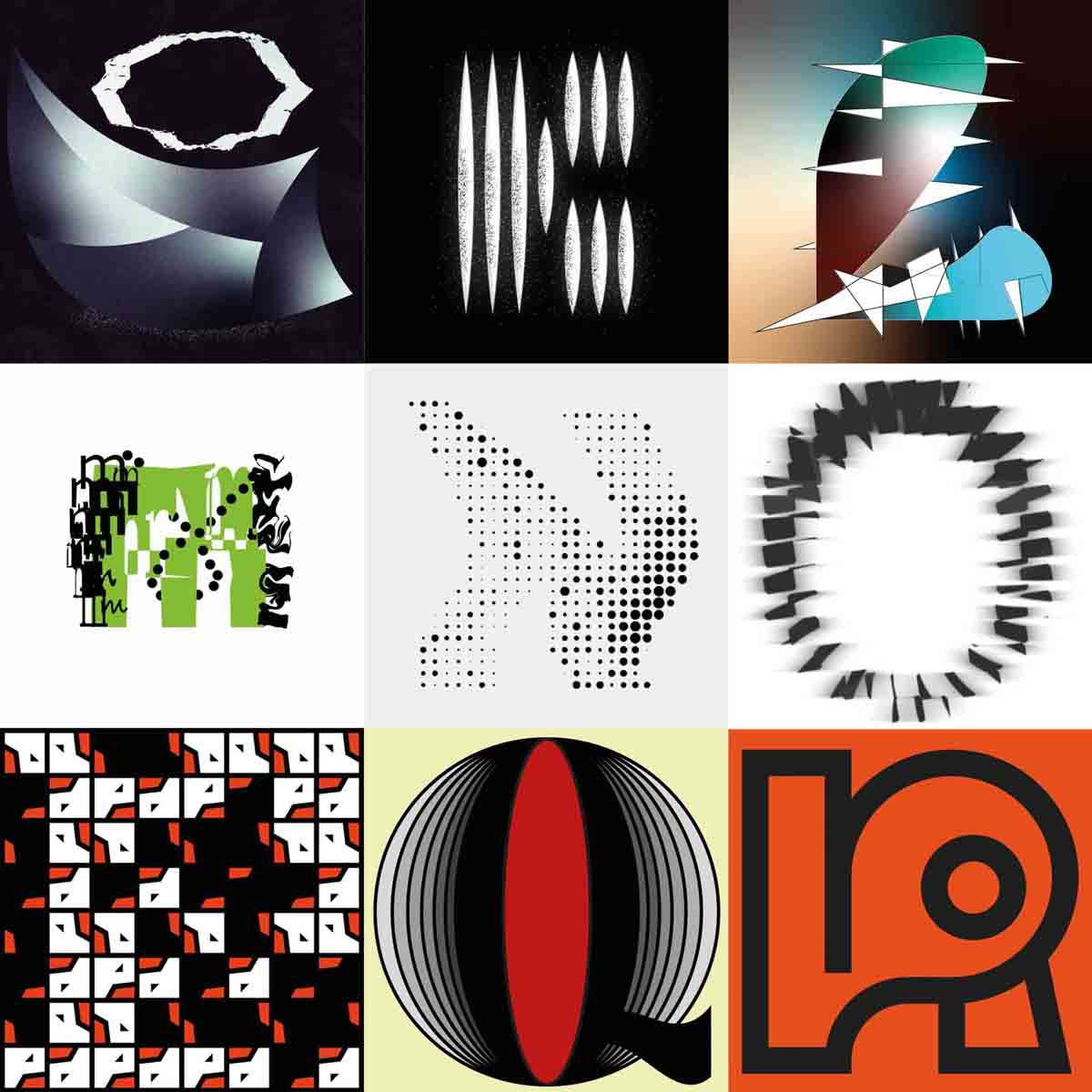
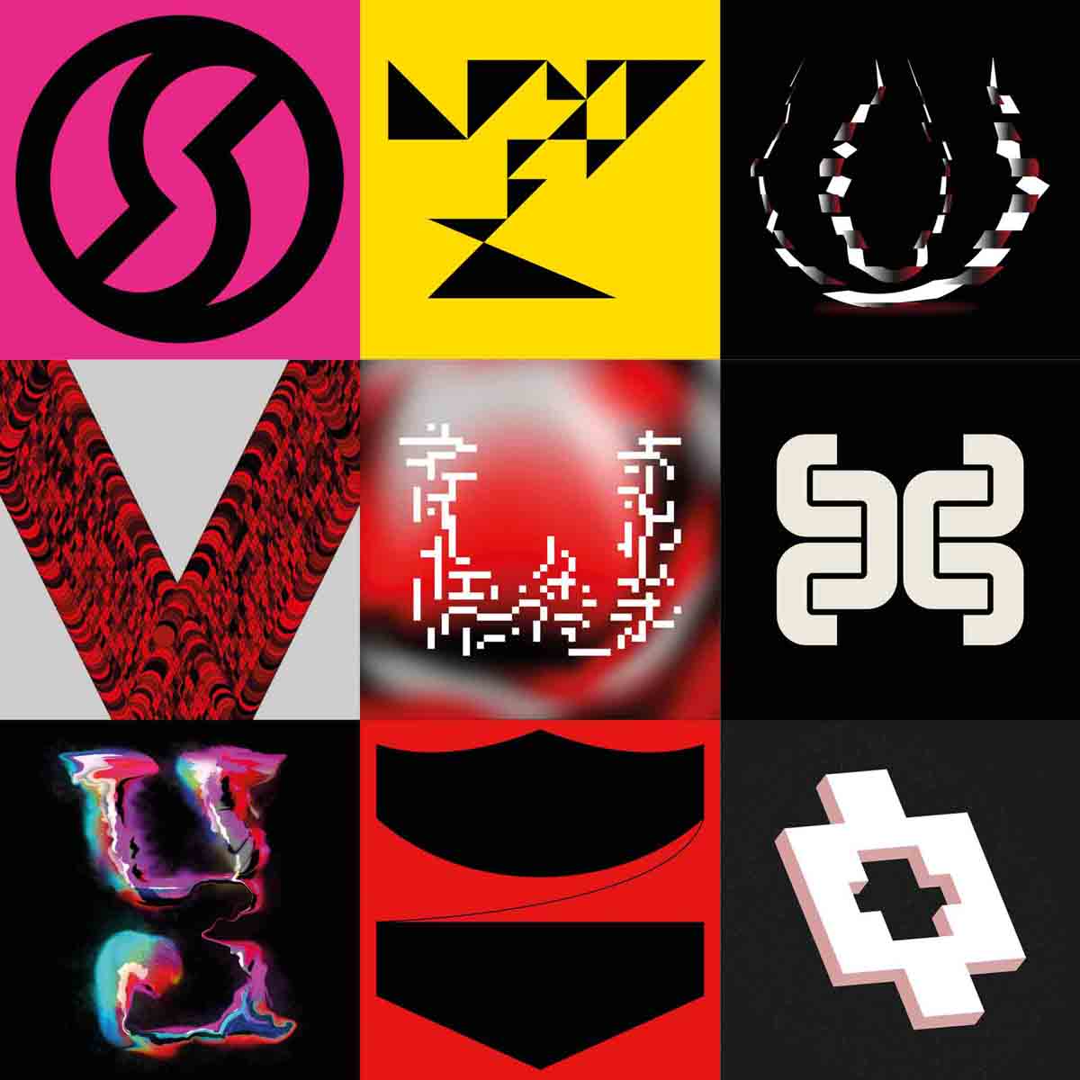
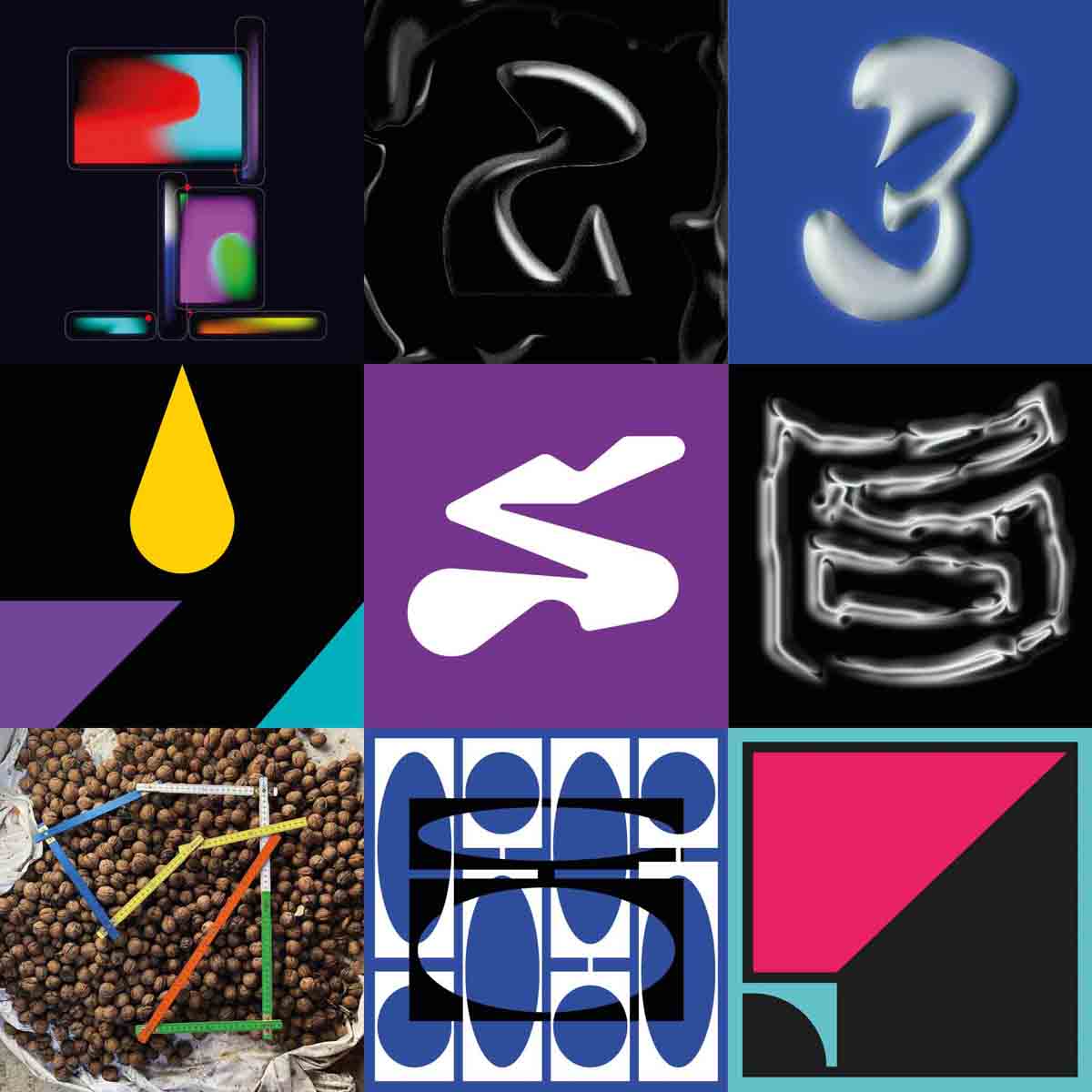
36 days of type 2021
36 Days of Type is a project that invites designers, illustrators and graphic artists to express their particular interpretation of the letters and numbers of the Latin alphabet.
A yearly open call exploring the creative boundaries of letterforms, where participants are challenged to design a letter or number each day for 36 consecutive days, as a global and simultaneous act showing the outcome of the ability to represent the same symbols from thousands different perspectives.
A project that aims to be a space for creation around typography and its endless graphic possibilities.
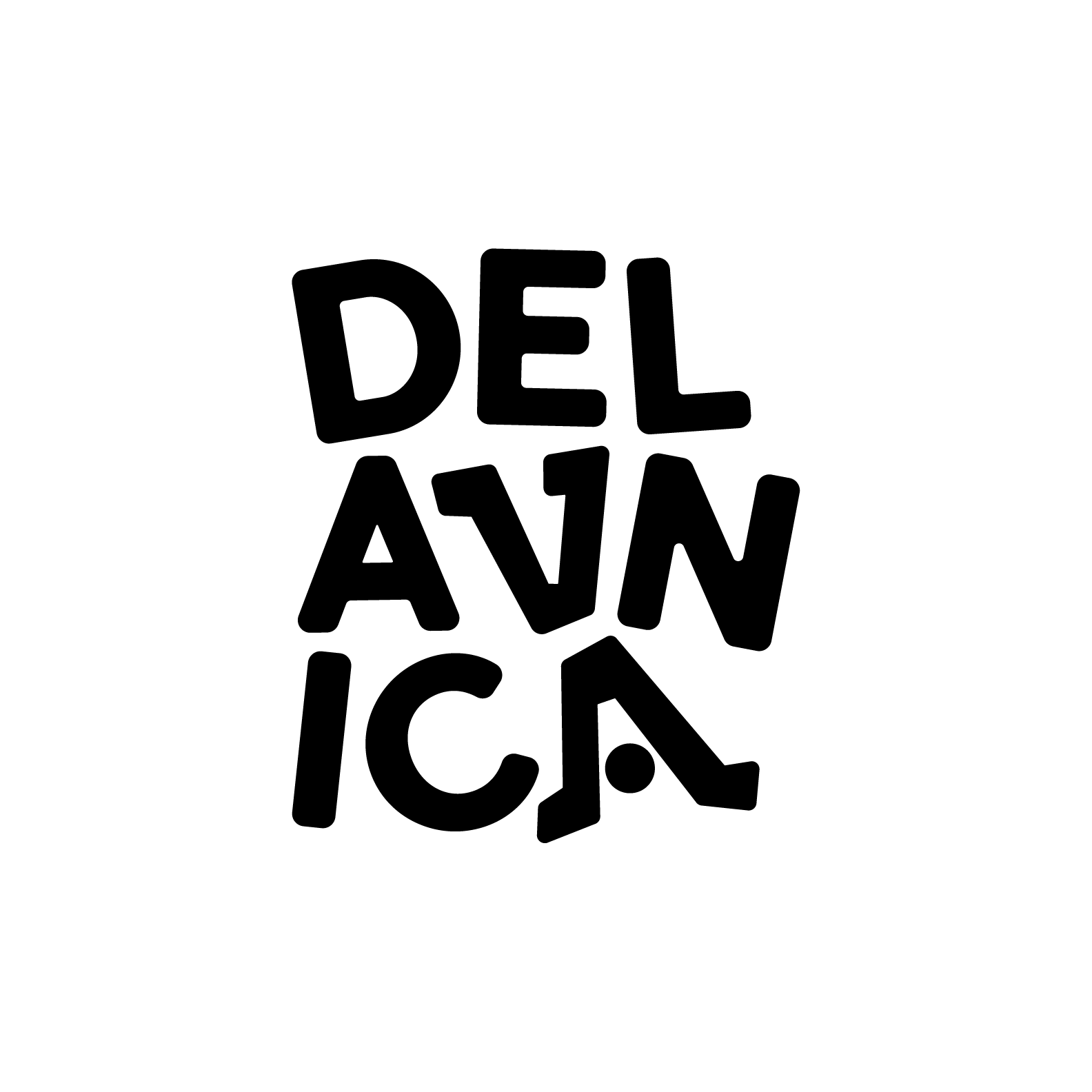
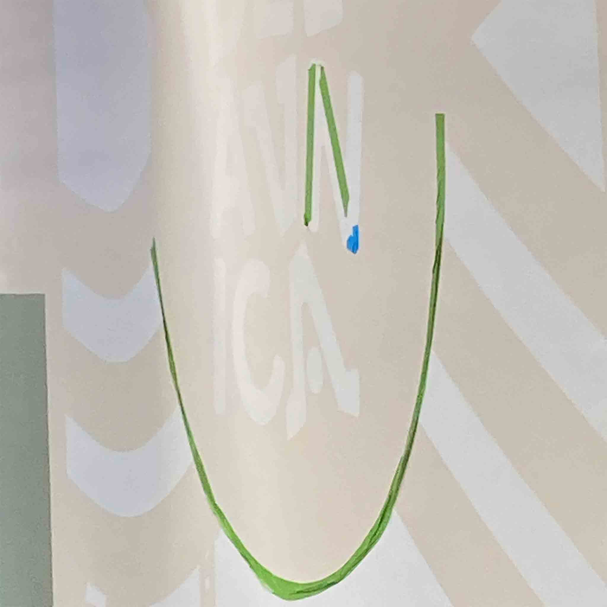
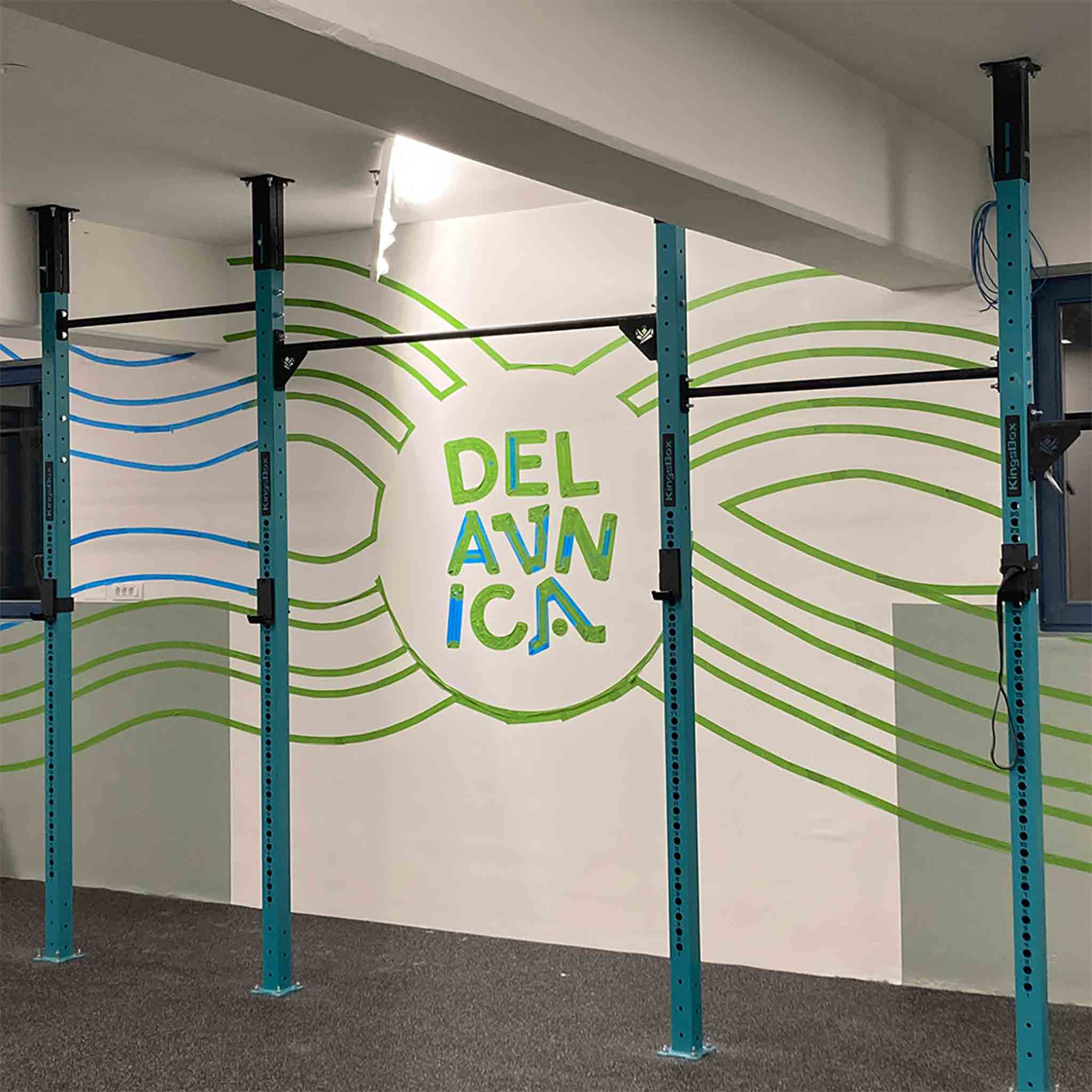
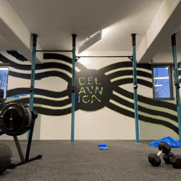
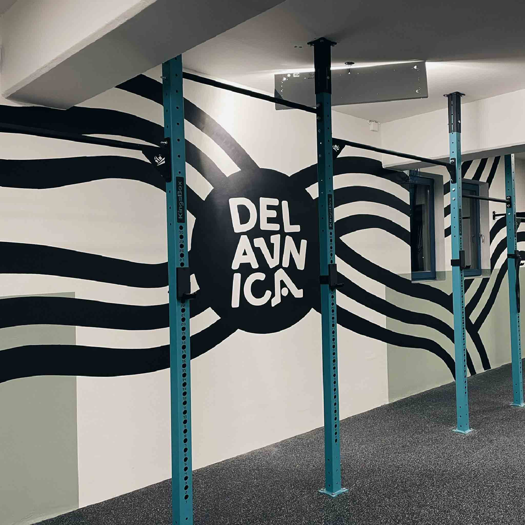
Logotype and mural for a local gym Delavnica
Delavnica is a functional gym in my hometown Šmarje. Best in Slovenia!